
Amra Sheikh
Scaling brands with high converting Meta Ads & Creatives
New to Contra
Amra is ready for their next project!

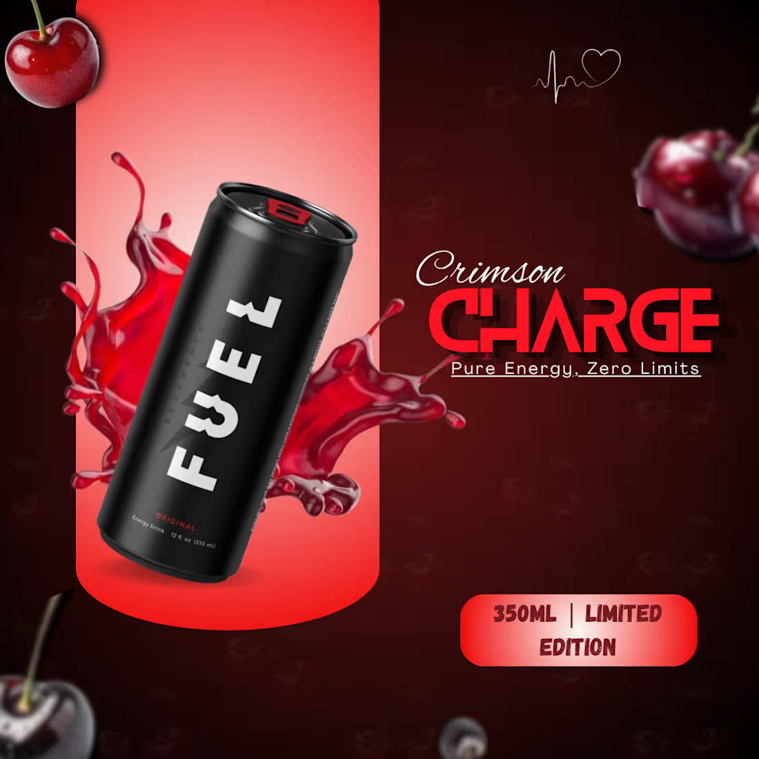
Crimson Ad design is an independent work to showcase my skills.
Focused mainly on attractive color combos and fonts that enhance with each other to stop the scroll in the first 2 seconds among the chaos & awake the thirst
0
11

As an independent concept project, I independently selected thefur to redesign their product presentation and marketing visuals. Even though this wasn't a commissioned project, my goal was to demonstrate how strategic design improvements can elevate an e-commerce brand's market presence.
What I Did:
Visual Redesign: Completely revamped the product presentation and marketing layout using Canva to make it look clean, modern, and high-converting.
Meta Ad Strategy: Transformed the designs into thumb-stopping Meta ad creatives tailored to capture user attention and boost click-through rates.
Brand Aesthetic: Maintained a professional balance between visual appeal and clear communication to drive better audience engagement.
1
94
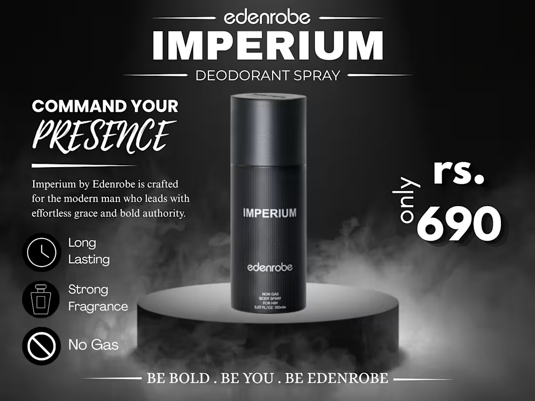
For this concept redesign of the edenrobe Imperium Deodorant Spray, the goal was to transform a standard e-commerce product listing shot into a high-converting static Meta ad graphic.
I restructured the visual hierarchy by placing the product on a dark textured podium with ambient lighting to reflect a bold, premium aesthetic. To optimize for mobile scroll-stoppers, I added clear feature icons (Long Lasting, Strong Fragrance, No Gas) for 2-second scannability, along with high-contrast typography emphasizing the Rs. 690 price point to boost click-through rates.
0
77

Designed a high-converting, scroll-stopping promotional ad banner tailored for Meta (Facebook & Instagram) ad campaigns. The goal was to establish a clear visual hierarchy, optimize readability on mobile feeds, and communicate the core value proposition instantly.
Visual Hierarchy: Strategically arranged typography to guide the scroller's eye from the primary headline to action-oriented sub-elements (Traffic + Leads + Sales).
Color Contrast & Polish: Used high-contrast yellow and blue tones combined with clean badge styling to ensure the offer pops on both light and dark social feeds.
Conversion-Focused Layout: Designed with a prominent CTA section ("Let's Grow Your Business!") and a professional presenter graphic to build immediate trust.
0
101