A series of food-focused digital illustrations exploring stylized forms, color, and detail through a modern visual approach.:
1
28
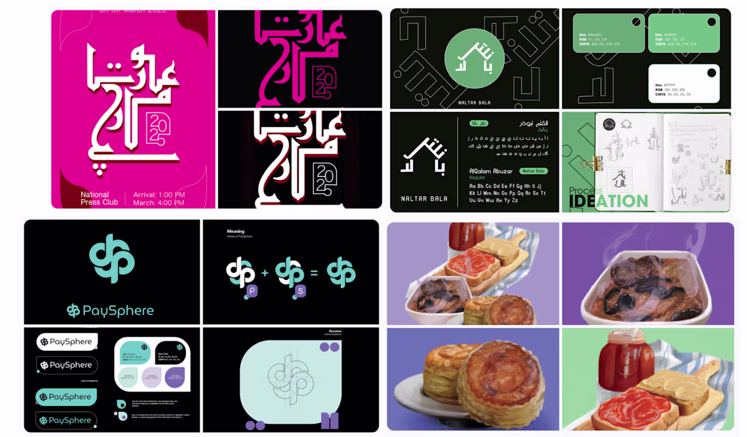
PaySphere’s branding centers on a modern identity built for a secure digital payments ecosystem. The system combines a clean geometric logo with a focused, technology-driven visual style. A refined color palette reinforces clarity, reliability, and innovation. Together, these elements establish a cohesive and scalable brand for the platform.
0
102
This collection features logos from both client work and personal explorations, focused on creating designs that feel thoughtful, flexible, and easy to use.
1
23
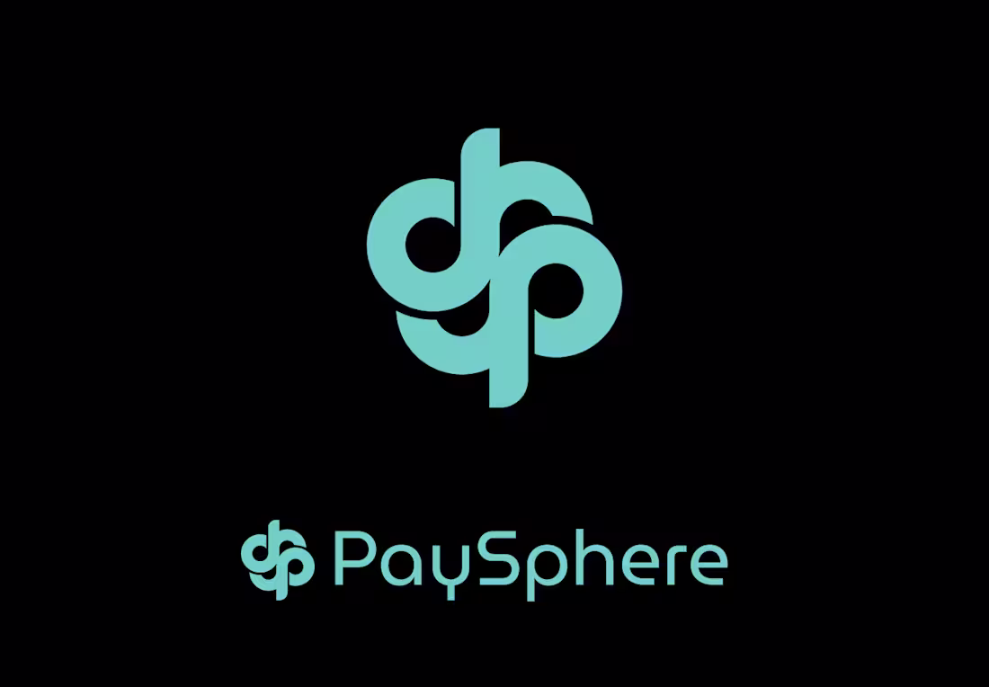
Naltar Bala is an Airbnb situated in the valley of Naltar, one of Pakistans most prestigious locations for winter sports and I had the opportunity to help my client with the branding for their Airbnb. Here are a few snippets into the design and workflow for this project. :)
0
170
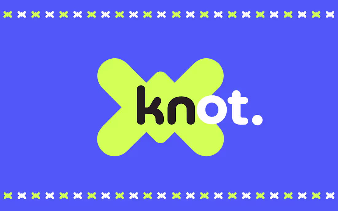
Simple branding for a fictional banking app.
0
132
These murals were created in two different styles for two different locations for a well established internet service provider. Each mural's color and style reflected the environment it was to be placed in and for the viewers within the location.
0
101
Fish-eye portrait created just for the sake of not having a boring pfp. :0
0
90
TUSK | Brand Guidelines
Tusk is an event rental brand built around minimal, classic design with subtle earthy undertones. The brand guidelines focus on timeless typography, muted color palettes, and a refined visual system that feels elevated yet approachable.