
Amen Psd
Pro thumbnail artist crafting high-CTR, curiosity-driven
New to Contra
Amen is ready for their next project!

I redesigned this thumbnail like this…
The old one was dull, crowded, and had weak colors — nothing really popped.
So I boosted contrast, used bold vibrant colors, and created a clear focal point.
Added a curiosity gap by hiding key info — now it actually grabs attention and drives clicks.
1
47

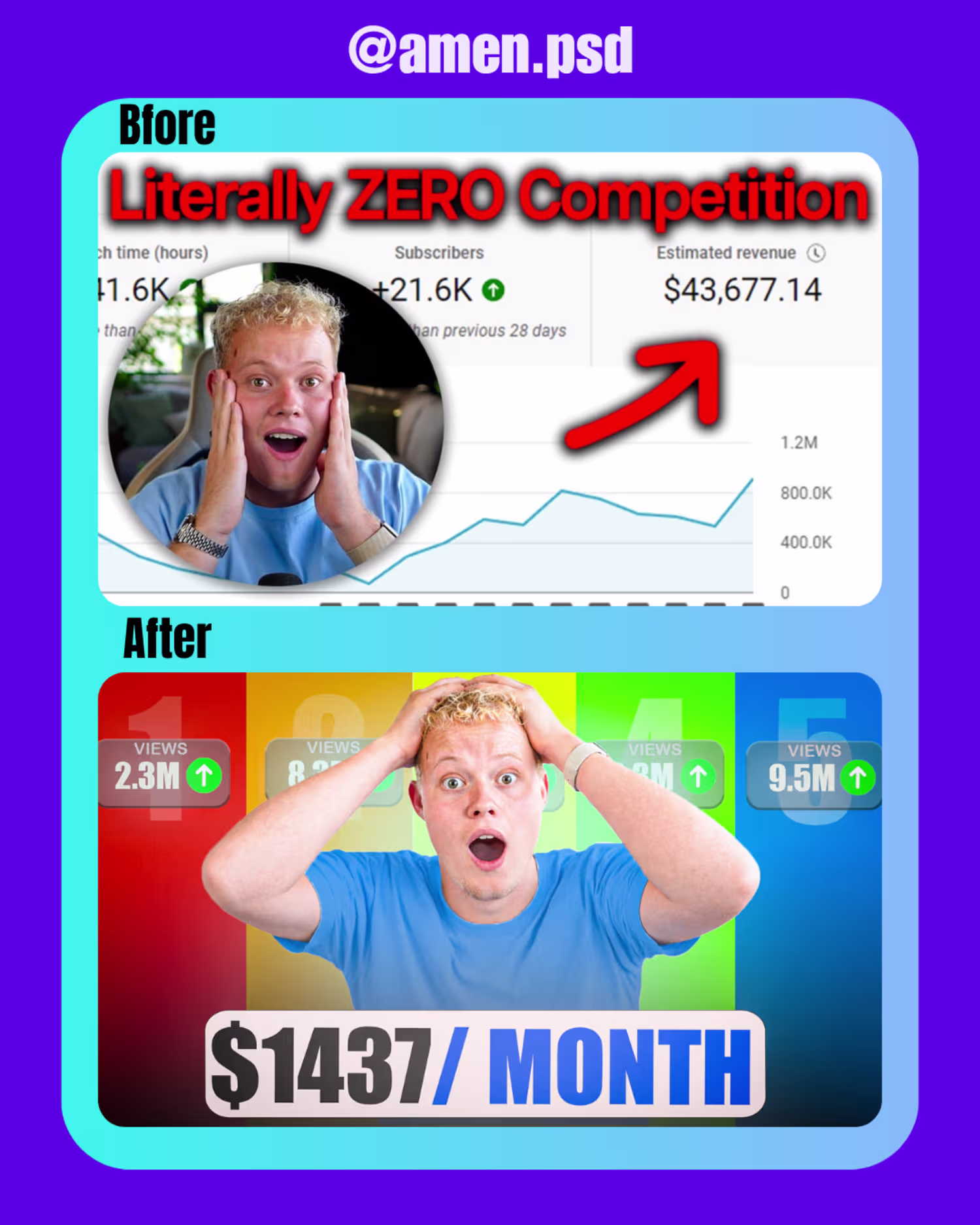
i created this thumbnail for cold outreach
0
34

Recent work for cold outreach
0
37

Recent work sample for outreaching
0
39

Recent sample work for prospect
0
43
Recent sample work for prospect🎉
0
38