
Alexandra M.
Graphic Designer building responsive and modern websites.
Ready for work
Alexandra is ready for their next project!
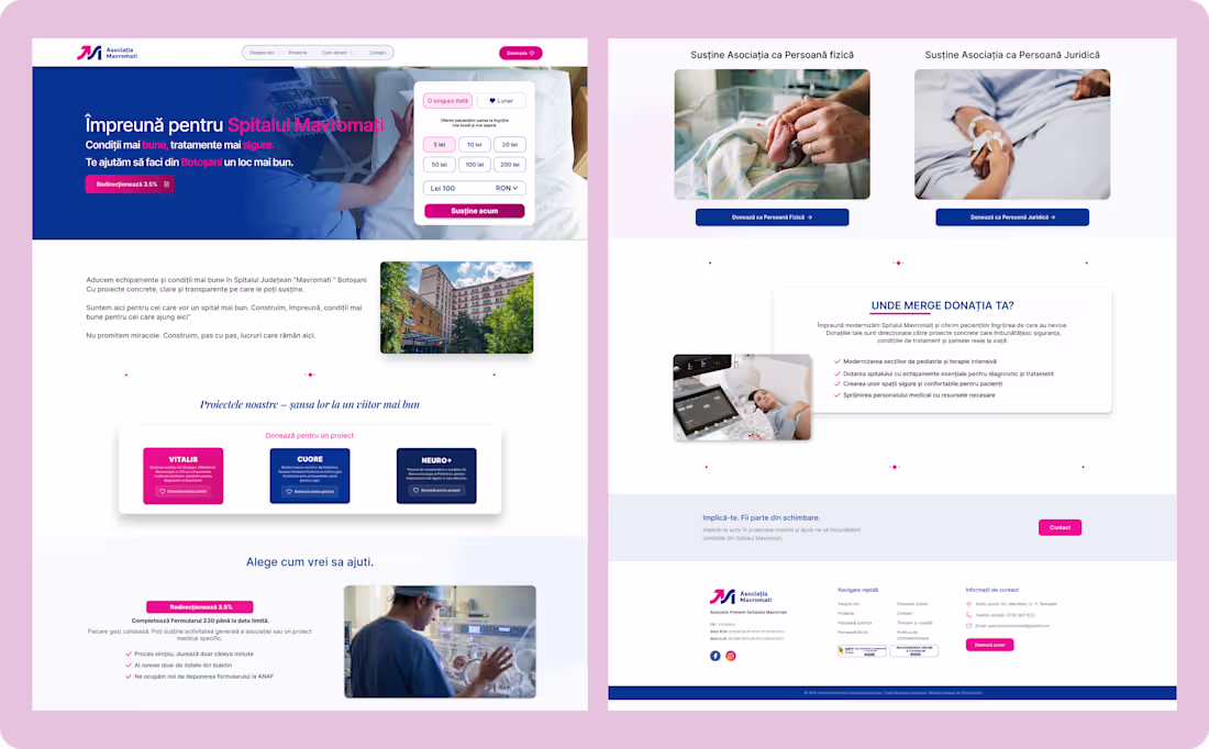
Designed this landing page to solve one problem:
people don’t donate if they don’t trust the flow.
Focused on clarity, transparency, and smooth user journey.
Thoughts?
2
38
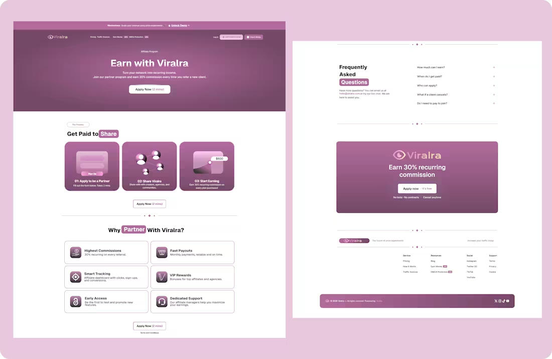
Built an affiliate landing page designed to remove friction at every step.
From recurring commission clarity to trust-building FAQs.
What would you test first here?
2
2
23
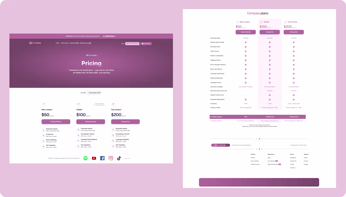
Pricing and plan comparison design for a creator platform. Focused on transparent pricing, clear plan hierarchy, and an easy-to-scan comparison table to help users choose faster. Would this layout help you choose a plan faster, or would you change anything?
2
37
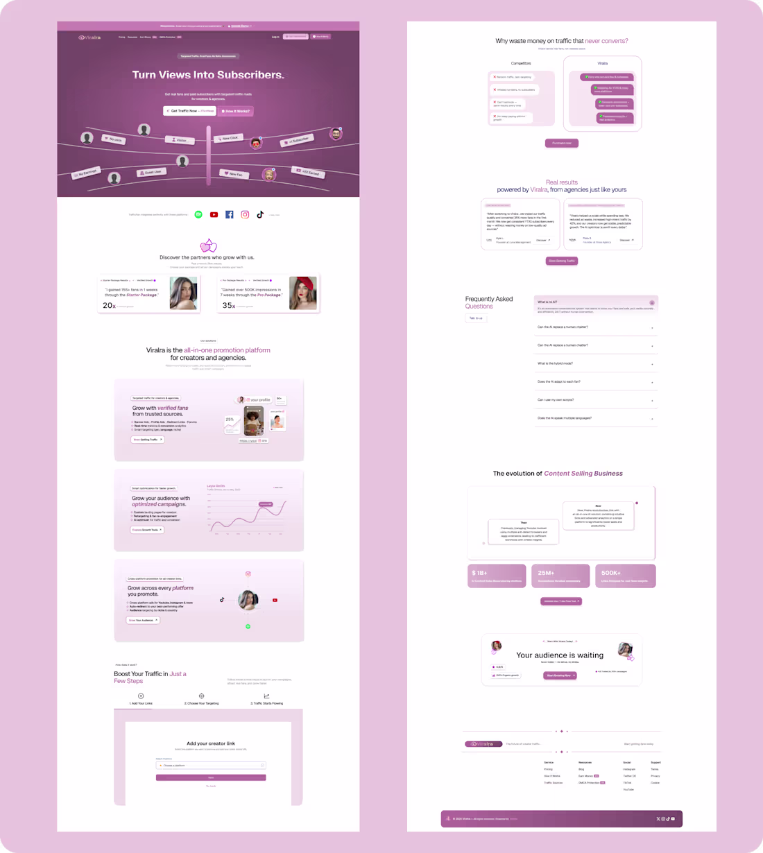
Just finished designing a full landing page for a creator traffic platform. Focused on clear storytelling, conversion-driven sections, comparison cards, social proof, and a strong closing CTA. Would love feedback
4
4
55
High-End Product Website Design – Clean & Modern UI/UX
1
32
i posted it so now u HAVE to hype me up 😍 🔥
2
2
54
Watched a tutorial and switched the theme to Game of Thrones because I’m obsessed with the show .
Hope you like it!
1
56
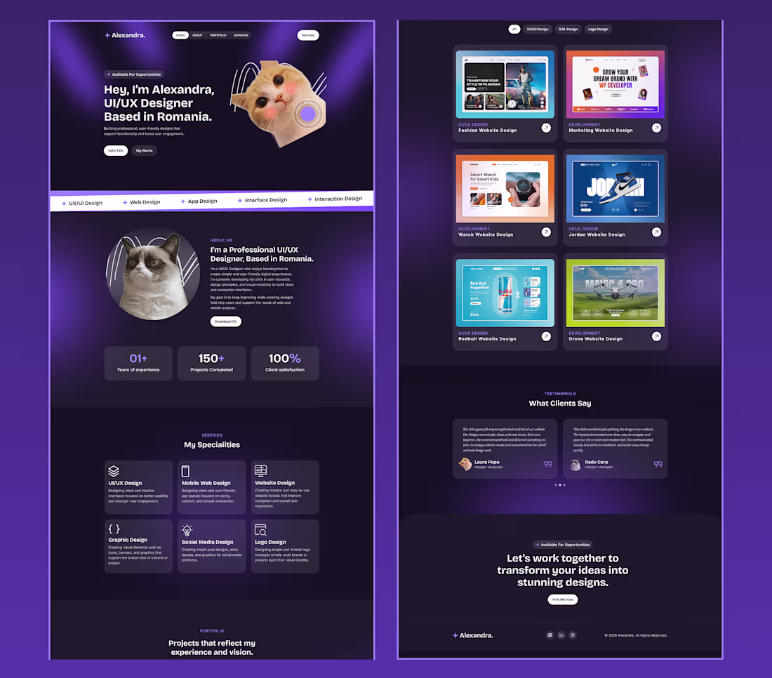
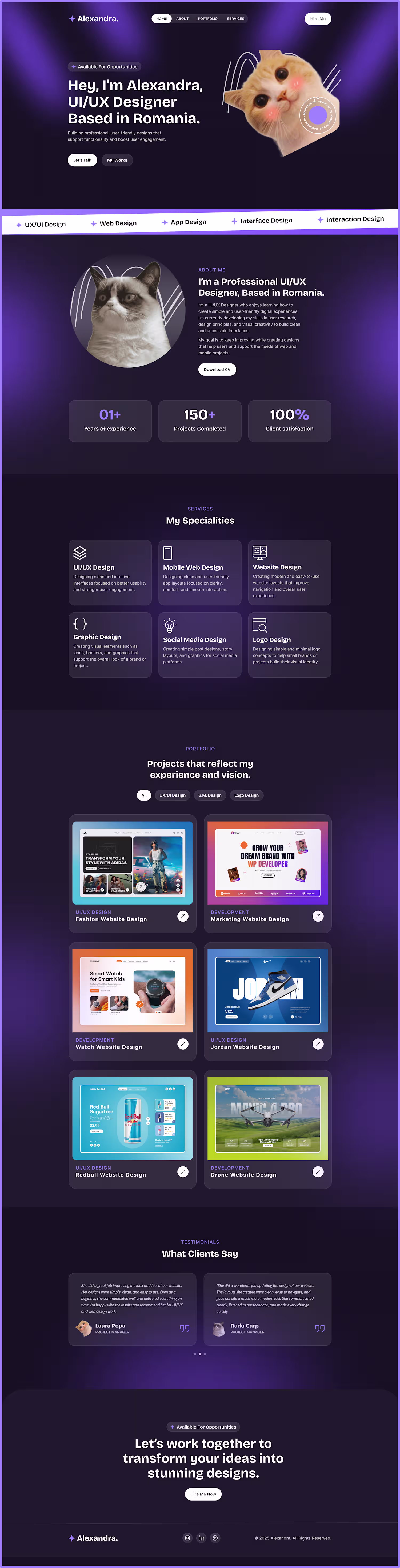
Experimenting with a more professional portfolio style. Let me know what you think.
1
60