
Dorcas Ecom
Designing high-converting ecommerce landing pages in Figma
Ready for work
Dorcas is ready for their next project!
Finished this landing page today.
Most of the work wasn't about adding more, it was removing distractions.
Cleaner hierarchy.
Stronger messaging.
Better visual flow.
The end result feels simpler, but it's far more intentional.
That's usually where the best designs end up.
0
4
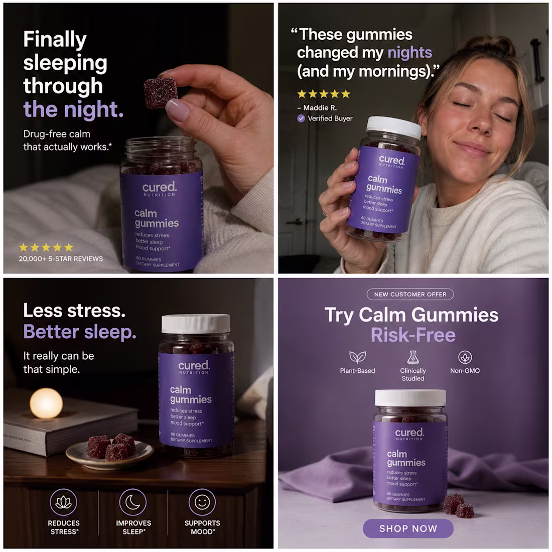
Creative inspiration for brands.
Your ad isn't competing with your last campaign.
It's competing with everything else in the feed.
That's why every creative has to earn attention on its own.
#CreativeStrategy #MetaAds #PerformanceCreative #Advertising
0
6
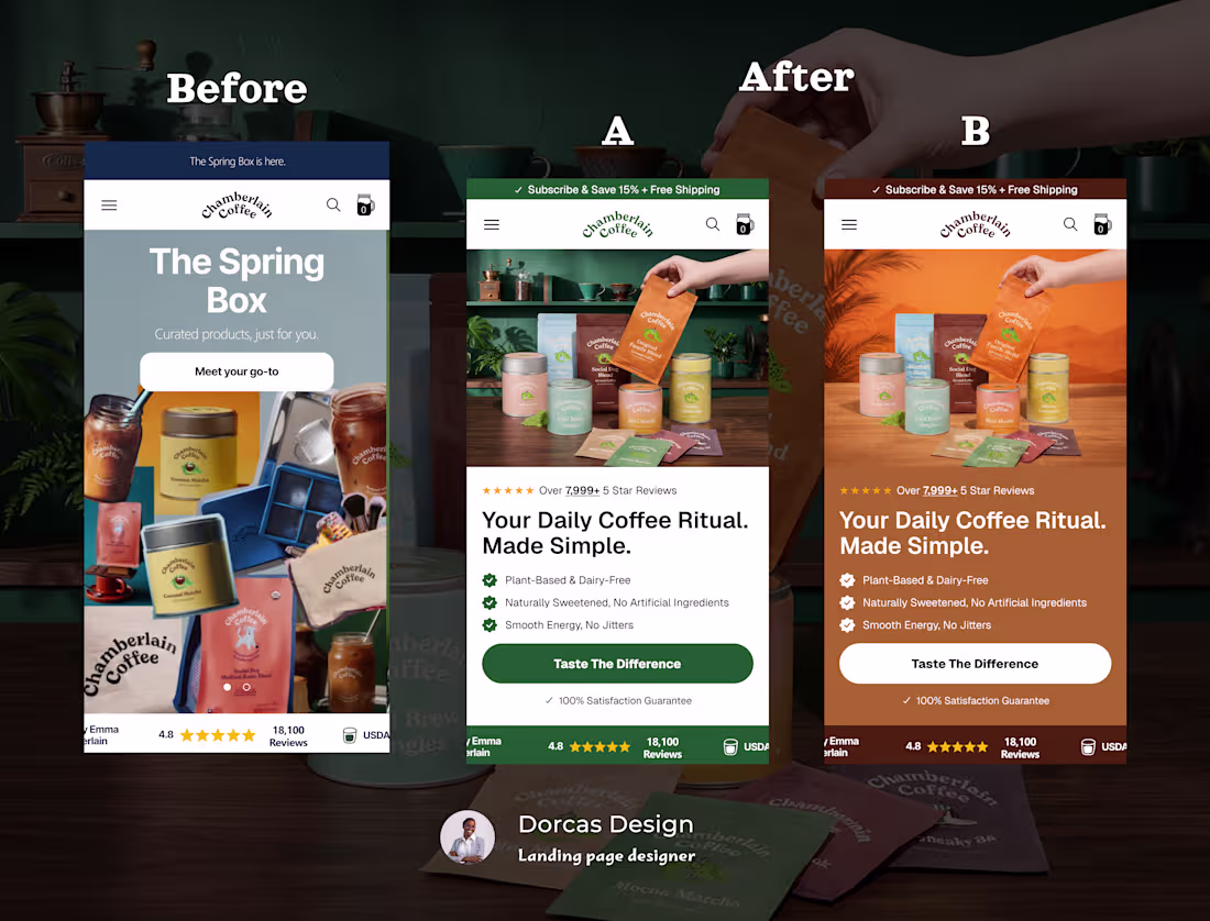
I redesigned the above-the-fold section for Chamberlain Coffee
Here's what changed and why it matters.
The original had the right ingredients, strong brand, great product, but the hero wasn't doing the heavy lifting it needed to.
What I changed above the fold:
Generic seasonal headline → benefit-led copy that speaks to a daily ritual
Weak CTA (Meet your go-to) → action-driving "Taste the Difference"
No trust signals → star ratings, reviews, and guarantee added
Cluttered hero image → clean product-forward layout with clear visual hierarchy
Missing value props → plant-based, no jitters, no artificial ingredients called out instantly
The above-the-fold section has one job: make the visitor feel like they already need this. Every element should earn its place or get cut.
I also gave the client two directions, A (fresh, minimal) and B (warm, earthy) so the brand can A/B test and let data decide.
0
24
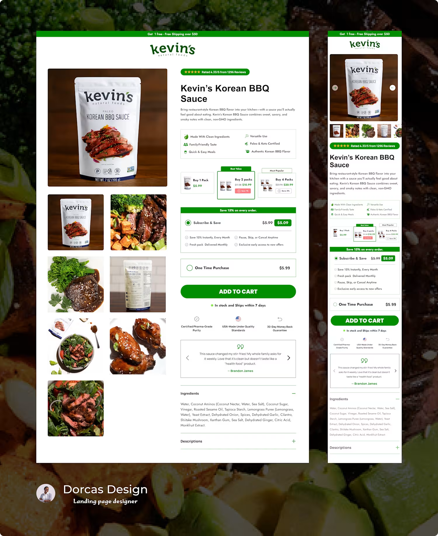
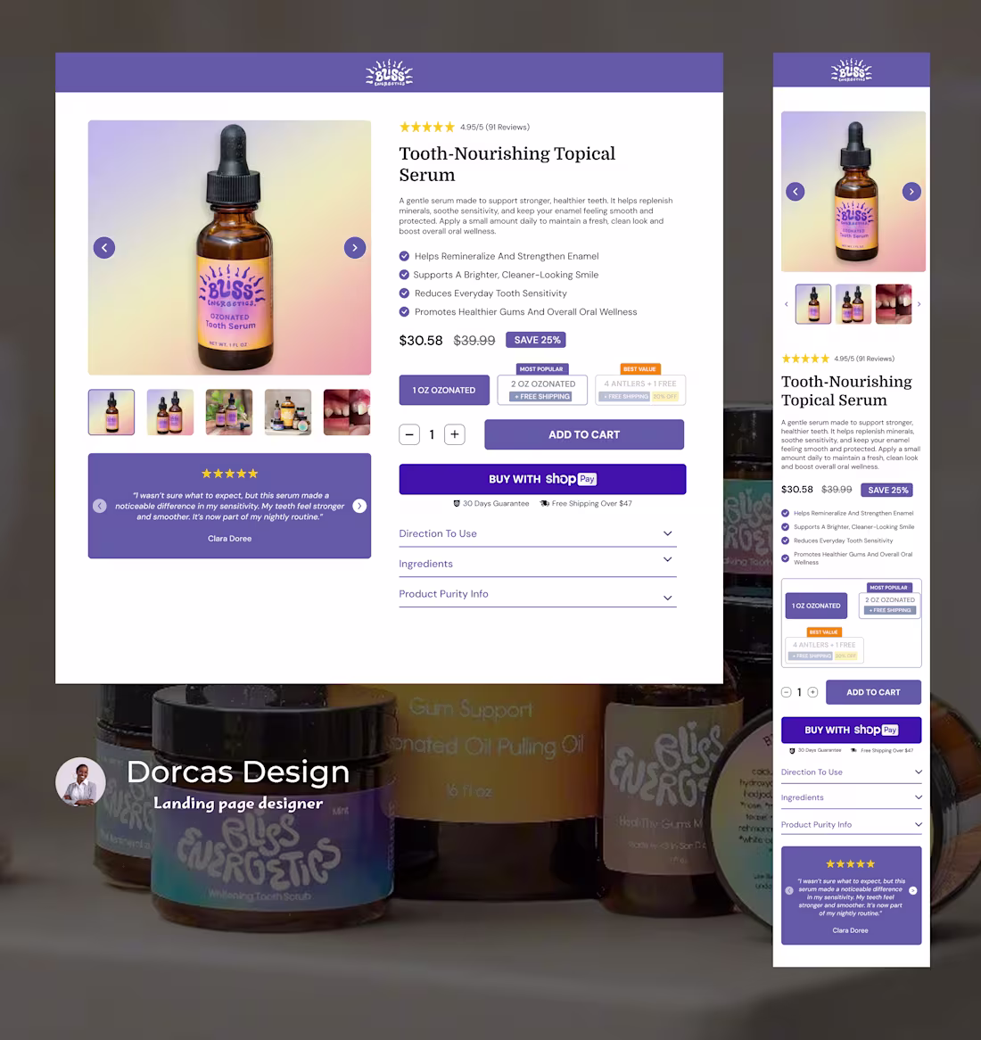
A Well-Converting Buy Box Section
1
4
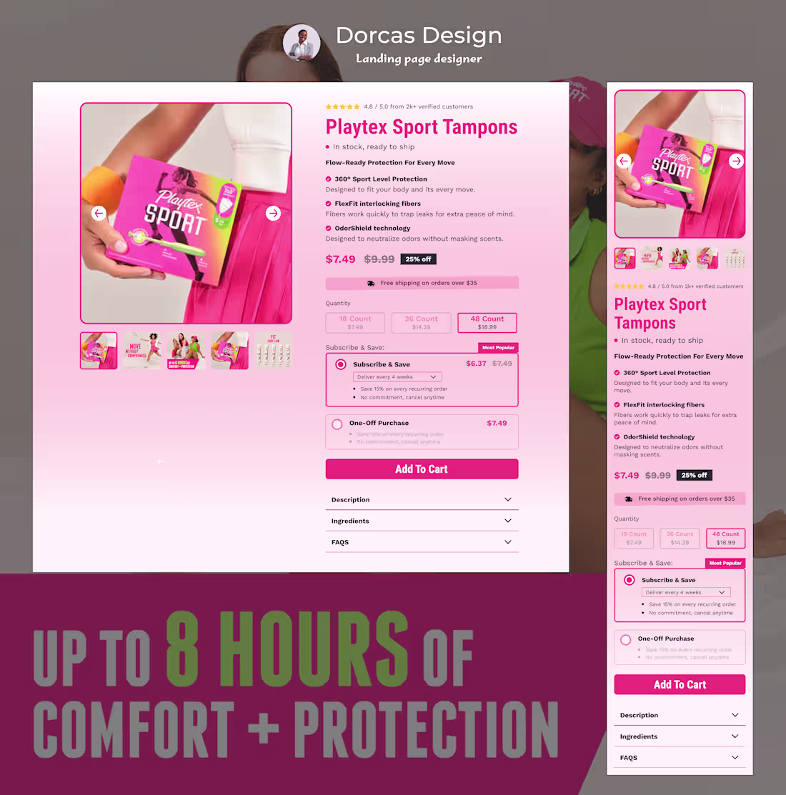
The Buy Box Where the Sale Is Won
1
2
A Buy Box That Answers Before the Buyer Asks
1
2
Landing Pages Designed With One Goal: Results
1
1
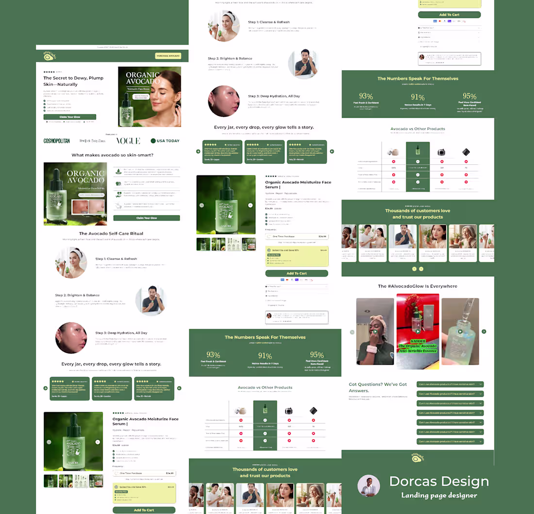
Listicle page built in Replo for a food Brand
1
3
A full Landing page Built in @Instant for @Ote_home
0
13
Full Landing Page For Catfit Mushroom Coffee
1
4
A Listicle Page for GemmyJammy
1
4
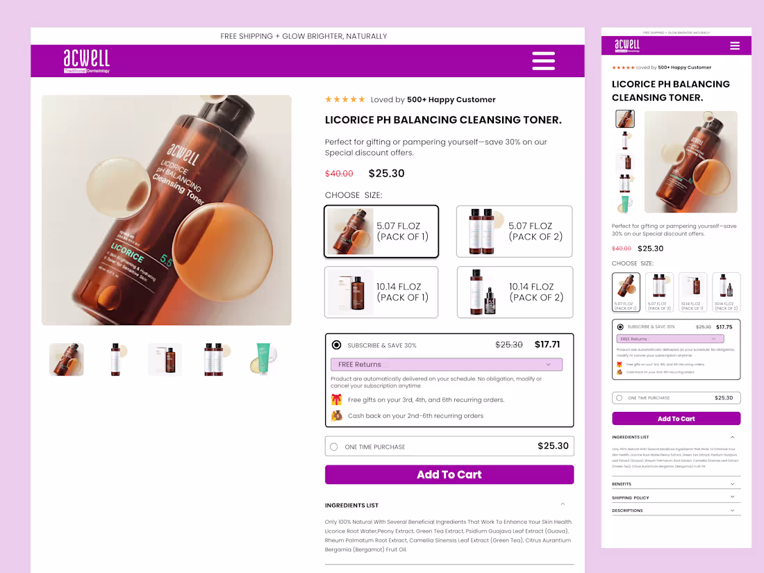
ACWELL Licorice product page
0
7