
Abdulsomad Bello
Product & Brand Designer
Ready for work
Abdulsomad is ready for their next project!
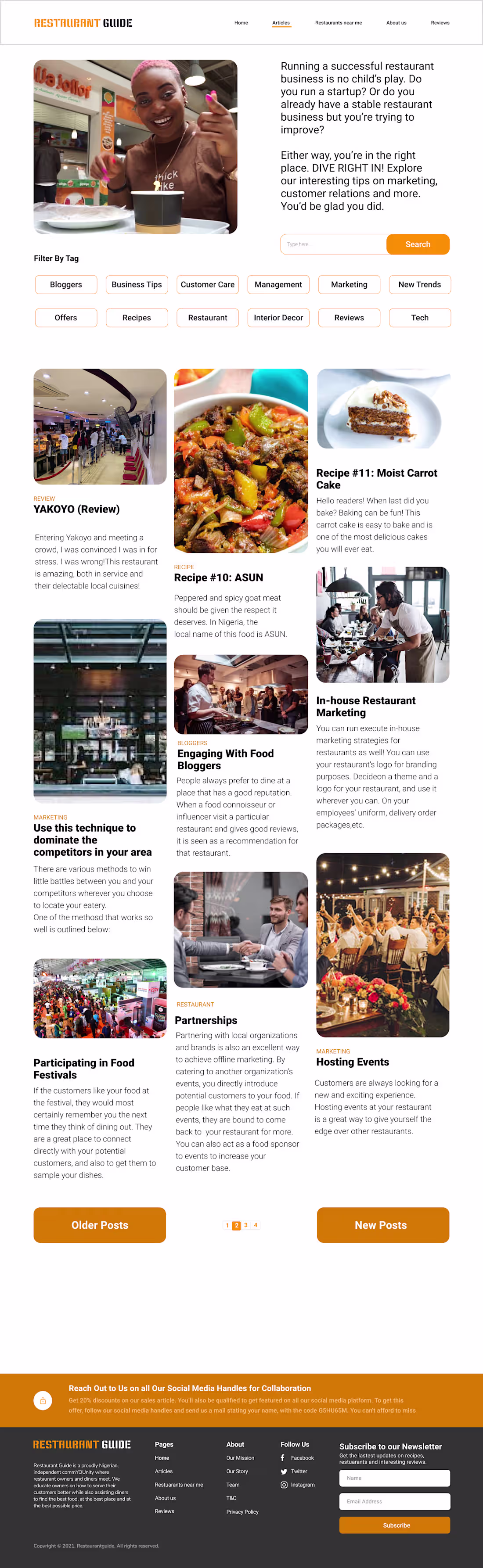
Project Title: Restaurant Guide | A Dual-Sided Content Ecosystem
The Challenge: Designing a platform that serves two distinct audiences, ambitious restaurant owners looking for business growth and hungry diners seeking their next favorite meal. The goal was to organize a vast amount of blog content, reviews, and industry tips without overwhelming the user.
The Solution:
I designed a comprehensive web experience that feels like a modern digital magazine. I focused on a structured hierarchy that allows users to toggle between professional advice and casual restaurant reviews seamlessly.
Key Design Features:
Dynamic Landing Page: Created a high-impact hero section with a dual-value proposition, immediately speaking to both diners and owners.
Intuitive Content Filtering: Implemented a "Filter by Tag" system with clean, rounded chips to help users navigate specialized topics like Tech, Marketing, or Interior Decor.
Masonry-Style Editorial Layout: Used a varied grid for the blog feed to keep the visual interest high and highlight featured reviews like "Pizza Bay" or "Bibi’s Bites."
"What I Ordered vs. What I Got" Feature: Integrated a dedicated social-proof video section to add a layer of authenticity and community engagement to the site.
Cohesive Brand Identity: Carried a warm, "appetizing" orange accent color throughout the UI to drive action on newsletters and primary CTAs.
The Vibe: Authoritative yet accessible. It’s a one-stop shop for the culinary community, designed to be as visually satisfying as a well-plated meal.
#WebDesign #UIUX #ContentStrategy #RestaurantTech #EditorialDesign #LandingPage #UserExperience
1
14
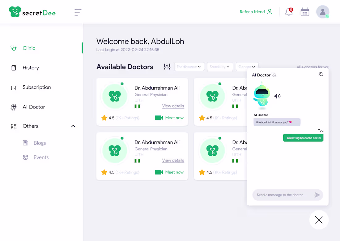
Project Title: Streamlining Healthcare Onboarding | License Verification Flow
The Challenge:
Credentialing in the medical field is often a tedious, high-friction process. For healthcare platforms, the goal is to verify professional legitimacy without causing "onboarding fatigue" for busy doctors.
The Solution:
I designed this License Verification interface for secretDee with a focus on clarity and speed.
Key Design Features:
Minimalist UI: Used a clean, spacious layout to reduce cognitive load during a data-heavy task.
Logical Information Grouping: Segmented license details, personal ID, and file uploads to make the form feel manageable.
Visual Guidance: Integrated subtle topographic background elements to provide brand personality without distracting from the functional inputs.
Trust Signals: Included "Your data is secured" indicators and clear CTAs to build user confidence during the verification process.
The Vibe: Professional, secure, and, most importantly, frictionless. Because doctors have more important things to do than fight with a registration form.
#ProductDesign #UXUI #HealthcareTech #HealthTech #FormDesign #UserExperience #FintechDesign
1
14
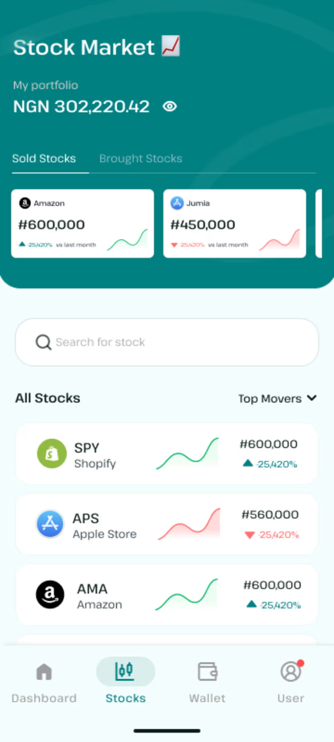
Project Title: Wealth Management UI | Fintech Stock & Wallet Experience
The Challenge: Financial apps often struggle with "data density", the need to show a lot of numbers without overwhelming the user. The goal for this project was to design an intuitive mobile interface that allows users to manage their portfolio and monitor stock market trends with total clarity.
The Solution:
I designed a clean, card-based UI that prioritizes high-level insights while keeping deep-dive data just a tap away. By using a soothing teal palette and distinct visual cues, I transformed a potentially stressful "numbers" screen into a calm, professional dashboard.
Key Design Features:
Holistic Wallet View: Designed a cohesive "Total Balance" card that clearly separates liquid cash from invested assets, giving users an immediate sense of their net worth.
Micro-Visualizations: Integrated sparkline graphs within stock cards to provide instant historical context ($25,420%$ vs last month) without requiring the user to open a new page.
Transaction Transparency: Created a streamlined "Recent Transactions" list with clear color-coding (Green for inflows, Red for outflows) and recognizable brand iconography.
Market Navigation: Developed a segmented "Sold vs. Bought" navigation and a search-first market discovery flow to help users find and track assets efficiently.
Mobile-First Accessibility: Optimized the bottom navigation bar and touch targets for one-handed use, ensuring the "Wallet" and "Stocks" views are always within reach.
The Vibe: Modern, secure, and data-driven. It’s designed to give users the confidence of a professional trader with the ease of use of a daily lifestyle app.
#FintechDesign #MobileAppDesign #UIUX #DataVisualization #StockMarketUI #ProductDesign #WealthTech
1
24
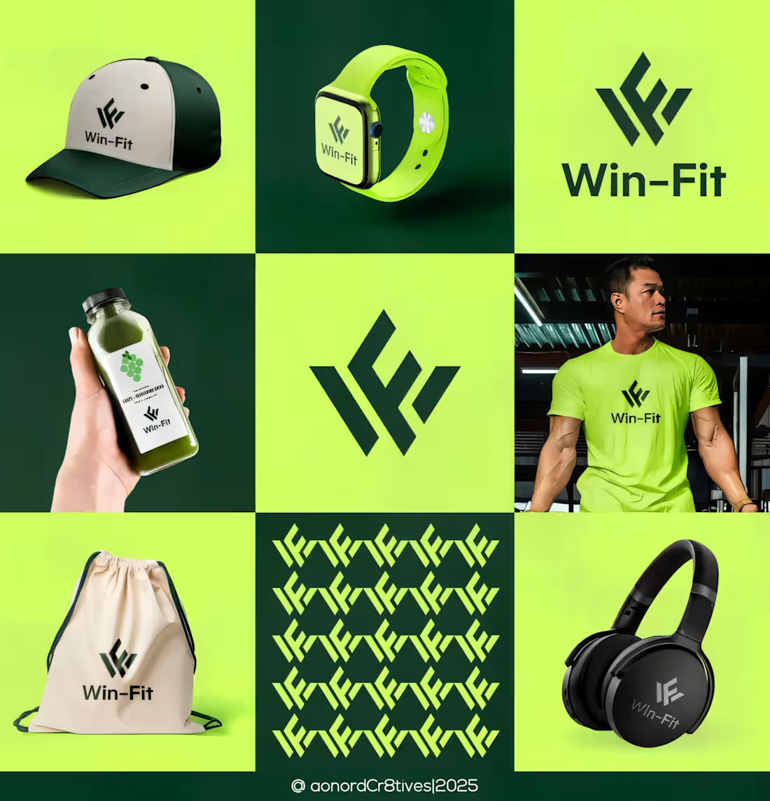
Premium Minimalist Gymnastics Company Logo
1
0
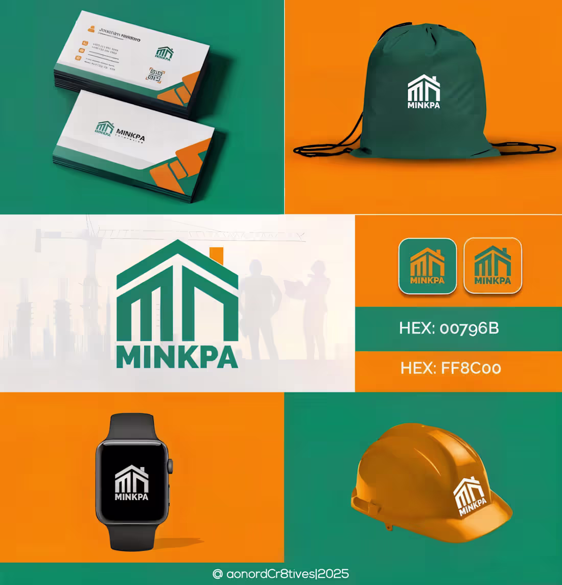
Premium Minimalist Construction Company Logo
1
0
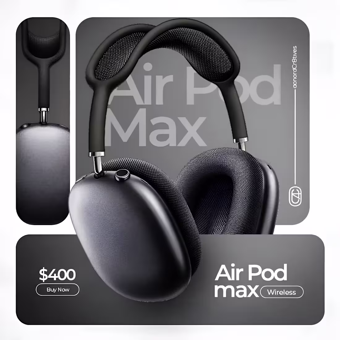
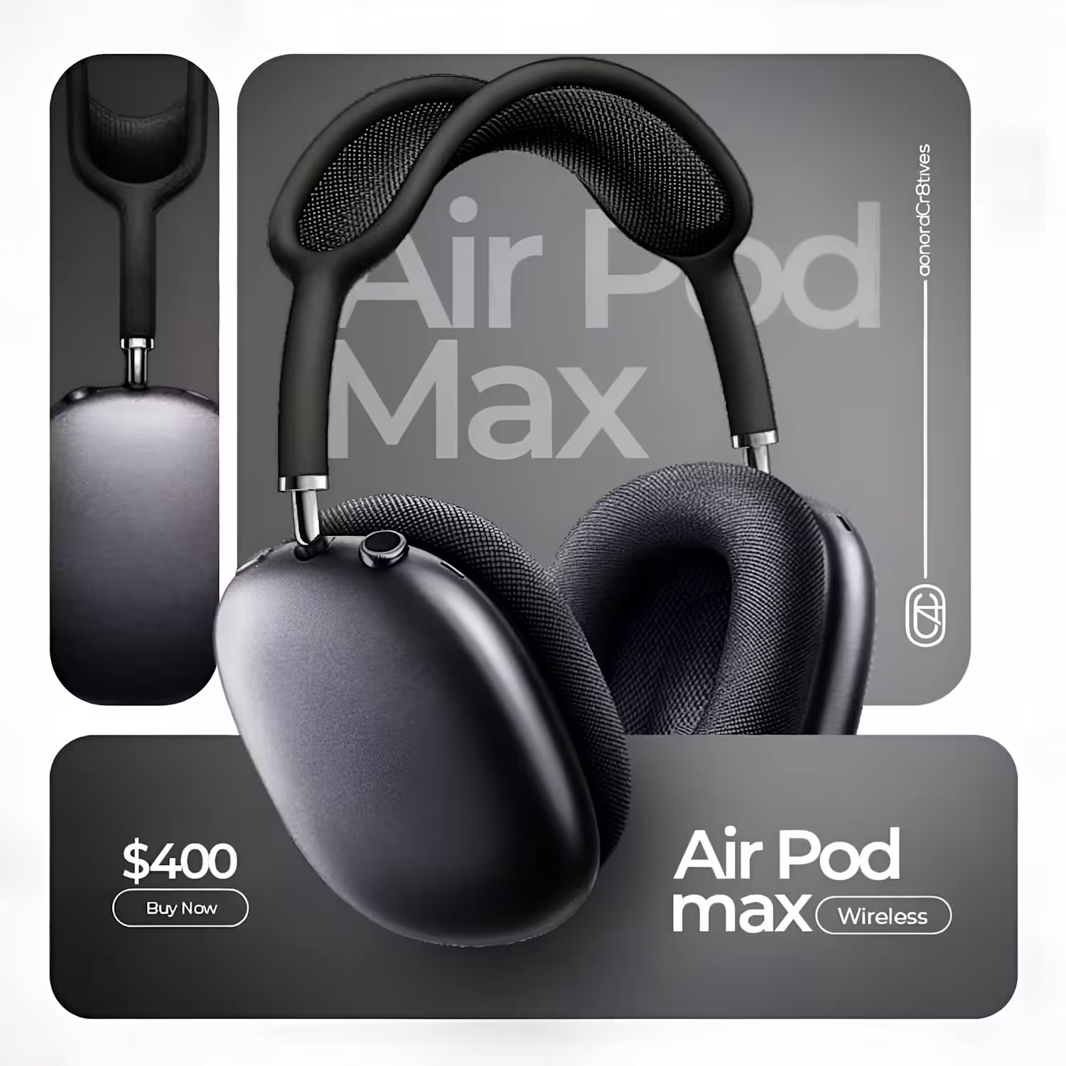
Premium AirPods Max Ad Design
1
0