
Abdul Kareem
Web Designer | Wix Studio Expert
Ready for work
Abdul is ready for their next project!
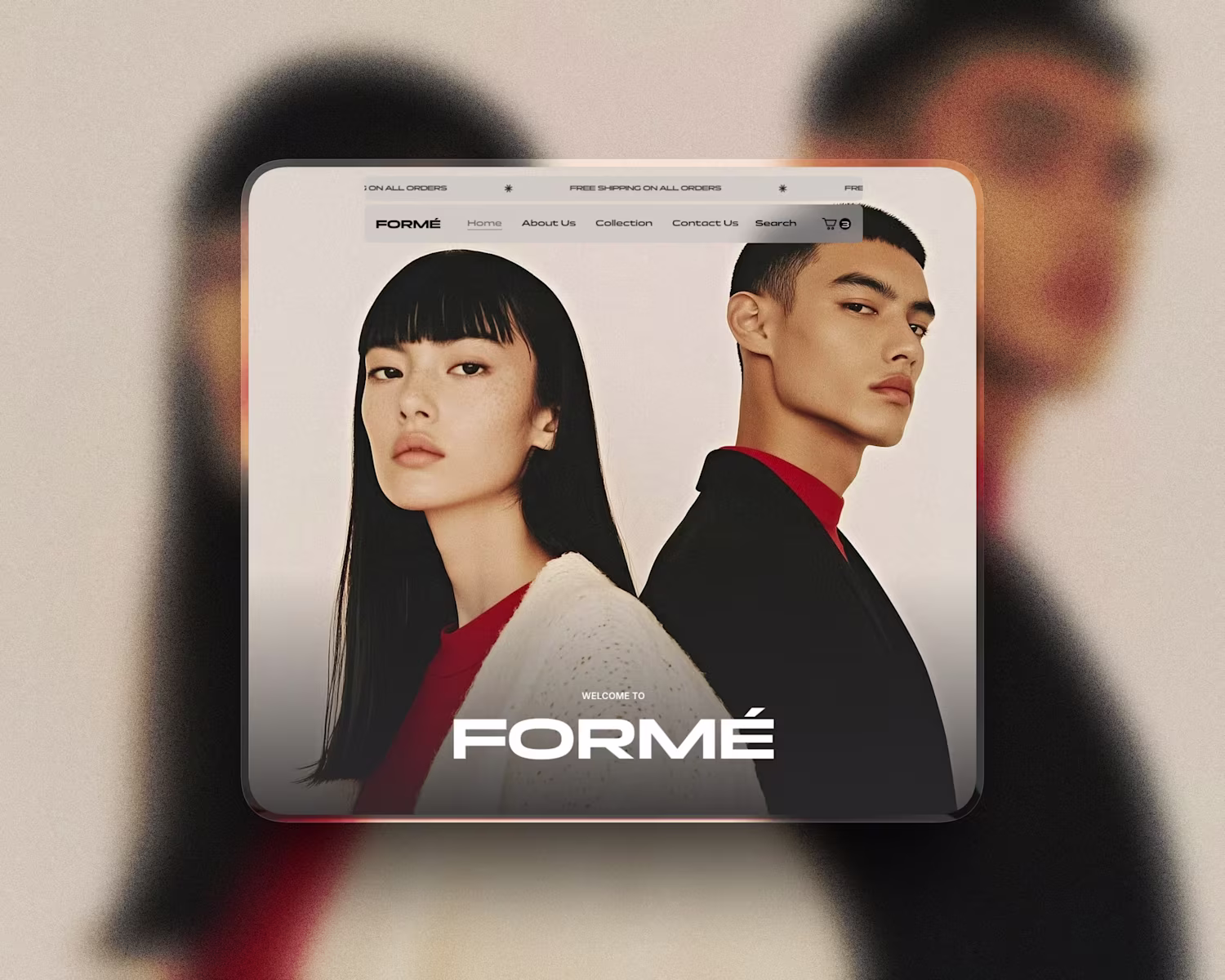
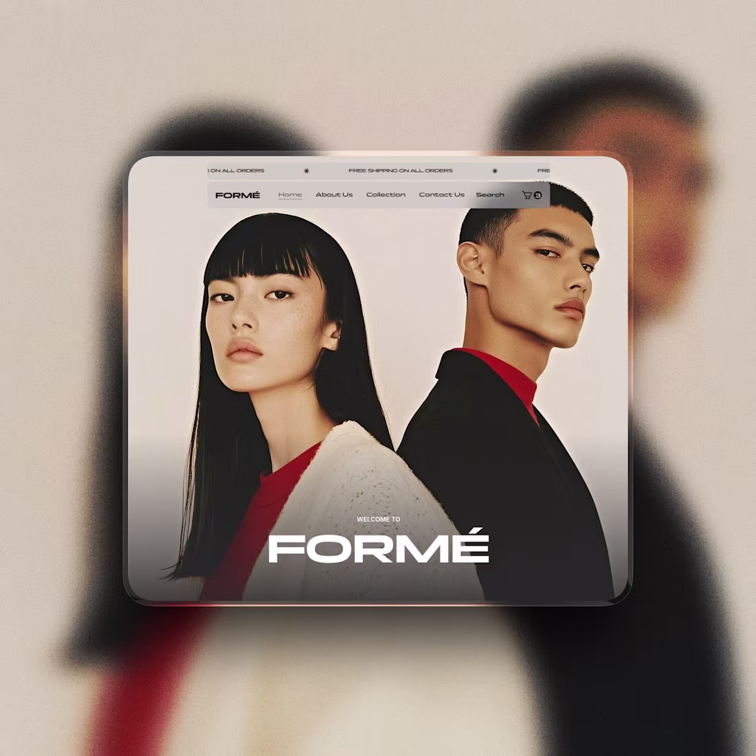
E-commerce Website Template - Wix Studio
Designed and built a modern, conversion-focused e-commerce website template using Wix Studio. The layout takes a clean, editorial approach to online retail, prioritising strong visual hierarchy, spacious layouts, and a calm shopping experience.
The template is fully responsive, easy to customise, and structured to help products stand out while building trust and clarity for customers. Ideal for fashion, lifestyle, skincare, and concept stores looking for a premium online presence.
Deliverables:
Custom e-commerce website template (Wix Studio)
Product, collection, and checkout-ready layouts
Mobile-first, responsive design
Clean CMS structure for scalability
Conversion-focused UI and UX
#ecommercewebsite #webdesign #uixdesign #uxdesign
#wixstudio
14
137
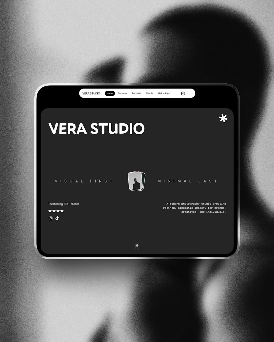
Vera Studio – Creative Studio Website Template (Wix Studio)
Why I Designed Vera Studio
While working with photographers and creative studios, I noticed many rely on social media or outdated websites that don’t reflect the quality of their work. Vera Studio was designed to change that.
The focus was to create a clean, editorial-style website that showcases projects properly, builds credibility, and guides visitors towards enquiries. Built mobile-first in Wix Studio, the template offers a professional, flexible foundation for creatives who want to present their work with confidence.
#WixStudio #CaseStudy #CreativeStudio #PhotographerWebsite #PortfolioDesign #WebDesignUK #ServiceBusiness #UXDesign
2
25
246
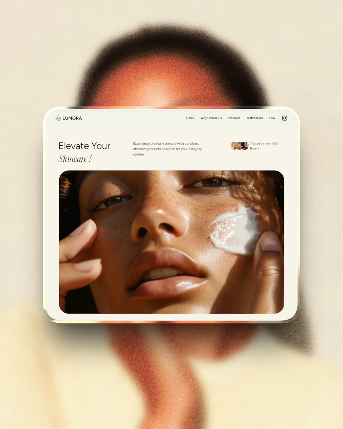
Lumora – Beauty Brand Website Template Built in Wix Studio
Why I Designed Lumora
While researching skincare and beauty startups, I noticed many brands rely on social media alone or use generic e-commerce layouts that don’t reflect a premium product. Lumora was designed to bridge that gap.
The goal was to create a clean, conversion-focused landing page that highlights products clearly, builds trust, and can scale into a full e-commerce store. Built mobile-first in Wix Studio, Lumora helps beauty brands look established and sell with confidence — without the cost of a custom build.
#WixStudio #CaseStudy #SkincareBrand #EcommerceDesign #BeautyBusiness #WebDesignUK #ProductWebsite #UXDesign
4
17
222
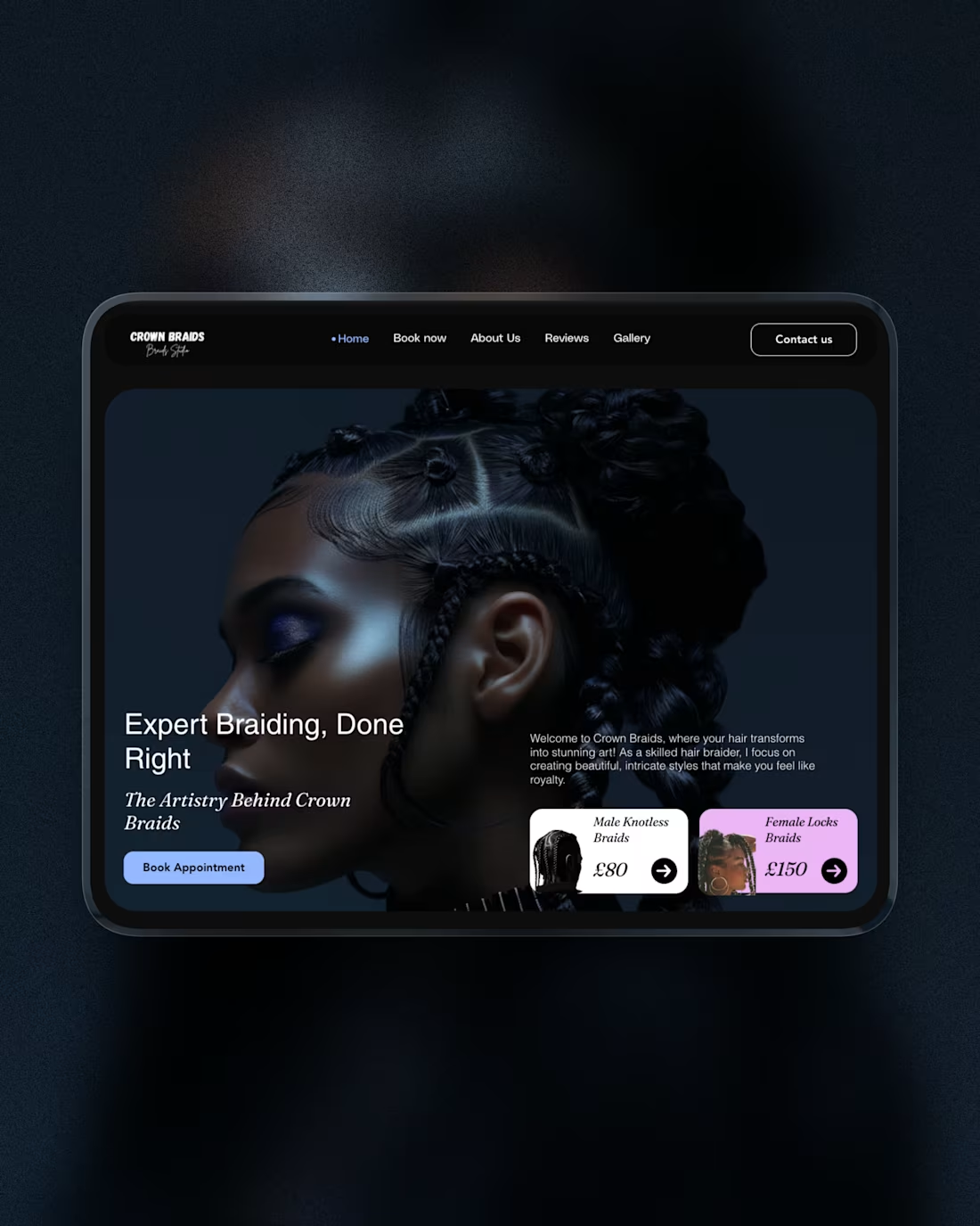
Crown Braids – Braiding & Hairstylist Website Template (Wix Studio) 💇🏾♀️
Why I Designed Crown Braids
While working with hair and beauty businesses, I noticed many braiders rely only on Instagram or booking apps. These work, but often limit brand perception and control.
Crown Braids was designed to give braiders a clean, professional website that builds trust and guides clients clearly from visit to booking. The layout is mobile-first, conversion-focused, and easy to customise in Wix Studio - offering a premium online presence without agency costs.
#WixStudio #CaseStudy #BraidingBusiness #HairstylistWebsite #BeautyEntrepreneur #WebDesignUK #ServiceBusiness
2
24
268
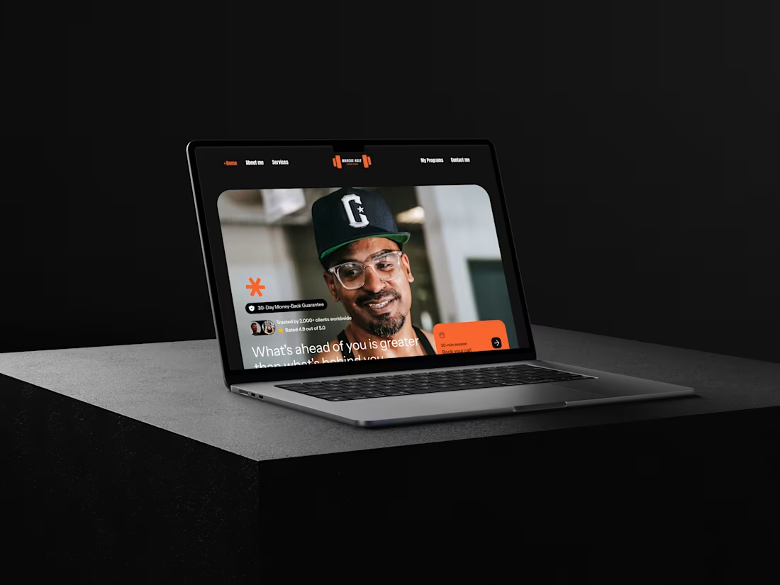
PT Pro is a conversion-focused landing page designed for personal trainers who want to turn visitors into enquiries with clarity and confidence.
What I Did
Designed a clean, modern landing page with a clear conversion flow
Structured content to highlight services, results, and credibility
Implemented smooth animations and micro-interactions
Built the page fully responsive in Wix Studio
Optimised layout for easy customisation and scalability
Why It Works
The design balances visual impact with usability, guiding users naturally from first impression to action. Every section has a purpose, reducing friction and improving conversion potential without overwhelming the visitor.
Live Preview
https://abdulkareemdesign.wixstudio.com/ptlandingpage
24
295
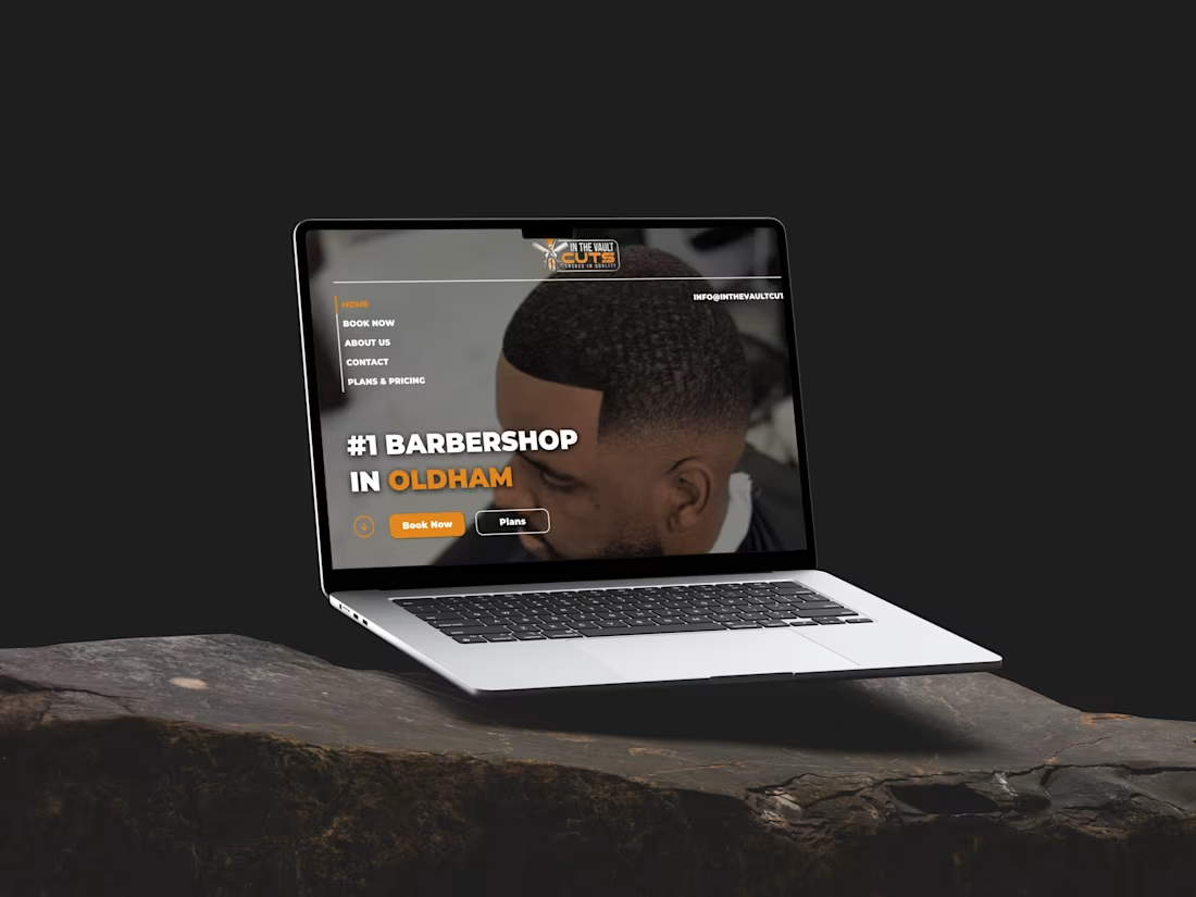
INTHEVAULTCUTS🔥 – Website Redesign Case Study
I redesigned the website for IntheVaultCuts, a modern barbershop offering premium grooming services. The aim was to create a cleaner, faster and more refined online experience that better reflects the brand’s identity.
The previous site lacked structure and didn’t clearly communicate service quality, so I focused on:
• A stronger visual identity – sharper typography, improved spacing and a more cohesive aesthetic.
• Clearer user journeys – simplified navigation and direct CTAs to help users book instantly.
• Modern UI patterns – better layout hierarchy, consistent components and an enhanced mobile experience.
• Performance improvements – quicker load times, reduced clutter and smoother responsiveness.
14
249
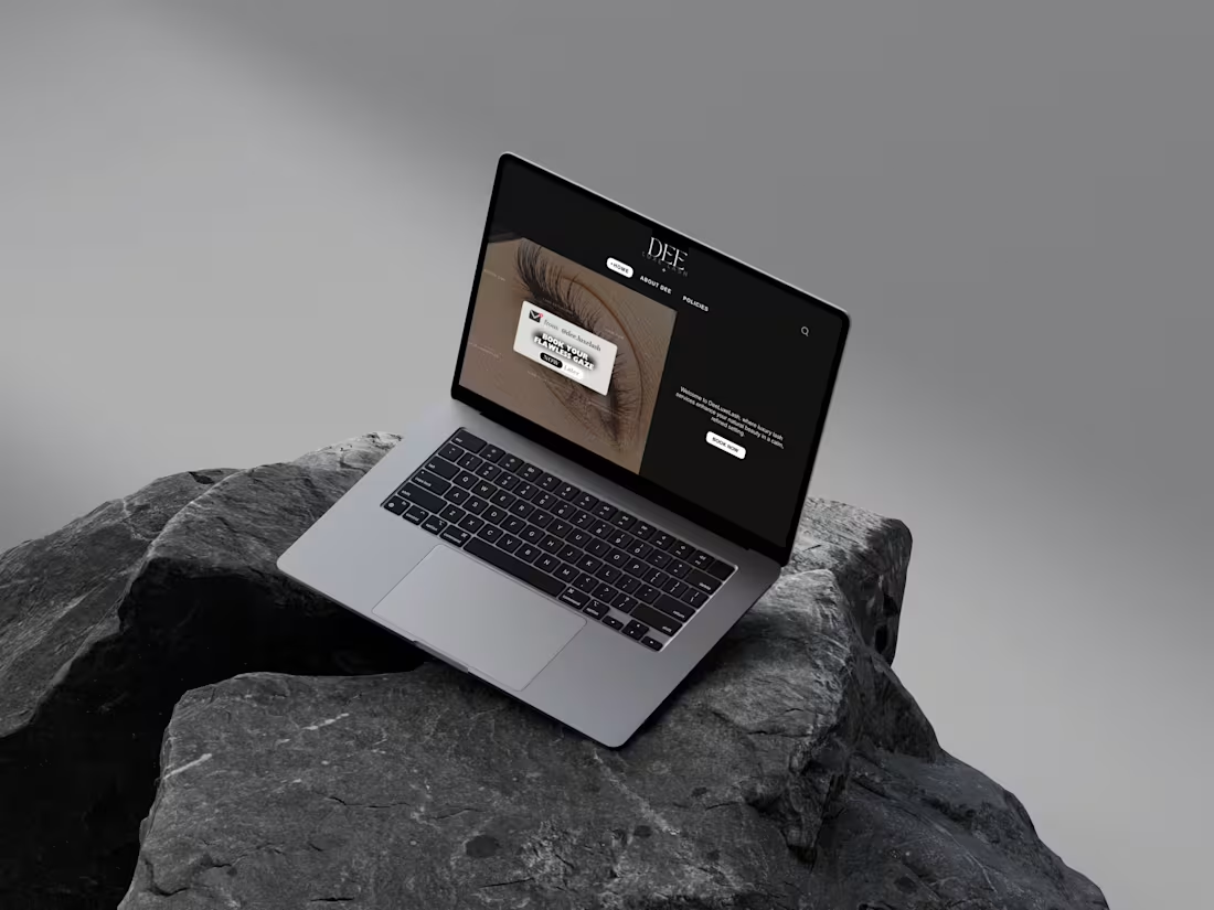
DEELUXELASH :– Custom Website Build
I created a fully custom website for deeluxelash.co.uk (http://deeluxelash.co.uk), designed from scratch to match the client’s exact vision for a modern, feminine and premium lash brand.
The focus was on:
• A tailored visual identity – soft, elegant aesthetics with refined spacing and colours chosen to reflect the brand’s luxury feel.
• A clear user journey – intuitive navigation and strong CTAs to help clients explore treatments and book with ease.
• Service-focused layout – clean sections that highlight lash services, prices and results in a professional, high-end way.
• Mobile-first performance – fast loading, responsive design and a smooth experience across all devices.
0
130
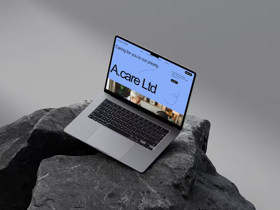
ACare Limited – Custom Website Build
I created a custom website for acarelimited.org (http://acarelimited.org), a UK care and support service. The goal was to design a clean, trustworthy and easy-to-use platform that clearly communicates their services while reflecting their values of reliability, quality and compassion.
The site was built around:
• A professional visual identity – a calm, approachable colour palette with clear typography to build trust.
• Service clarity – structured content and simple layouts that help users understand the care services offered.
• Straightforward navigation – clear pathways for enquiries, contact details and key information.
• Mobile-first thinking – fast, responsive design so families and clients can access details on any device.
0
122