
Abayomi Daniel
Brand Identity Designer for Pre-Seed Startups
- 1
- Followers

Good ideas can remain unexplored because the right collaborators never cross paths.
Skills go untapped.
Promising projects struggle to move beyond the people and resources already available to them.
Pollen is built around a different premise: creative work gets stronger when people with different skills, experiences and perspectives have the opportunity to work together.
It's a platform designed to make those connections easier to find, and collaboration easier to begin.
1
13

Home care is practical, and customers need to trust the people responsible for their property.
People invest in their homes because of what those spaces make possible: rest, relationships, routines, privacy, and a sense of belonging.
Finding reliable service providers takes time.
Even when the house looks fine, managing it can remain an invisible source of work.
Stardust Home Services (https://www.linkedin.com/company/stardust-home-services/) exists to make the home easier to live in and easier to manage, so its customers can devote more of their attention to the things that matter to them.
.
.
.
.
.
.
.
Ready for your brand glow-up?
Let's build something amazing together.
1
80
There are more than 7,000 languages spoken around the world.
And sometimes, speaking just one of them differently is enough to leave you out of the conversation.
You can be in the same meeting.
Attend the same event.
Join the same call.
Watch the same live moment.
And still not fully be part of what is happening around you.
Palabra.ai (http://Palabra.ai), a London, UK-based real-time speech AI company that just raised $8.4M in pre-seed funding, is building technology that enables people to have natural, real-time conversations across languages.
But the more I explored the brand, the more I realized the project wasn't really about translation.
Translation is the technology.
The real impact is human.
It's about what happens when language stops deciding who gets to participate.
I initially explored several directions around the brand.
Preserving conversation.
Nothing lost in translation.
Conversational flow.
Each direction connected to something Palabra does, but none of them felt big enough to define what the brand ultimately stands for.
So I went back to a simpler question:
What problem does Palabra solve for people?
You can be physically present and still feel absent from the conversation.
And if conversation is where we share ideas, ask questions, build relationships, make decisions, and discover one another, being left out means missing more than just words.
It means missing the opportunity to take part.
That led to the central idea behind the identity: uniting humanity.
The strategy also changed how I approached the visual and verbal identity.
Instead of relying on the usual visual language associated with AI and translation, the identity explores the idea of bringing more people into a shared space.
One thing this project has reinforced for me:
A strong brand idea doesn't begin with trying to find something that sounds clever.
It begins with understanding the human problem deeply enough that the creative direction has somewhere meaningful to come from.
For Palabra, that place was never really about language.
It was about what language can prevent.
And what becomes possible when it no longer does.
#brand (https://www.linkedin.com/search/results/all/?keywords=%23brand&origin=HASH_TAG_FROM_FEED) #raised (https://www.linkedin.com/search/results/all/?keywords=%23raised&origin=HASH_TAG_FROM_FEED) #preseed (https://www.linkedin.com/search/results/all/?keywords=%23preseed&origin=HASH_TAG_FROM_FEED) #startup (https://www.linkedin.com/search/results/all/?keywords=%23startup&origin=HASH_TAG_FROM_FEED) #design (https://www.linkedin.com/search/results/all/?keywords=%23design&origin=HASH_TAG_FROM_FEED) #founder #ceo
1
102
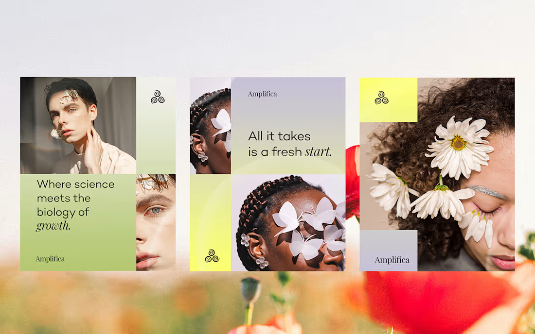
I finally completed Week 2's brand sprint: Amplifica.
Amplifica, a company that just raised $26 million, is a clinical-stage biotechnology company developing new treatments for hair loss. Its research focuses on understanding the biological mechanisms that influence hair growth and translating those discoveries into potential therapies.
.
When I first started researching the company, I barely understood what I was reading.
Osteopontin. Senescent cells. Hair follicle stem cells. Signaling pathways.
At some point, I realized I was trying to come up with a brand direction for something I didn't actually understand.
So I stopped.
Instead of jumping straight into logos and moodboards, I went back to the beginning and started asking very basic questions:
What exactly does Amplifica do?
Why was a baby's hairy mole relevant to their research?
What did scientists actually discover?
How is Amplifica different from other companies trying to treat hair loss?
Slowly, the story became clearer.
Amplifica is exploring new ways to treat hair loss by studying the biological mechanisms behind hair growth and translating those discoveries into potential treatments.
That understanding eventually led me to the brand idea: Reawakening Growth
From there, I developed the visual and verbal direction around the idea of growth returning and re-emerging.
This project was a useful reminder that strategy isn't always about immediately having a clever insight.
Sometimes, the work starts with admitting, "I don't understand this."
And staying with the questions long enough to get there.
#startup #branddesign #yc #raised #business #logo
1
173