
pro

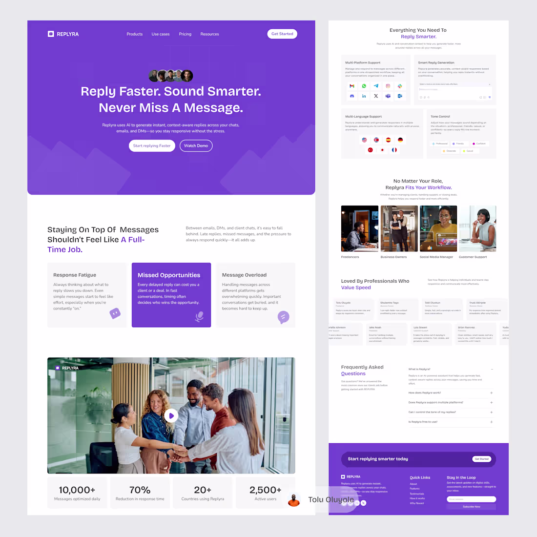
Ever missed a message and thought, “I’ll reply later”… then forgot?
That’s the problem Replyra solves.
I designed a landing page for Replyra an AI assistant that helps you reply faster, sound better, and stay consistent across conversations.
1
65
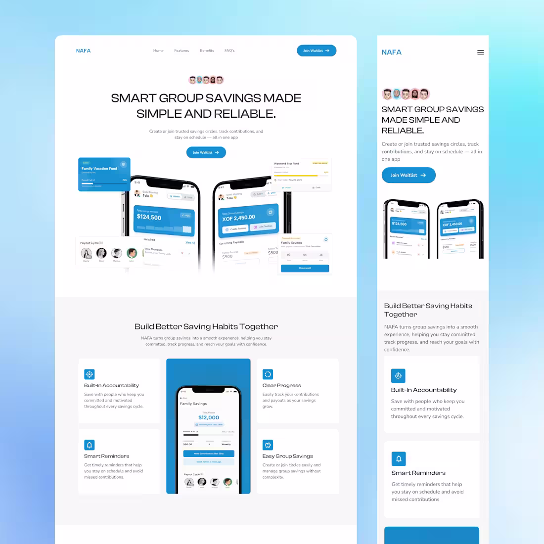
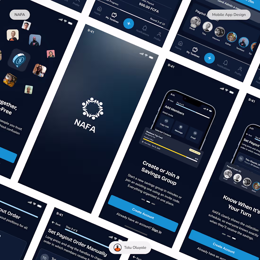
Group savings — but smarter, safer, and digital.
In many communities, group savings systems help people achieve financial goals together.
NAFA brings this tradition into the digital world — making contributions, tracking, and payouts easier, more transparent, and secure.
Here’s the landing page design concept.
More mobile, web screens and short protyped version coming soon.
#Fintech (https://www.instagram.com/explore/tags/fintech/) #UXDesign (https://www.instagram.com/explore/tags/uxdesign/) #ProductDesign (https://www.instagram.com/explore/tags/productdesign/) #UIUX (https://www.instagram.com/explore/tags/uiux/) #WebDesign (https://www.instagram.com/explore/tags/webdesign/) #StartupDesign (https://www.instagram.com/explore/tags/startupdesign/) #buildinginpublic (https://www.instagram.com/explore/tags/buildinginpublic/)
4
2
160
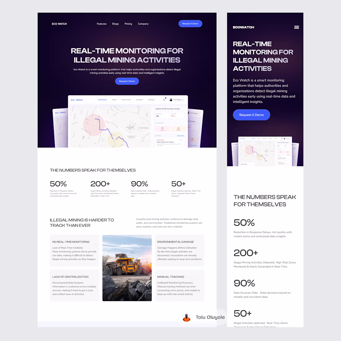
Started with a question:
“How can we detect illegal mining earlier?”
Ended with a solution:
Eco Watch — a real-time monitoring platform.
This is the landing page design.
#CaseStudy #UXDesign #ProductDesign
4
5
129
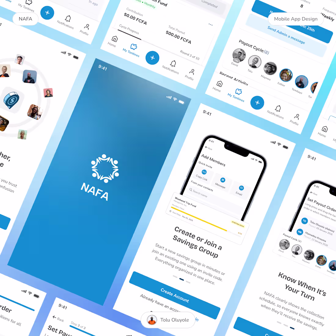
NAFA is a product concept designed to modernize group savings systems commonly used across many communities.
The goal:
• Improve trust through transparency
• Simplify contribution tracking
• Create a seamless user experience
Here are some mobile screens from the project.
#uidesigns (https://www.linkedin.com/search/results/all/?keywords=%23uidesigns&origin=HASH_TAG_FROM_FEED) #mobileapp (https://www.linkedin.com/search/results/all/?keywords=%23mobileapp&origin=HASH_TAG_FROM_FEED) #groupsavings (https://www.linkedin.com/search/results/all/?keywords=%23groupsavings&origin=HASH_TAG_FROM_FEED)
2
99
Following up on the NAFA light mode shared earlier, here’s a look at the dark mode experience.
The focus here was on maintaining clarity, reducing visual strain, and creating a more immersive interface without losing usability.
Curious to hear which direction you prefer—light or dark?
1
79
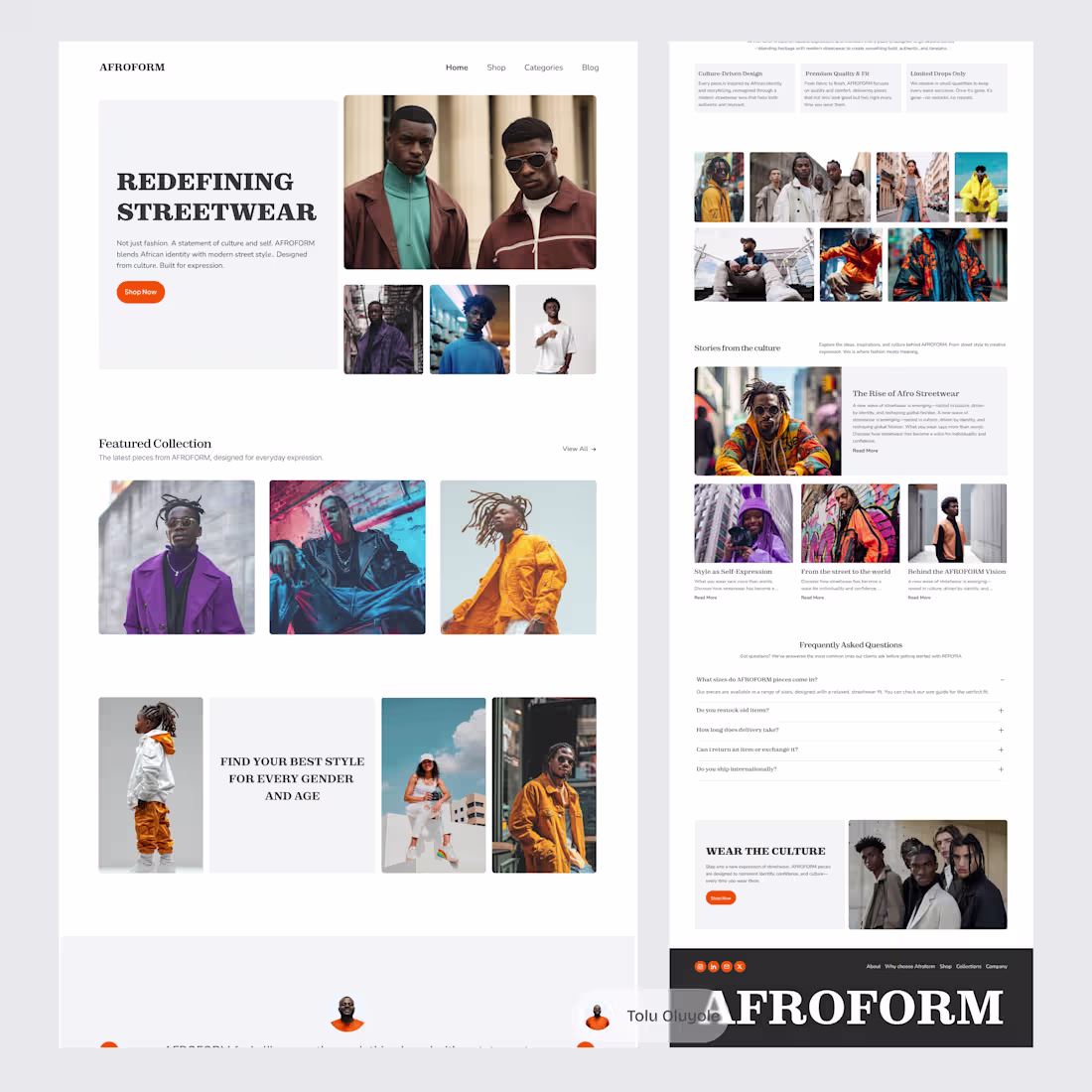
Designed a streetwear landing page.
The focus was on creating a clean, high-impact experience that blends strong visuals with a simple product layout.
More than just selling clothes, the goal was to communicate identity through design.
1
43
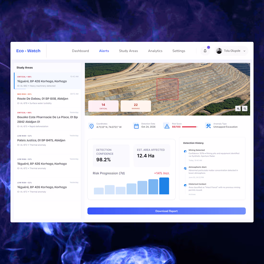
Eco - Watch (paid project)
A look at a web platform designed for illegal mining detection.
The system allows users to monitor regions, track risk alerts, and gain better visibility into study areas.
Designing products that turn data into action.
#ProductDesign (https://www.instagram.com/explore/tags/productdesign/) #UXDesign (https://www.instagram.com/explore/tags/uxdesign/) #DashboardDesign (https://www.instagram.com/explore/tags/dashboarddesign/)
1
119
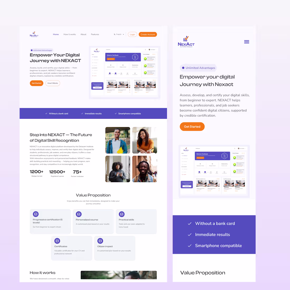
Introducing NEXACT
A Digital Skills Assessment Platform, .
Starting with the landing page — built to communicate clarity, structure, and digital growth.
1
2
123
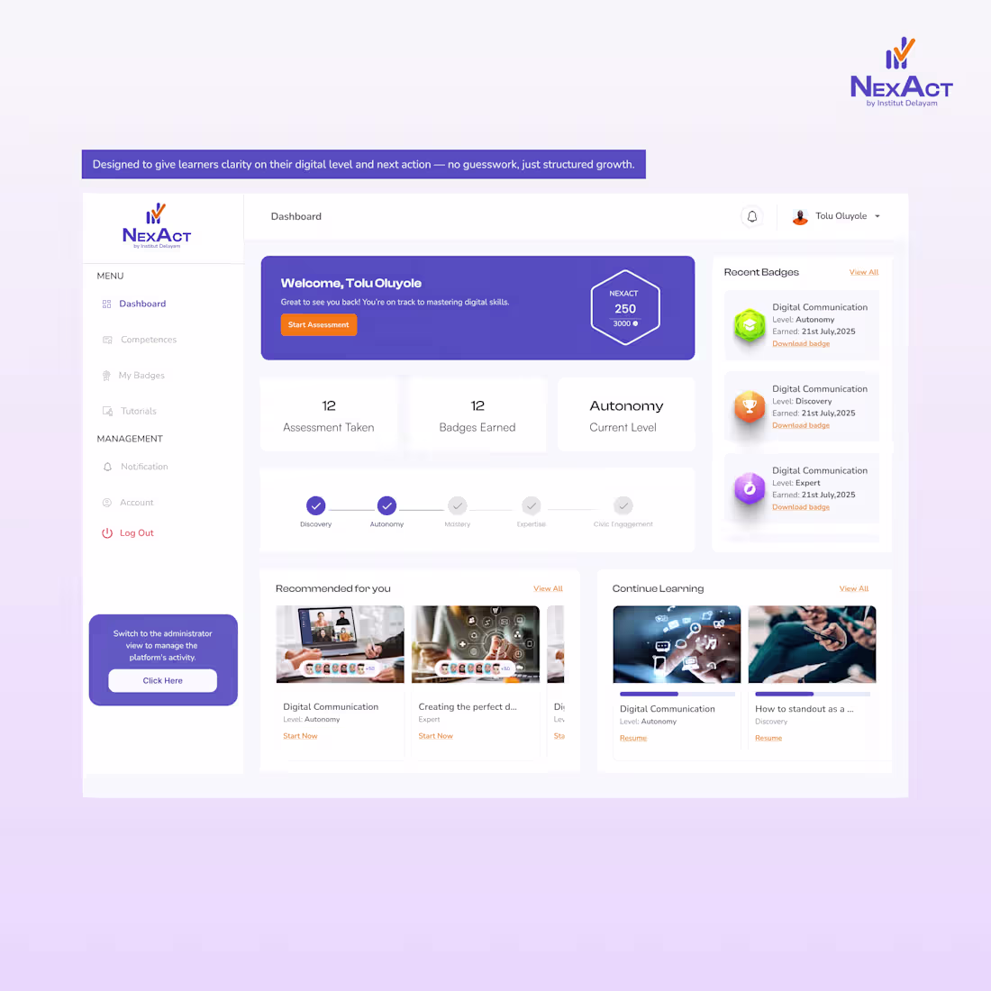
A closer look inside the NEXACT web application.
The interface is only the surface — beneath it is a structured system for assessment and level-based progression.
#productdesign
(https://www.instagram.com/explore/tags/productdesign/)#uxdesign
(https://www.instagram.com/explore/tags/uxdesign/)#uiux
(https://www.instagram.com/explore/tags/uiux/)#EdTech
(https://www.instagram.com/explore/tags/edtech/)#techinnovation
(https://www.instagram.com/explore/tags/techinnovation/)#buildinpublic (https://www.instagram.com/explore/tags/buildinpublic/)
2
1
99

I designed this two hero sections quickly for a mobile application project that i am working on. Which is your favorite and why?
1
149
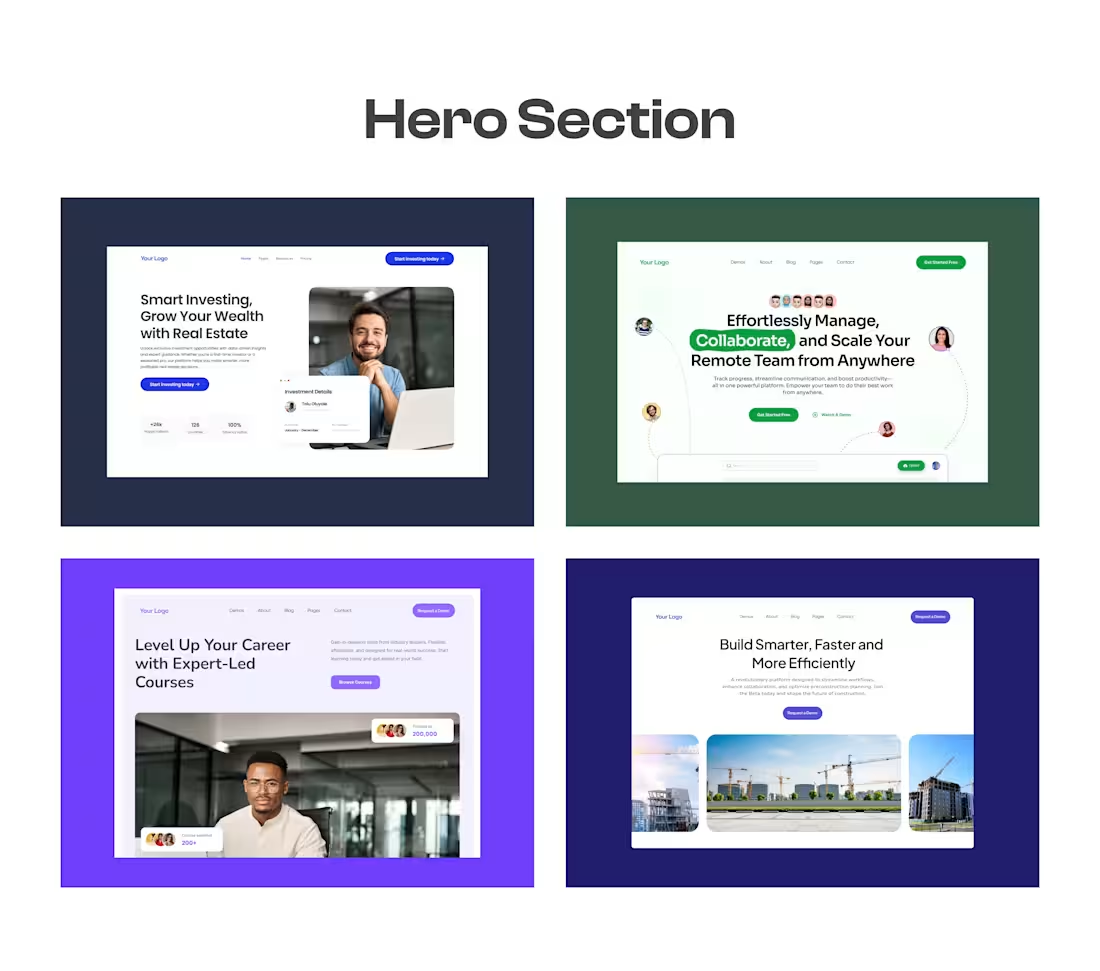
Been playing around with hero section concepts lately — testing out new layouts and visual balance.
Here are four quick explorations. I’d love to hear which direction feels the strongest
#UIDesign #UXDesign #HeroSection #DesignExploration #VisualDesign #WebDesign #CreativeProcess
3
180