
Daniel Emeka
Brand and Marketing Designer Expert.
Ready for work
Daniel is ready for their next project!
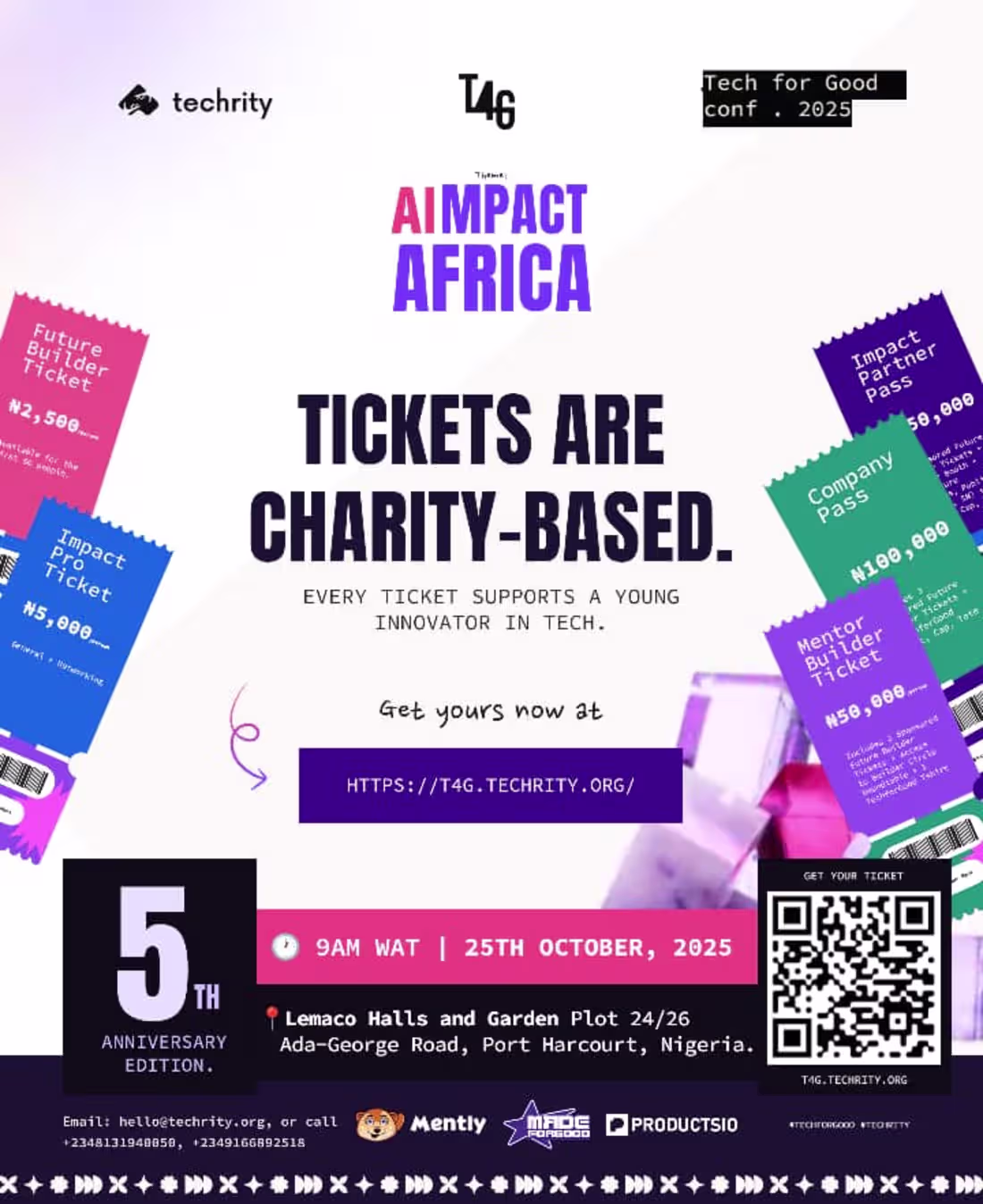
Designed a bold, impact-driven event flyer for AImpact Africa 2025 — where tech meets purpose.
The concept centers on clarity, urgency, and social impact, highlighting that every ticket supports a young innovator in tech. Clean typography, vibrant ticket elements, and a strong hierarchy drive attention while keeping the message powerful and easy to act on.
2
56
I enrolled in the HNG 2023 Bootcamp, where I challenged myself to grow beyond my comfort zone and explore bold design directions.
During the program, I designed several neubrutalism-inspired websites experimenting with raw typography, high-contrast color palettes, strong grid systems, and expressive layouts.
Each project pushed me to think differently about structure, usability, and visual impact while still maintaining clarity and functionality.
Always learning. Always evolving.
1
1
26
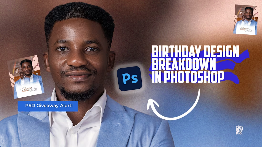
Want to know how I made this viral birthday design? I’ve shared the full process on YouTube.
1
2
62
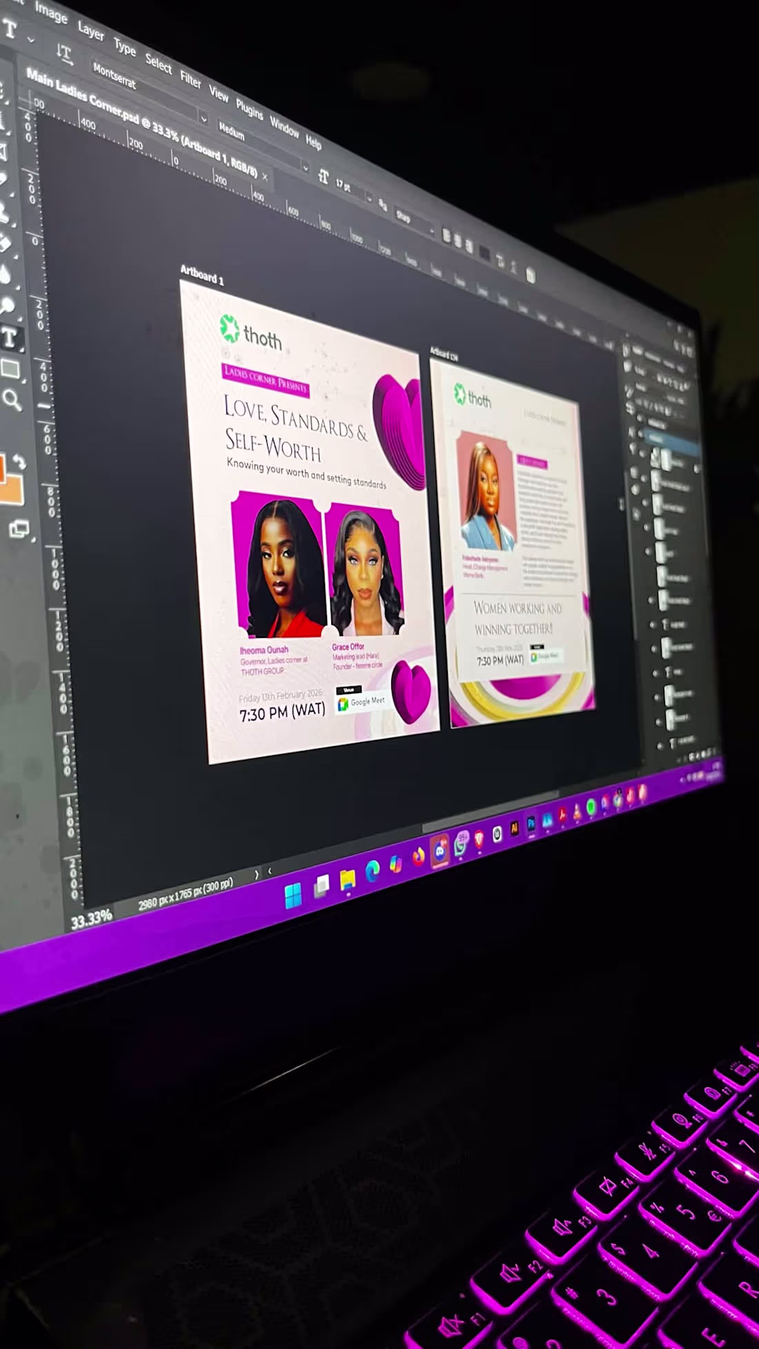
Here’s a design I created for Thoth Group (Ladies Corner).
This project was centered around building a warm, expressive, and empowering visual identity for the Ladies Corner community under Thoth Group. The goal was to create a design that felt safe, feminine, and conversational — a space where women feel seen, heard, and celebrated.
From typography selection to color psychology, every element was intentionally crafted to reflect elegance, strength, and community. I leaned into soft but confident tones, balanced layouts, and a visual hierarchy that guides the eye naturally while keeping the message at the heart of the composition.
0
27
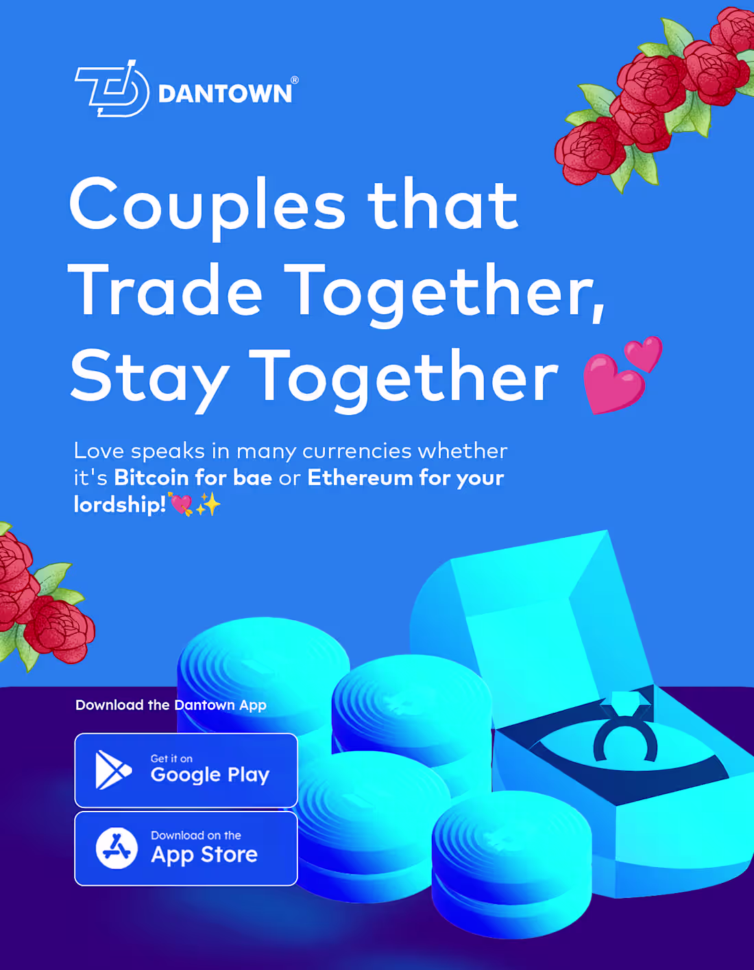
I made a design for lovers ❤️
This piece was more than just a romantic visual; it was an exploration of emotion translated into design.
Love isn’t loud all the time; sometimes it’s subtle, warm, and deeply intentional. I wanted the colors to reflect that.
In terms of composition, balance was everything. The layout was carefully structured to guide the eye naturally, allowing the focal point to breathe while supporting elements complemented the story instead of competing with it. Good design isn’t about adding more; it’s about knowing what to remove.
But beyond aesthetics, this project was about emotional storytelling. How can a single frame communicate affection?
0
35
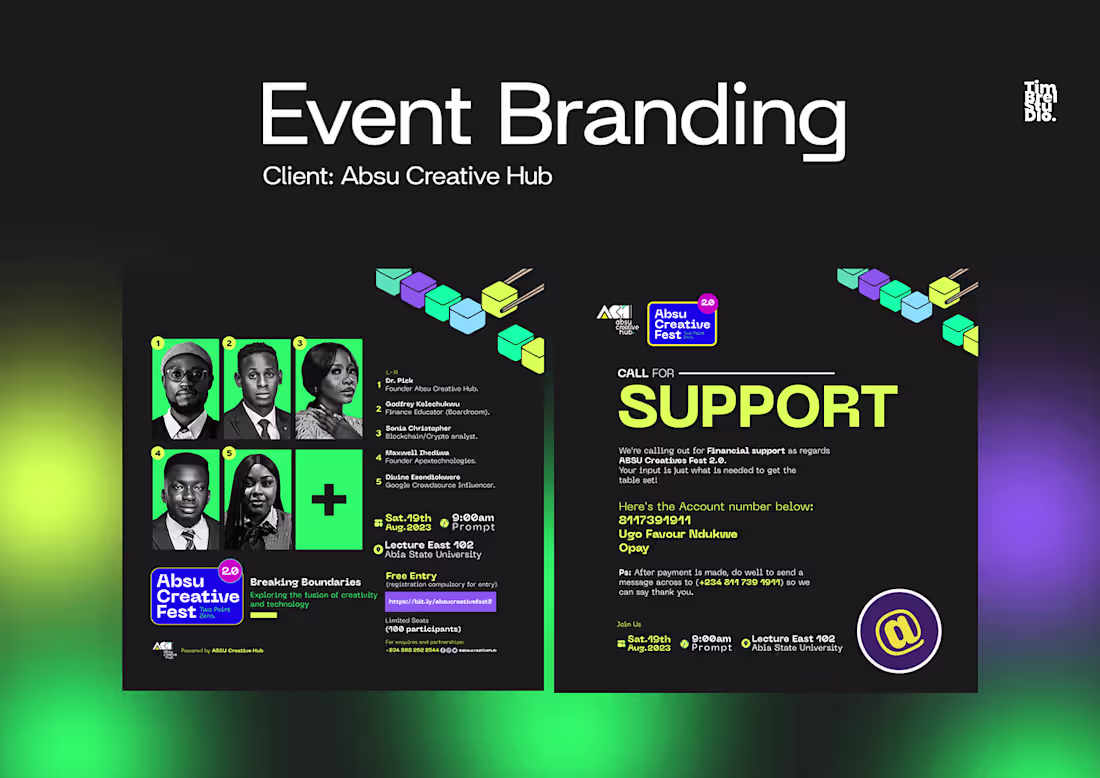
Event Branding | Abia State University Tech Hub
1
0