Minimalistic Website and Brand Logo Design for We Do Follow-Up

Ahmad Nazirov

Designed in Figma as part of the Nexus Creative team
We Do Follow-Up came to us with a bold message:
“Your old leads aren’t dead — they’re just waiting.”
They wanted a site that could deliver that with clarity and confidence — but without being loud or over-designed.
💬 The brief?
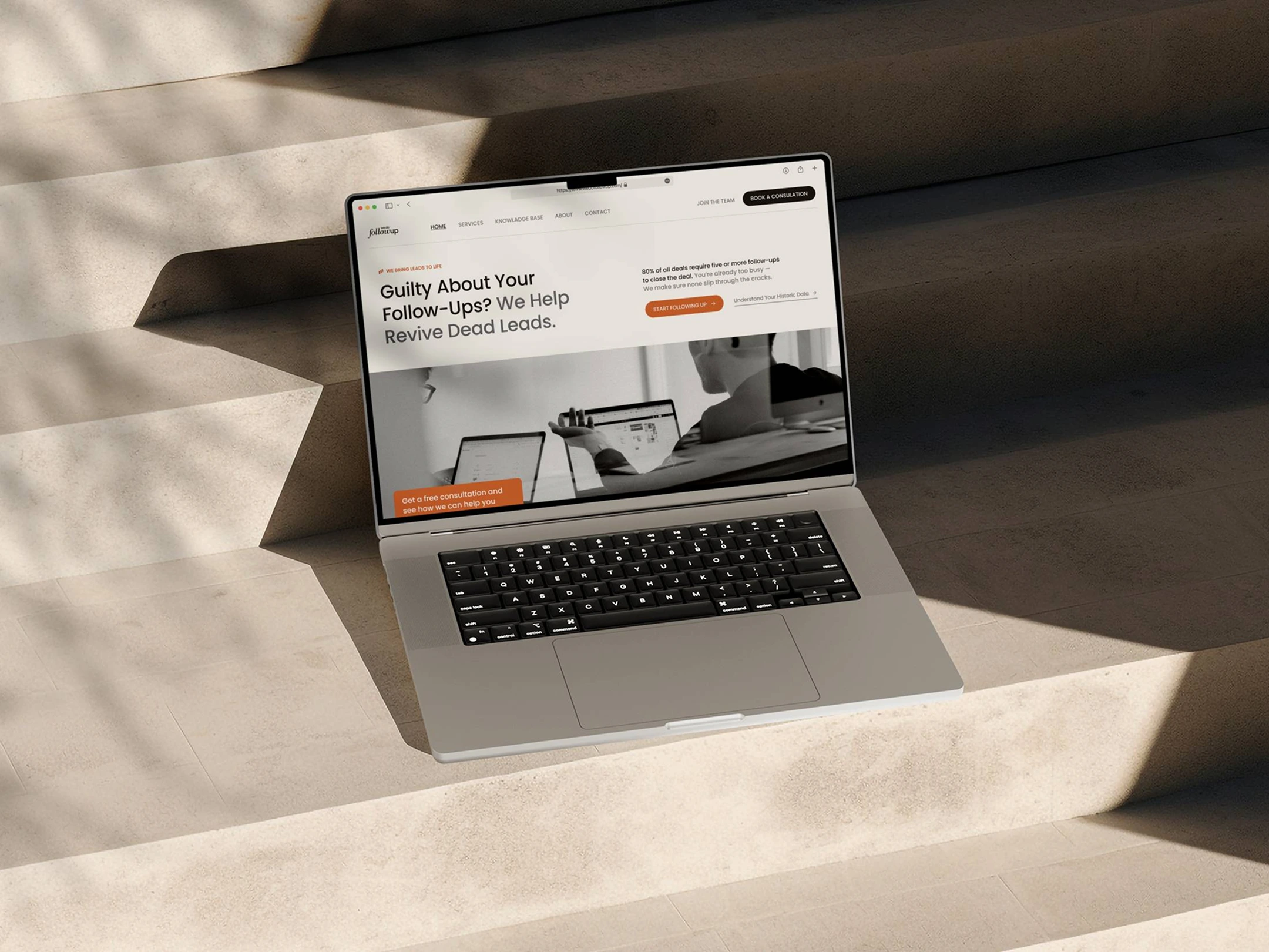
Build a high-converting site with a minimal, Nordic-inspired aesthetic. Clean lines, strong typography, intentional white space, and a calm but confident tone throughout.
💡 My role
As the lead designer, I was in charge of translating that vision into Figma — from structure to visuals. I also redesigned their brand logo to align with the new tone: clean, modern, and quietly assertive.
🛠️ What I focused on:
A smooth, scroll-based experience that walks users through the offering
Clear CTAs with zero fluff
A minimal but strong layout system
Close handoff with the dev team to preserve visual polish and intent
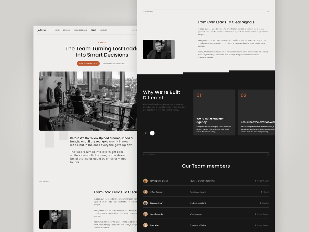
About us page
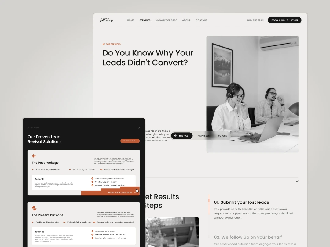
Services Page
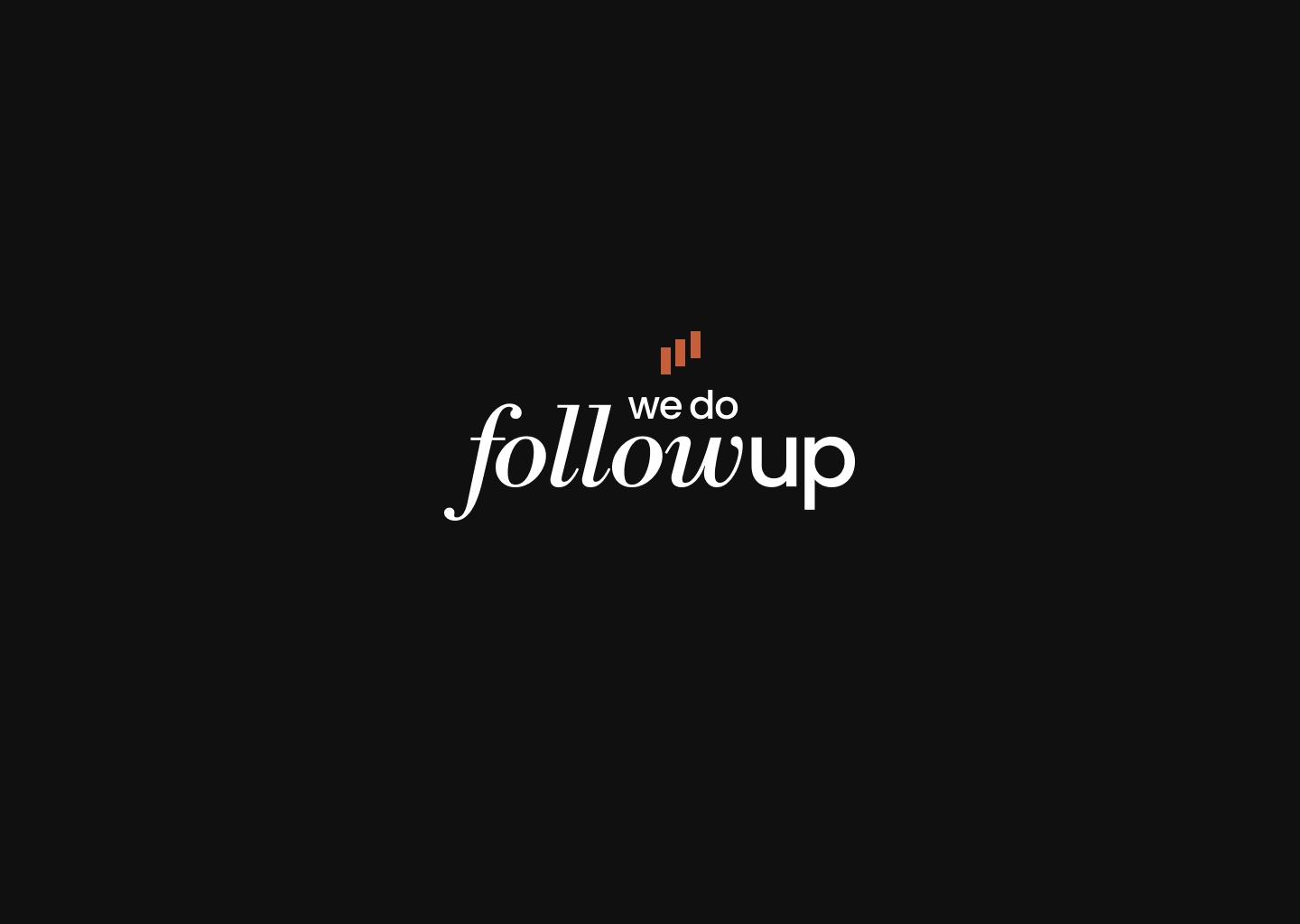
Logo Design
🔗 Live site: wedofollowup.com
Like this project
Posted Jul 2, 2025
Designed a minimalistic, high-converting website and brand logo for We Do Follow-Up.
Likes
0
Views
1
Timeline
May 1, 2025 - Jul 10, 2025


NeoDeliver – Multi-Channel Communication Website Redesign
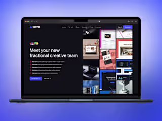
Sprintli Studio - Creative design agency
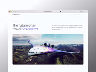
Outbound Aero — Website Development (Framer)

Transfly – AI-Powered Finance Landing Page