
Figma | Design SystemSrikar Suresh
I deliver production-ready design systems built on systematic foundations—design tokens, component variants with auto-layout, and comprehensive documentation your developers will actually use. Having designed systems for complex automotive interfaces, SaaS products, and Landing Pages, I bring a methodical approach to handling edge cases, states, and scalability that simpler products rarely demand. Your team gets a design system that's not just a UI kit- but a strategic asset that compounds design efficiency over time
What's included
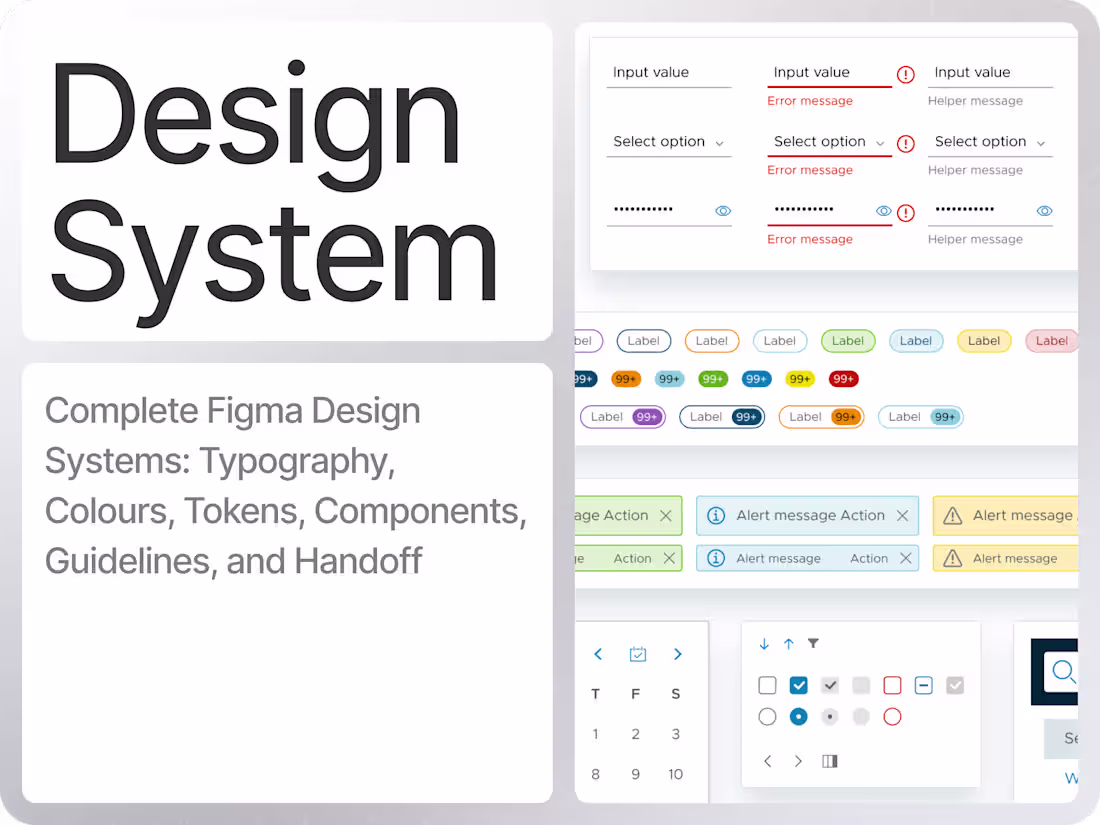
Production-ready Figma Design System
A central library with core UI components (buttons, inputs, cards, nav, tables, dialogs) built with variants, auto layout, and component properties so your team can design new flows quickly and consistently.
Semantic Typography and Color Tokens
A scalable type ramp, semantic color system (e.g., primary/secondary/success/error), and tokens for spacing, radius, and elevation, ready to map to code variables and themes.
Layout, Grid, and Spacing Guidelines
Responsive grid setups and spacing rules tailored to your product (web, mobile, or in-vehicle/dashboards), so multiple designers can work in parallel without visual drift.
Design System Documentation in Figma
In-file guidelines that explain how to use components, naming conventions, states, and patterns, making it easy for designers, developers, and new team members to adopt the system.
Handoff and Onboarding Walkthrough
A Loom or live walkthrough of the system structure plus a short Q&A session, ensuring your team knows how to use, maintain, and extend the design system after delivery.
FAQs
Srikar's other services
Contact for pricing
Tags
Figma
Google Apps
Notion
Design Systems Specialist
Product Designer
UI Designer
Service provided by
Srikar Suresh proBengaluru, India
- 25
- Followers
Figma | Design SystemSrikar Suresh
Contact for pricing
Tags
Figma
Google Apps
Notion
Design Systems Specialist
Product Designer
UI Designer
I deliver production-ready design systems built on systematic foundations—design tokens, component variants with auto-layout, and comprehensive documentation your developers will actually use. Having designed systems for complex automotive interfaces, SaaS products, and Landing Pages, I bring a methodical approach to handling edge cases, states, and scalability that simpler products rarely demand. Your team gets a design system that's not just a UI kit- but a strategic asset that compounds design efficiency over time
What's included
Production-ready Figma Design System
A central library with core UI components (buttons, inputs, cards, nav, tables, dialogs) built with variants, auto layout, and component properties so your team can design new flows quickly and consistently.
Semantic Typography and Color Tokens
A scalable type ramp, semantic color system (e.g., primary/secondary/success/error), and tokens for spacing, radius, and elevation, ready to map to code variables and themes.
Layout, Grid, and Spacing Guidelines
Responsive grid setups and spacing rules tailored to your product (web, mobile, or in-vehicle/dashboards), so multiple designers can work in parallel without visual drift.
Design System Documentation in Figma
In-file guidelines that explain how to use components, naming conventions, states, and patterns, making it easy for designers, developers, and new team members to adopt the system.
Handoff and Onboarding Walkthrough
A Loom or live walkthrough of the system structure plus a short Q&A session, ensuring your team knows how to use, maintain, and extend the design system after delivery.
FAQs
Srikar's other services
Contact for pricing