
Brand Identity DesignTho Anh
About the Project
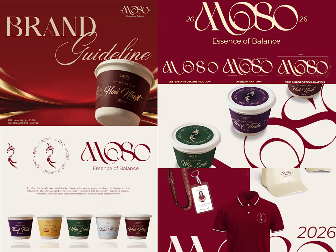
MOSO is a premium Vietnamese instant self-heating beauty tea concept, created around the idea of beauty, wellness and self-care.
The brand aims to turn the familiar experience of traditional beauty teas into a more refined and convenient product for modern consumers.
The Challenge
MOSO needed a visual identity that could communicate luxury, beauty and wellness, while still maintaining a connection to traditional Vietnamese culture.
The challenge was also to create a clear visual distinction between the five flavors without making the packaging feel overly colorful or losing its premium character.
My Approach
I used the concept of Ngũ Hành (Five Elements) as the foundation for the packaging system.
Instead of treating the Five Elements as a purely decorative cultural reference, I translated them into five gradient color palettes, with each color system representing one element and corresponding flavor.
The gradients create a clear distinction between the products while maintaining a cohesive visual language across the collection. Combined with elegant typography and refined compositions, the system allows MOSO to feel both premium and contemporary, while retaining a subtle connection to Vietnamese cultural values.
The Result
The final packaging creates a balance between traditional inspiration and modern beauty, using color as both a storytelling element and a functional way to navigate the product range.
FAQs
Tho's other services
Starting at$15 /hr
Tags
Brand Designer
Graphic Designer
Logo Designer
Visual Designer
Branding
Service provided by
Tho Anh Long Chau, Vietnam
- 1
- Followers
Brand Identity DesignTho Anh
Starting at$15 /hr
Tags
Brand Designer
Graphic Designer
Logo Designer
Visual Designer
Branding
About the Project
MOSO is a premium Vietnamese instant self-heating beauty tea concept, created around the idea of beauty, wellness and self-care.
The brand aims to turn the familiar experience of traditional beauty teas into a more refined and convenient product for modern consumers.
The Challenge
MOSO needed a visual identity that could communicate luxury, beauty and wellness, while still maintaining a connection to traditional Vietnamese culture.
The challenge was also to create a clear visual distinction between the five flavors without making the packaging feel overly colorful or losing its premium character.
My Approach
I used the concept of Ngũ Hành (Five Elements) as the foundation for the packaging system.
Instead of treating the Five Elements as a purely decorative cultural reference, I translated them into five gradient color palettes, with each color system representing one element and corresponding flavor.
The gradients create a clear distinction between the products while maintaining a cohesive visual language across the collection. Combined with elegant typography and refined compositions, the system allows MOSO to feel both premium and contemporary, while retaining a subtle connection to Vietnamese cultural values.
The Result
The final packaging creates a balance between traditional inspiration and modern beauty, using color as both a storytelling element and a functional way to navigate the product range.
FAQs
Tho's other services
$15 /hr