
I Will Create a Dark Style Landing Page With FramerEdward Jaiyeola
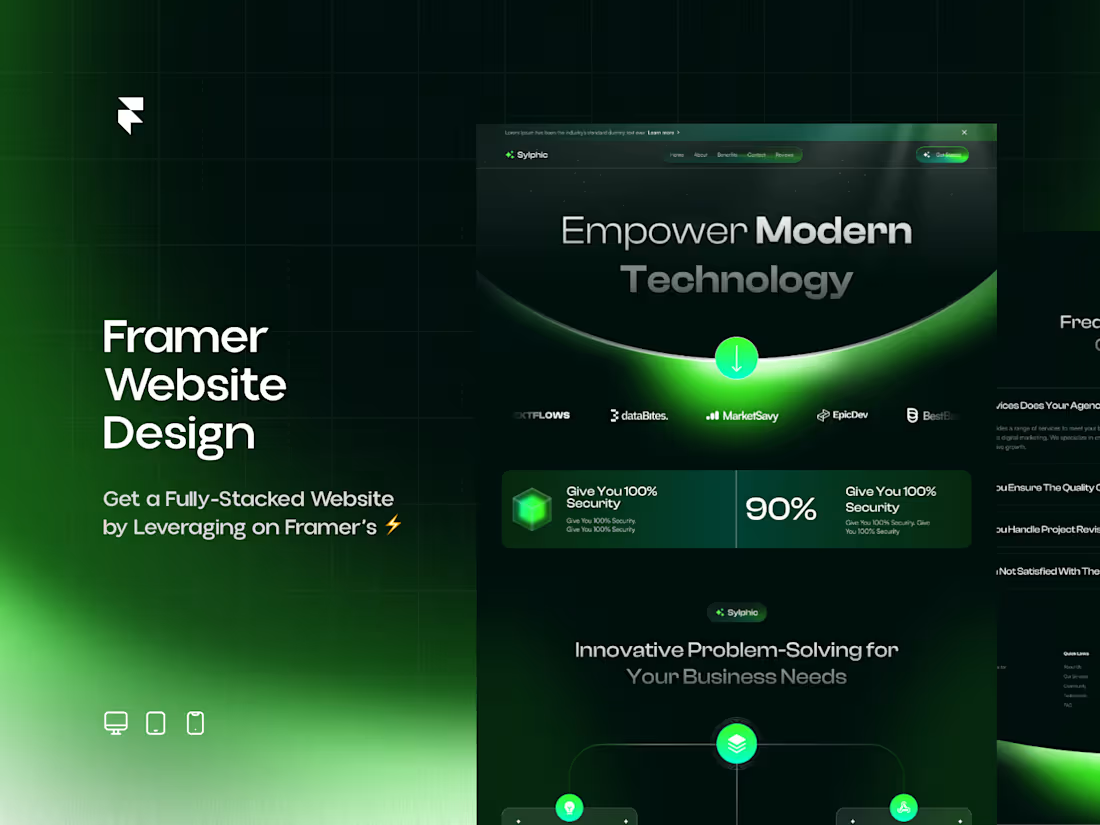
Dark mode is not a feature anymore. It is an expectation. And done right, it converts.
For tech companies, AI startups, SaaS products, and premium brands, a dark landing page signals one thing immediately: this is a company that knows what it is doing. Light backgrounds feel generic. Dark backgrounds feel intentional.
I create dark mode landing pages on Framer that combine modern aesthetics with conversion logic. Not dark for dark's sake. Dark that builds trust, reduces cognitive load, and makes your product look premium.
What makes a dark landing page convert:
Modern Aesthetics That Signal Competence.
The biggest landing page design trends in 2026 are dark-mode-first aesthetics, bento grid layouts, glassmorphism, 3D device mockups, minimal hero sections, and subtle scroll-triggered animations. These are not trends for trends' sake. They are design patterns that the best-performing landing pages actually use.
Glassmorphism and Depth.
Glassmorphism is now used tastefully as an accent rather than the entire design language, with floating cards and soft blur effects against gradient backgrounds, adding depth and dimension while creating a premium, modern aesthetic. Dark glassmorphism uses semi-transparent surfaces over vibrant, deep gradients with ambient gradients of color that float behind the UI, creating depth, atmosphere, and a sense of digital luxury.
Minimal, Bold Typography.
Many SaaS landing pages now feature hero sections with just a powerful headline, one-line description, and a CTA, nothing else, because this clarity converts better than busy layouts. Dark backgrounds make bold type even more readable and impactful.
Performance That Does Not Sacrifice Animation.
An experienced Framer developer keeps performance in mind. Animations are light. Pages stay responsive. The story flows without slowing the user down. Dark pages with animations should feel fast, not sluggish.
Dark and Light Mode Option.
With Framer web development, switching between light and dark themes is smooth. If you want to offer both, it is built in. But the dark mode is the primary experience, not an afterthought.
Best for:
Tech startups, AI companies, SaaS products, developer tools, crypto and fintech brands, and any company whose audience expects sophistication and technical credibility. If your customers are designers, developers, or tech-savvy decision-makers, dark is the right call.
If you want a landing page that makes visitors feel like they landed somewhere serious, this is it.
FAQs
Example work

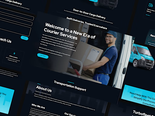
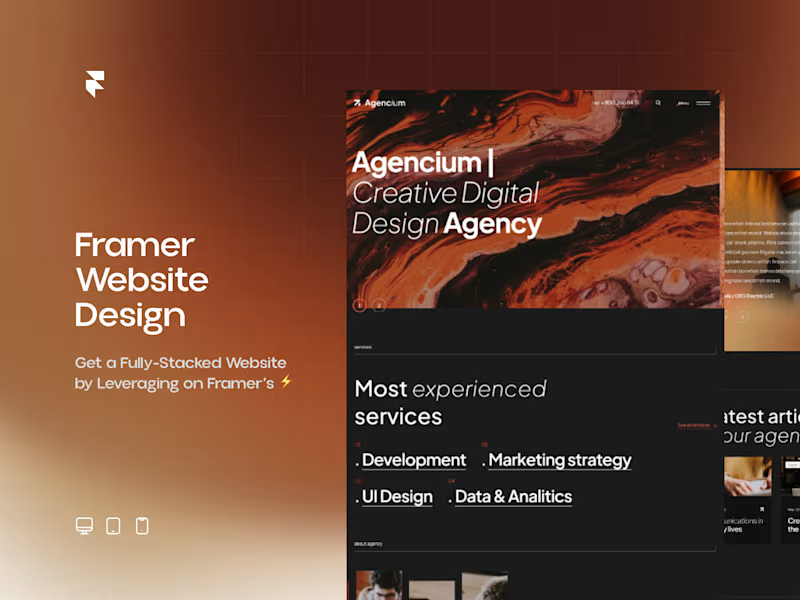
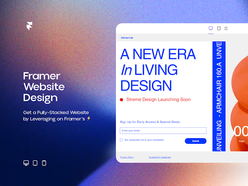
Starting at$1,099.99
Duration4 weeks
Tags
Framer
React
Website Design
CEO
Framer Designer
Framer Developer
Build Landing Page
Dark & Light Mode
Website on Framer
Service provided by
Edward Jaiyeola proLagos, Nigeria
- $1k+
- Earned
- 5.00
- Rating
- 56
- Followers
I Will Create a Dark Style Landing Page With FramerEdward Jaiyeola
Starting at$1,099.99
Duration4 weeks
Tags
Framer
React
Website Design
CEO
Framer Designer
Framer Developer
Build Landing Page
Dark & Light Mode
Website on Framer
Dark mode is not a feature anymore. It is an expectation. And done right, it converts.
For tech companies, AI startups, SaaS products, and premium brands, a dark landing page signals one thing immediately: this is a company that knows what it is doing. Light backgrounds feel generic. Dark backgrounds feel intentional.
I create dark mode landing pages on Framer that combine modern aesthetics with conversion logic. Not dark for dark's sake. Dark that builds trust, reduces cognitive load, and makes your product look premium.
What makes a dark landing page convert:
Modern Aesthetics That Signal Competence.
The biggest landing page design trends in 2026 are dark-mode-first aesthetics, bento grid layouts, glassmorphism, 3D device mockups, minimal hero sections, and subtle scroll-triggered animations. These are not trends for trends' sake. They are design patterns that the best-performing landing pages actually use.
Glassmorphism and Depth.
Glassmorphism is now used tastefully as an accent rather than the entire design language, with floating cards and soft blur effects against gradient backgrounds, adding depth and dimension while creating a premium, modern aesthetic. Dark glassmorphism uses semi-transparent surfaces over vibrant, deep gradients with ambient gradients of color that float behind the UI, creating depth, atmosphere, and a sense of digital luxury.
Minimal, Bold Typography.
Many SaaS landing pages now feature hero sections with just a powerful headline, one-line description, and a CTA, nothing else, because this clarity converts better than busy layouts. Dark backgrounds make bold type even more readable and impactful.
Performance That Does Not Sacrifice Animation.
An experienced Framer developer keeps performance in mind. Animations are light. Pages stay responsive. The story flows without slowing the user down. Dark pages with animations should feel fast, not sluggish.
Dark and Light Mode Option.
With Framer web development, switching between light and dark themes is smooth. If you want to offer both, it is built in. But the dark mode is the primary experience, not an afterthought.
Best for:
Tech startups, AI companies, SaaS products, developer tools, crypto and fintech brands, and any company whose audience expects sophistication and technical credibility. If your customers are designers, developers, or tech-savvy decision-makers, dark is the right call.
If you want a landing page that makes visitors feel like they landed somewhere serious, this is it.
FAQs
Example work
$1,099.99