
Product UI/UX Design wrong comic.
We create intuitive product UIs grounded in design strategy and user flow awareness. Our goal is to make things feel easy to navigate, seamless to use, and scalable to build.
What's included
UX Research & Insights Deck
Synthesis of user research, competitor audits, and product goals — turned into actionable insights that shaped the UX foundation.
Information Architecture & User Flows
Clear maps of how users move through the product, with screen-to-screen logic and key decision points laid out visually.
Low-Fidelity Wireframes (Desktop + Mobile)
Rapid, functional layouts to test structure, layout hierarchy, and feature placement — shared for early alignment.
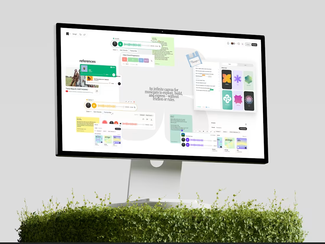
High-Fidelity UI Screens
Pixel-level design of all key screens for desktop and mobile, including navigation, modals, empty states, and edge cases.
Component Library or Mini Design System
Reusable UI elements, type scales, color tokens, button states — delivered in Figma, ready for dev or expansion.
Prototyped User Journey
Interactive Figma prototype showing real flows, interactions, and user pathways — perfect for internal testing or pitching.
Developer Handoff Package
Includes dev notes, Figma specs, export-ready assets, and any documentation needed for smooth handoff.
FAQs

Contact for pricing
Tags
Figma
Notion
Product Designer
UI Designer
UX Designer
Service provided by
wrong comic. Bengaluru, India
- 7
- Followers
Product UI/UX Design wrong comic.
We create intuitive product UIs grounded in design strategy and user flow awareness. Our goal is to make things feel easy to navigate, seamless to use, and scalable to build.
What's included
UX Research & Insights Deck
Synthesis of user research, competitor audits, and product goals — turned into actionable insights that shaped the UX foundation.
Information Architecture & User Flows
Clear maps of how users move through the product, with screen-to-screen logic and key decision points laid out visually.
Low-Fidelity Wireframes (Desktop + Mobile)
Rapid, functional layouts to test structure, layout hierarchy, and feature placement — shared for early alignment.
High-Fidelity UI Screens
Pixel-level design of all key screens for desktop and mobile, including navigation, modals, empty states, and edge cases.
Component Library or Mini Design System
Reusable UI elements, type scales, color tokens, button states — delivered in Figma, ready for dev or expansion.
Prototyped User Journey
Interactive Figma prototype showing real flows, interactions, and user pathways — perfect for internal testing or pitching.
Developer Handoff Package
Includes dev notes, Figma specs, export-ready assets, and any documentation needed for smooth handoff.
FAQs
Contact for pricing