
Full Branding + GuidelinesIsaac Bartlett
Help businesses create strong, professional brand identities that stand out and build trust with customers. What makes me unique is my ability to translate a founder’s vision into clean, modern branding that feels timeless and sets them apart from competitors.
What's included
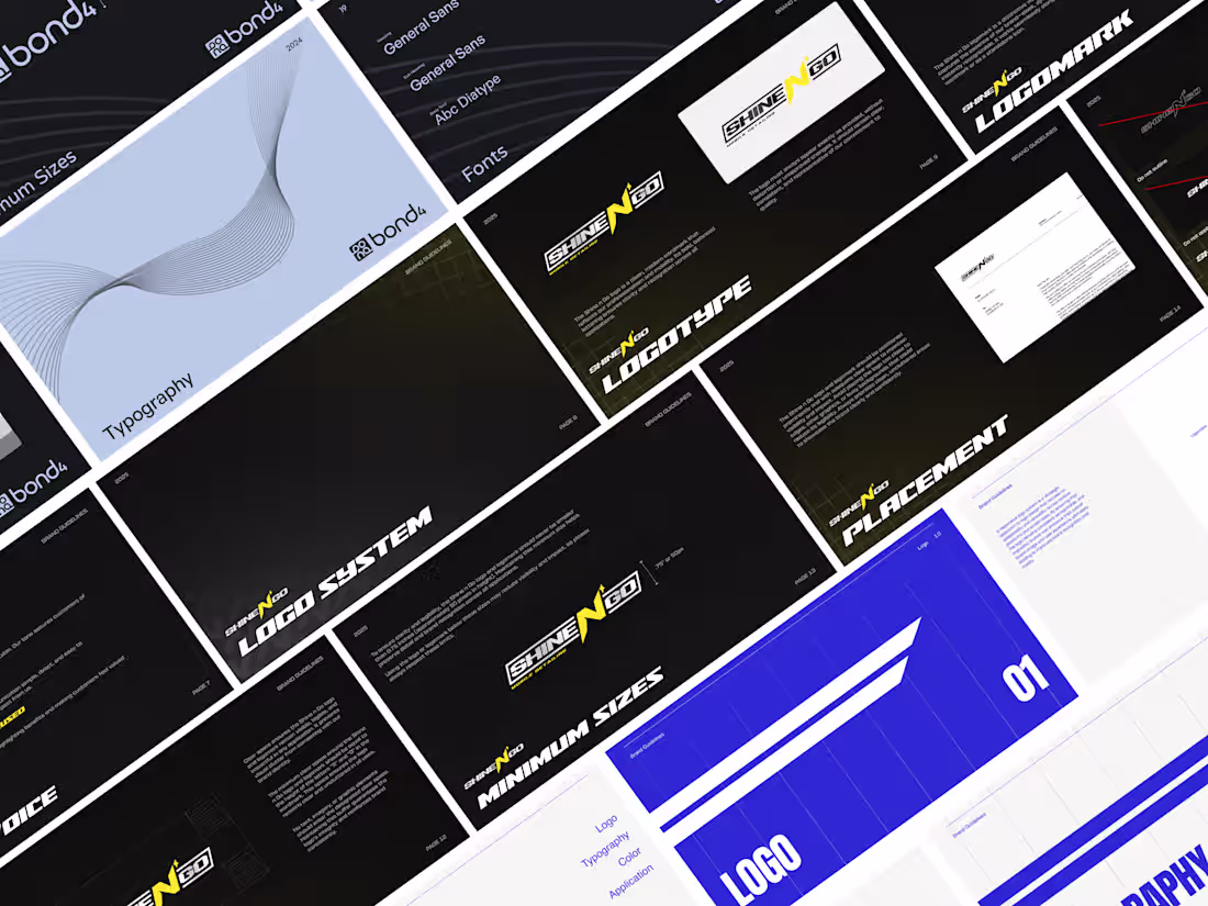
Logo System
1. Primary Logo
The main logo design (full-color, detailed version).
Used in most brand applications.
2. Secondary / Alternative Logos
Horizontal version (wider format for website headers, signage, etc.).
Stacked/vertical version (for square spaces like profile images, packaging).
Simplified version (for small-scale use, when details won’t reproduce well).
3. Logo Marks / Icons
Standalone brand mark/symbol (without text).
Monogram or lettermark (if applicable).
Useful for favicons, app icons, avatars, or minimal brand presence.
Style Guide
1. Introduction
Brand story / positioning: What the brand stands for, mission, values.
Voice & tone overview: Short notes on how the brand speaks (professional, playful, approachable, etc.).
2. Logo Guidelines
Primary logo + all variations (with correct/incorrect usage examples).
Clear space and minimum size requirements.
Color versions (full, mono, reversed).
Background rules (what’s allowed / not allowed).
3. Color System
Primary palette (core brand colors).
Secondary / accent colors.
Neutral colors (grays, black, white).
Usage ratios (e.g., 70% primary, 20% secondary, 10% accent).
Technical breakdowns:
CMYK (print)
RGB (screen)
HEX (web)
Pantone (spot printing)
4. Typography
Primary typeface (headlines).
Secondary typeface (body text).
Optional tertiary (accents or captions).
Web-safe alternatives (e.g., Google Fonts fallback).
Hierarchy examples (headline → subhead → body → caption).
Do’s and don’ts (e.g., no stretched fonts, all caps only in headings).
5. Imagery & Photography
Style guidelines (e.g., candid, minimal, high-contrast, warm tones).
Subject matter (people, products, lifestyle, abstract).
Do’s and don’ts (stock-photo clichés, over-editing).
Photo treatments (filters, color grading, overlays).
6. Iconography & Graphics
Custom icon set (line style, fill style, rounded vs sharp).
Usage rules (sizing, stroke weight, color fill).
Patterns, shapes, or graphic elements unique to the brand.
7. Layout & Composition
Grid system (columns, margins, spacing rules).
Standard page layouts (poster, social media, business card).
White space usage.
Alignment and proportion rules.
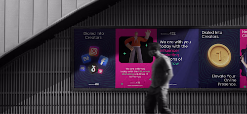
8. Applications & Mockups
Examples of the brand in use:
Stationery (business cards, letterhead, envelopes).
Social media templates.
Website or app screens.
Merch or packaging.
Consistency examples across platforms.
9. Tone of Voice & Copywriting
Messaging pillars (e.g., “friendly, innovative, trustworthy”).
Example headlines, taglines, and calls-to-action.
Do’s and don’ts (words to avoid, brand-specific phrasing).
10. File Assets
Links to the actual logo files, color palettes, typeface downloads.
Templates (social posts, presentations, letterhead, email signatures).
Favicon / icon exports.
Business Card
1. Design Variations
Front + back design (main layout).
Multiple roles/people (if client needs cards for more than one employee).
Alternative orientations (horizontal vs vertical — if relevant).
2. File Formats for Print
Editable / Source file:
.AI (Adobe Illustrator, preferred).
.PSD or .INDD (if used).
Print-ready files:
.PDF (with crop marks, bleeds, CMYK).
.EPS (sometimes requested by printers).
Preview files:
.JPG or .PNG (RGB, for client approval or digital reference).
3. Specs & Technicals
Size / dimensions (usually 3.5" × 2" in North America, but varies by region).
Bleed setup (typically 0.125" / 3mm).
Safe zone / margins (to avoid cutting off text/logos).
Color mode: CMYK for print, RGB for preview.
Resolution: 300 DPI (print standard).
4. Brand Integration
Logo placement (primary or secondary logo).
Brand colors applied correctly.
Typography aligned with brand style guide.
Optional graphic elements (icons, background patterns, spot colors, embossing).
5. Printing Guidance
Notes on paper stock (e.g., matte, glossy, textured, recycled).
Finishes (spot UV, foil stamp, emboss/deboss, edge painting).
Special cuts (rounded corners, square cards, custom die-cuts).
Recommendations for bulk printing services (if client doesn’t have a printer).
6. Export Variations
With bleed (for printer).
Without bleed (for digital reference).
Single card PDF + multi-up sheet (8–10 cards per sheet, if client prints in-house).
FAQs
Example work
Contact for pricing
Tags
Adobe Illustrator
Adobe Photoshop
Figma
Brand Designer
Brand Strategist
Digital Marketer
Service provided by
Isaac Bartlett proToronto, Canada
- $10k+
- Earned
- 5
- Paid projects
- 4.95
- Rating
- 28
- Followers
Full Branding + GuidelinesIsaac Bartlett
Contact for pricing
Tags
Adobe Illustrator
Adobe Photoshop
Figma
Brand Designer
Brand Strategist
Digital Marketer
Help businesses create strong, professional brand identities that stand out and build trust with customers. What makes me unique is my ability to translate a founder’s vision into clean, modern branding that feels timeless and sets them apart from competitors.
What's included
Logo System
1. Primary Logo
The main logo design (full-color, detailed version).
Used in most brand applications.
2. Secondary / Alternative Logos
Horizontal version (wider format for website headers, signage, etc.).
Stacked/vertical version (for square spaces like profile images, packaging).
Simplified version (for small-scale use, when details won’t reproduce well).
3. Logo Marks / Icons
Standalone brand mark/symbol (without text).
Monogram or lettermark (if applicable).
Useful for favicons, app icons, avatars, or minimal brand presence.
Style Guide
1. Introduction
Brand story / positioning: What the brand stands for, mission, values.
Voice & tone overview: Short notes on how the brand speaks (professional, playful, approachable, etc.).
2. Logo Guidelines
Primary logo + all variations (with correct/incorrect usage examples).
Clear space and minimum size requirements.
Color versions (full, mono, reversed).
Background rules (what’s allowed / not allowed).
3. Color System
Primary palette (core brand colors).
Secondary / accent colors.
Neutral colors (grays, black, white).
Usage ratios (e.g., 70% primary, 20% secondary, 10% accent).
Technical breakdowns:
CMYK (print)
RGB (screen)
HEX (web)
Pantone (spot printing)
4. Typography
Primary typeface (headlines).
Secondary typeface (body text).
Optional tertiary (accents or captions).
Web-safe alternatives (e.g., Google Fonts fallback).
Hierarchy examples (headline → subhead → body → caption).
Do’s and don’ts (e.g., no stretched fonts, all caps only in headings).
5. Imagery & Photography
Style guidelines (e.g., candid, minimal, high-contrast, warm tones).
Subject matter (people, products, lifestyle, abstract).
Do’s and don’ts (stock-photo clichés, over-editing).
Photo treatments (filters, color grading, overlays).
6. Iconography & Graphics
Custom icon set (line style, fill style, rounded vs sharp).
Usage rules (sizing, stroke weight, color fill).
Patterns, shapes, or graphic elements unique to the brand.
7. Layout & Composition
Grid system (columns, margins, spacing rules).
Standard page layouts (poster, social media, business card).
White space usage.
Alignment and proportion rules.
8. Applications & Mockups
Examples of the brand in use:
Stationery (business cards, letterhead, envelopes).
Social media templates.
Website or app screens.
Merch or packaging.
Consistency examples across platforms.
9. Tone of Voice & Copywriting
Messaging pillars (e.g., “friendly, innovative, trustworthy”).
Example headlines, taglines, and calls-to-action.
Do’s and don’ts (words to avoid, brand-specific phrasing).
10. File Assets
Links to the actual logo files, color palettes, typeface downloads.
Templates (social posts, presentations, letterhead, email signatures).
Favicon / icon exports.
Business Card
1. Design Variations
Front + back design (main layout).
Multiple roles/people (if client needs cards for more than one employee).
Alternative orientations (horizontal vs vertical — if relevant).
2. File Formats for Print
Editable / Source file:
.AI (Adobe Illustrator, preferred).
.PSD or .INDD (if used).
Print-ready files:
.PDF (with crop marks, bleeds, CMYK).
.EPS (sometimes requested by printers).
Preview files:
.JPG or .PNG (RGB, for client approval or digital reference).
3. Specs & Technicals
Size / dimensions (usually 3.5" × 2" in North America, but varies by region).
Bleed setup (typically 0.125" / 3mm).
Safe zone / margins (to avoid cutting off text/logos).
Color mode: CMYK for print, RGB for preview.
Resolution: 300 DPI (print standard).
4. Brand Integration
Logo placement (primary or secondary logo).
Brand colors applied correctly.
Typography aligned with brand style guide.
Optional graphic elements (icons, background patterns, spot colors, embossing).
5. Printing Guidance
Notes on paper stock (e.g., matte, glossy, textured, recycled).
Finishes (spot UV, foil stamp, emboss/deboss, edge painting).
Special cuts (rounded corners, square cards, custom die-cuts).
Recommendations for bulk printing services (if client doesn’t have a printer).
6. Export Variations
With bleed (for printer).
Without bleed (for digital reference).
Single card PDF + multi-up sheet (8–10 cards per sheet, if client prints in-house).
FAQs
Example work
Contact for pricing