
MagicPath – Design System & MockupsAndrés Sepúlveda Morales
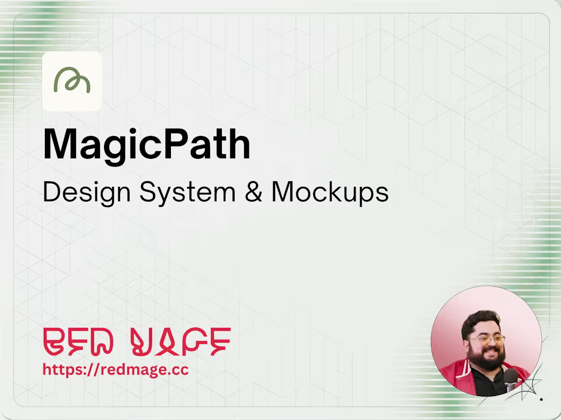
Website design system and mockups built in Figma using MagicPath. Includes component library, page mockups, and a style guide your team can build from.
What's included
Design System — Colors, typography, spacing, and component tokens documented and organized.
Component Library — Reusable UI components built in Figma for consistency across pages.
Page Mockups — Key pages designed at desktop and mobile breakpoints.
Style Guide — Reference document your dev team can use to build with confidence.
1 Round of Revisions — Refinements based on your feedback.
FAQs

Andrés's other services
Starting at$500
Duration2 weeks
Tags
Figma
MagicPath
Frontend Engineer
UX Designer
Web Developer
Service provided by
Andrés Sepúlveda Morales maxFort Collins, USA
- $25k+
- Earned
- 22
- Paid projects
- 4.98
- Rating
- 310
- Followers
MagicPath – Design System & MockupsAndrés Sepúlveda Morales
Starting at$500
Duration2 weeks
Tags
Figma
MagicPath
Frontend Engineer
UX Designer
Web Developer
Website design system and mockups built in Figma using MagicPath. Includes component library, page mockups, and a style guide your team can build from.
What's included
Design System — Colors, typography, spacing, and component tokens documented and organized.
Component Library — Reusable UI components built in Figma for consistency across pages.
Page Mockups — Key pages designed at desktop and mobile breakpoints.
Style Guide — Reference document your dev team can use to build with confidence.
1 Round of Revisions — Refinements based on your feedback.
FAQs
Andrés's other services
$500