
I will do mobile app UI UX design in FigmaV SUBU
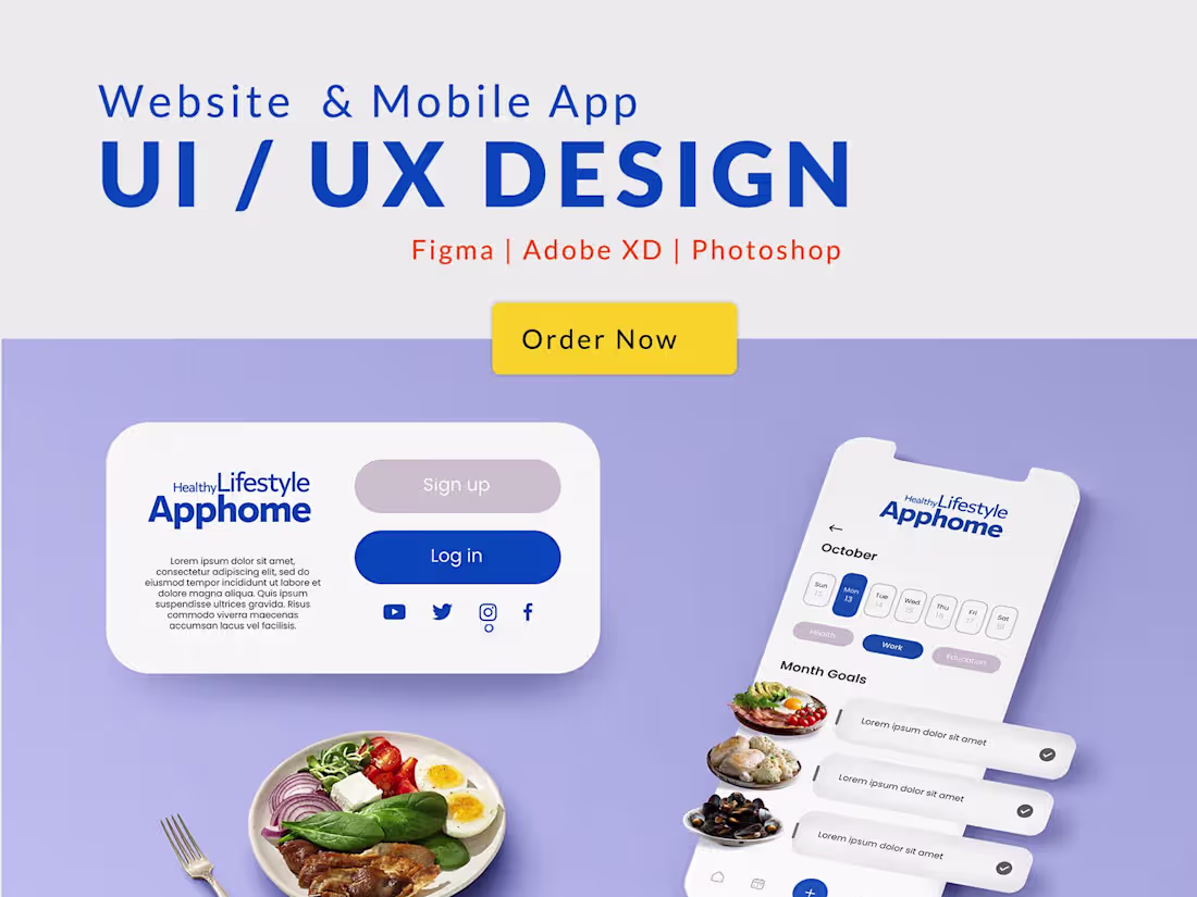
Custom UI Design: Tailor-made interfaces that align with your brand identity and business goals.
High-Fidelity Prototypes: Interactive and responsive designs that bring your ideas to life.
Wireframes & Mockups: Detailed layouts to visualize the structure and flow of your application.
Design Consultation: Expert advice on design best practices and usability improvements.
What's included
UI Design
Wireframes: Detailed blueprints for the layout and structure of each screen or page in the application.
High-Fidelity Mockups: Visually polished designs that showcase the final look and feel of the user interface, including color schemes, typography, and imagery.
Interactive Prototypes: Clickable prototypes that simulate user interactions and flow through the application, allowing for a better understanding of the user experience.
Design System: A comprehensive guide that includes UI components, design patterns, style guides, and documentation to ensure consistency throughout the application.
Assets: All necessary design assets such as icons, buttons, images, and other graphical elements, typically provided in various formats (e.g., PNG, SVG).
Style Guide: A document detailing the design standards, including colors, fonts, and spacing, to maintain visual consistency.
User Flow Diagrams: Visual representations of the user's journey through the application, highlighting key interactions and decision points.

Starting at$15
Duration1 week
Tags
Adobe XD
Figma
Sketch
UX Designer
UX Engineer
Service provided by
V SUBU India
I will do mobile app UI UX design in FigmaV SUBU
Starting at$15
Duration1 week
Tags
Adobe XD
Figma
Sketch
UX Designer
UX Engineer
Custom UI Design: Tailor-made interfaces that align with your brand identity and business goals.
High-Fidelity Prototypes: Interactive and responsive designs that bring your ideas to life.
Wireframes & Mockups: Detailed layouts to visualize the structure and flow of your application.
Design Consultation: Expert advice on design best practices and usability improvements.
What's included
UI Design
Wireframes: Detailed blueprints for the layout and structure of each screen or page in the application.
High-Fidelity Mockups: Visually polished designs that showcase the final look and feel of the user interface, including color schemes, typography, and imagery.
Interactive Prototypes: Clickable prototypes that simulate user interactions and flow through the application, allowing for a better understanding of the user experience.
Design System: A comprehensive guide that includes UI components, design patterns, style guides, and documentation to ensure consistency throughout the application.
Assets: All necessary design assets such as icons, buttons, images, and other graphical elements, typically provided in various formats (e.g., PNG, SVG).
Style Guide: A document detailing the design standards, including colors, fonts, and spacing, to maintain visual consistency.
User Flow Diagrams: Visual representations of the user's journey through the application, highlighting key interactions and decision points.
$15