
Fix Your Website for Phones in One Day (WordPress, Tilda, HTML)Flow Lab
Your site looks fine on a laptop, but on a phone the text is tiny, the page slides sideways, the menu won't open, the phone number can't be tapped and the contact form loses enquiries without any error. Most web traffic now comes from phones, and visitors leave for whoever is easier to use.
What I do:
Load your site in a phone-sized browser on a slow connection, measure it and list what gets in the way, each item with a screenshot.
Fix it in what you already have: WordPress (Elementor included), Tilda or plain HTML. Your text, pictures and look stay as they are; I don't rebuild the site.
Test the form with a real enquiry and turn the phone number into a call button.
Measure again the same way and send a before-and-after table with phone screenshots.
A site of up to five pages from $100. For a bigger site I quote from your link before starting.
Delivered in one working day from access.
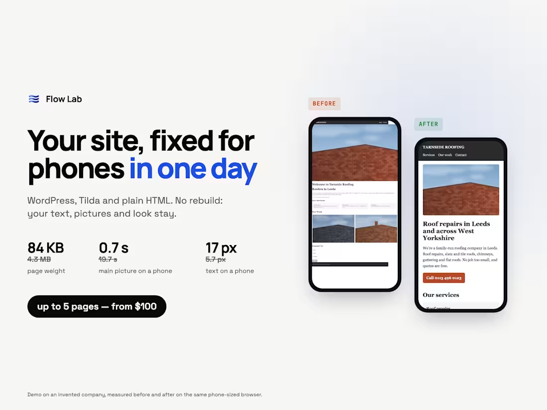
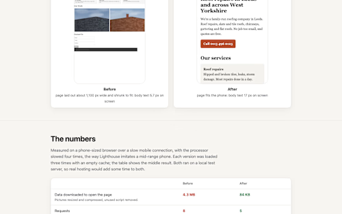
Worked example on an invented roofing company: the page went from 4.3 MB to 84 KB, the main picture on a phone from 19.7 s to 0.7 s, body text from 5.7 px to 17 px, and the form stopped losing enquiries.
https://flowlab-dev.github.io/work/site-fix/
Send me your link and usually within a few hours I'll tell you the three things that hurt most on a phone.

Starting at$100
Duration1 day
Tags
Tilda
WordPress

Responsive Design
Web Developer
Service provided by
Flow Lab proBelarus
- 2
- Followers
Fix Your Website for Phones in One Day (WordPress, Tilda, HTML)Flow Lab
Starting at$100
Duration1 day
Tags
Tilda
WordPress
Responsive Design
Web Developer
Your site looks fine on a laptop, but on a phone the text is tiny, the page slides sideways, the menu won't open, the phone number can't be tapped and the contact form loses enquiries without any error. Most web traffic now comes from phones, and visitors leave for whoever is easier to use.
What I do:
Load your site in a phone-sized browser on a slow connection, measure it and list what gets in the way, each item with a screenshot.
Fix it in what you already have: WordPress (Elementor included), Tilda or plain HTML. Your text, pictures and look stay as they are; I don't rebuild the site.
Test the form with a real enquiry and turn the phone number into a call button.
Measure again the same way and send a before-and-after table with phone screenshots.
A site of up to five pages from $100. For a bigger site I quote from your link before starting.
Delivered in one working day from access.
Worked example on an invented roofing company: the page went from 4.3 MB to 84 KB, the main picture on a phone from 19.7 s to 0.7 s, body text from 5.7 px to 17 px, and the form stopped losing enquiries.
https://flowlab-dev.github.io/work/site-fix/
Send me your link and usually within a few hours I'll tell you the three things that hurt most on a phone.
$100