
I will Design a Fully Responsive Website on FramerEdward Jaiyeola

Fully Responsive Framer Website Design
If your website looks incredible on a laptop but breaks, clips, or overlaps on a smartphone, you are driving away over half of your potential customers. A truly professional digital presence requires fluid responsiveness across every single viewport.
I design and build production-ready Framer websites that look pristine, load instantly, and adapt flawlessly whether viewed on a massive 4K monitor, a standard tablet, or a mobile screen.
By combining precision layout geometry with rapid visual development, I eliminate rigid static design constraints to deliver a fluid, high-converting digital storefront for your brand.
What You Get
Fluid Grid Architecture: Custom layout systems engineered using fractional sizing and relative constraints so your content scales naturally on any screen size.
Pixel-Perfect Device Testing: Thorough optimization across all common viewport breakpoints, eliminating horizontal scrolling, clipping text, and broken buttons.
Modern Trend-Forward UI: Clean, sophisticated visual structures tailored to your specific industry, utilizing striking typography and balanced whitespace.
Smooth Framer Motion Elements: Native micro-interactions and scroll entries optimized to remain fluid and performant on touchscreens and trackpads alike.
Lightweight Performance-First Development: Optimized asset rendering and clean structural organization to guarantee lightning-fast load speeds across all devices.
Why Work With Me?
Responsive design isn't an afterthought; it is the foundation of modern web conversion. I don't waste time with long, bloated development cycles or storytelling filler. I build clean, ultra-responsive digital assets that look premium from every angle and protect your brand's authority on any screen.
Let's build a website that perfectly fits your audience.
FAQs
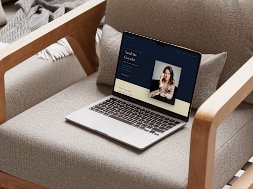
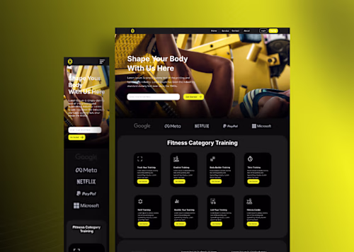
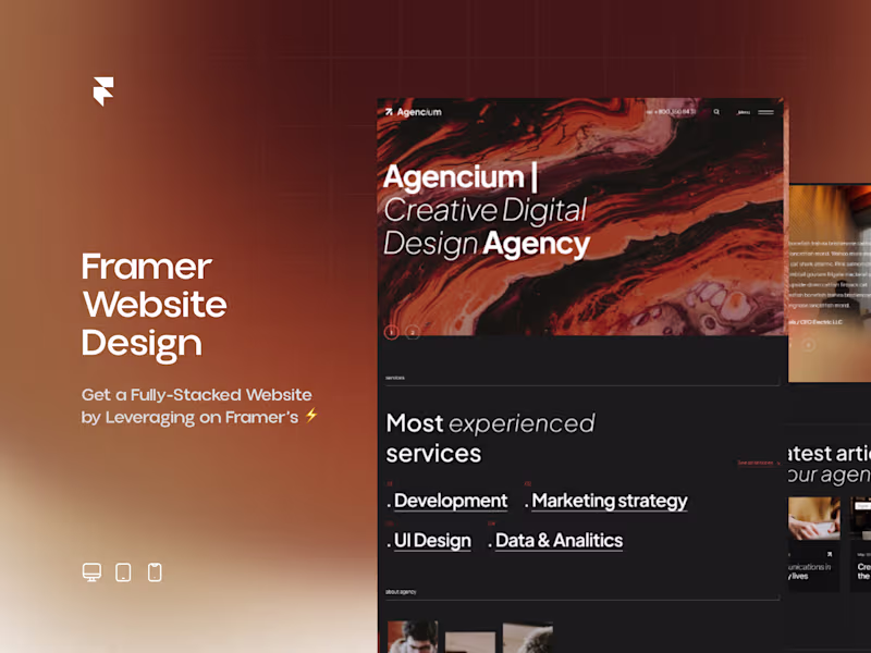
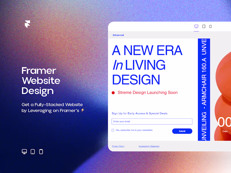
Example work

Starting at$680.99
Duration4 weeks
Tags
Claude
Framer
Website Design
Framer Designer
Framer Developer
Responsive Design
Vibe Coding
Framer UI
Wireframer
Service provided by
Edward Jaiyeola proLagos, Nigeria
- 5.00
- Rating
- 51
- Followers
I will Design a Fully Responsive Website on FramerEdward Jaiyeola
Starting at$680.99
Duration4 weeks
Tags
Claude
Framer
Website Design
Framer Designer
Framer Developer
Responsive Design
Vibe Coding
Framer UI
Wireframer
Fully Responsive Framer Website Design
If your website looks incredible on a laptop but breaks, clips, or overlaps on a smartphone, you are driving away over half of your potential customers. A truly professional digital presence requires fluid responsiveness across every single viewport.
I design and build production-ready Framer websites that look pristine, load instantly, and adapt flawlessly whether viewed on a massive 4K monitor, a standard tablet, or a mobile screen.
By combining precision layout geometry with rapid visual development, I eliminate rigid static design constraints to deliver a fluid, high-converting digital storefront for your brand.
What You Get
Fluid Grid Architecture: Custom layout systems engineered using fractional sizing and relative constraints so your content scales naturally on any screen size.
Pixel-Perfect Device Testing: Thorough optimization across all common viewport breakpoints, eliminating horizontal scrolling, clipping text, and broken buttons.
Modern Trend-Forward UI: Clean, sophisticated visual structures tailored to your specific industry, utilizing striking typography and balanced whitespace.
Smooth Framer Motion Elements: Native micro-interactions and scroll entries optimized to remain fluid and performant on touchscreens and trackpads alike.
Lightweight Performance-First Development: Optimized asset rendering and clean structural organization to guarantee lightning-fast load speeds across all devices.
Why Work With Me?
Responsive design isn't an afterthought; it is the foundation of modern web conversion. I don't waste time with long, bloated development cycles or storytelling filler. I build clean, ultra-responsive digital assets that look premium from every angle and protect your brand's authority on any screen.
Let's build a website that perfectly fits your audience.
FAQs
Example work
$680.99