
Design SystemVera Mardovina
I craft tailored design systems that not only streamline your user experience but also ensure brand consistency. My focus on advanced UX strategies and scalable solutions sets me apart, delivering a design system that evolves with your product and resonates with your users.
What's included
Design Tokens
These are the essential building blocks of your design system, including defined colors, typography, spacing, and other basic style attributes.
UI Component Library
A comprehensive collection of reusable components, such as buttons, input fields, navigation elements, and modals, all documented and coded for consistency and efficiency.
Visual Style Guide
This guide will outline the visual design principles, including color palettes, font styles, iconography, and imagery usage that would keep your brand's visual identity consistent across all platforms.
Pattern and Practices Documentation
Detailed guidelines on how components should be used and combined within the product, ensuring uniformity and best practices across your team.
Design System Governance
A plan for the maintenance and evolution of the design system, detailing how the system will be updated and the procedures for contributing new components or patterns.
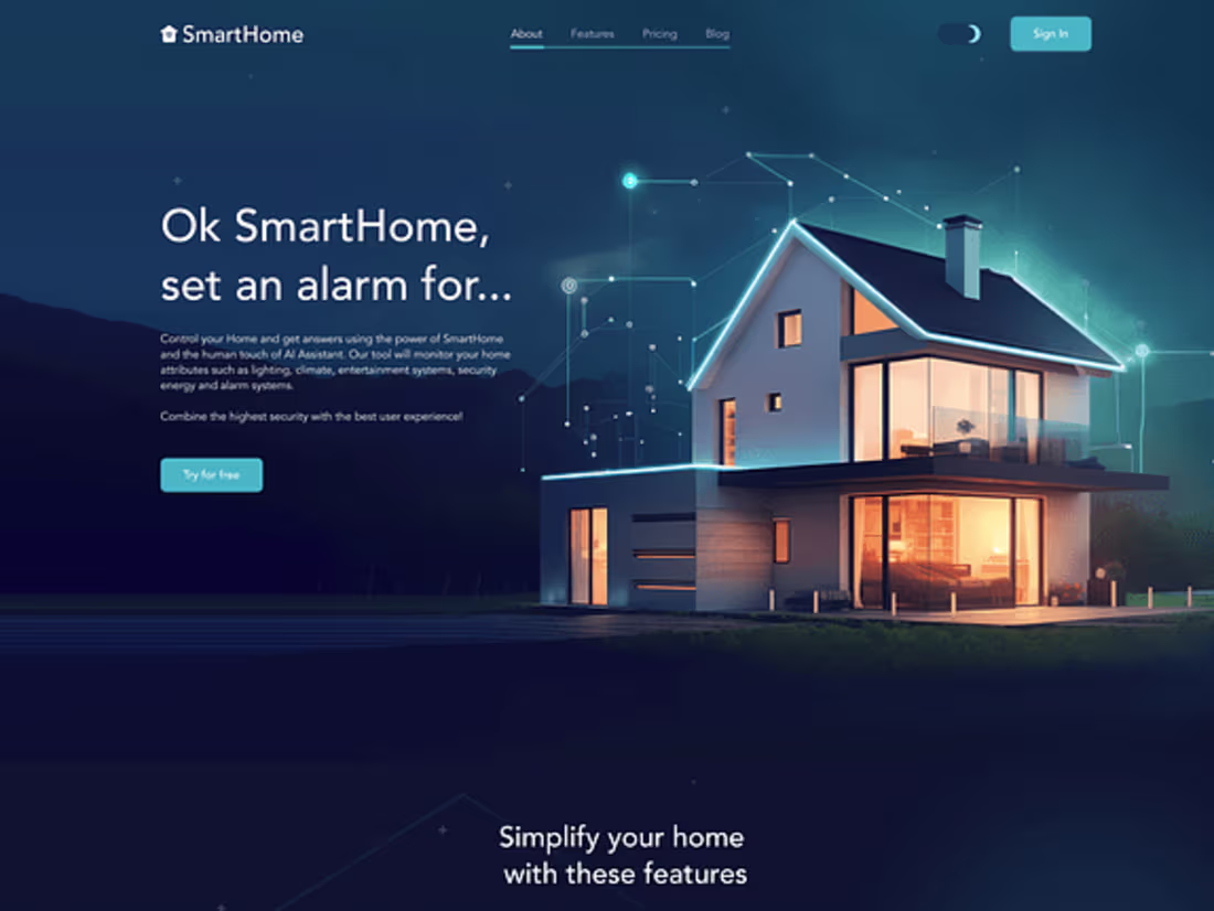
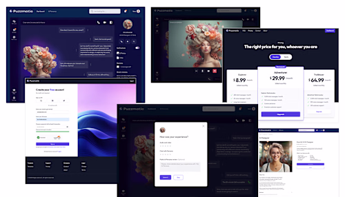
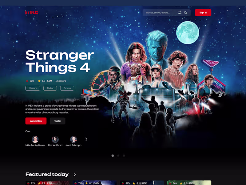
Example work
Vera's other services
Contact for pricing
Tags
Adobe Photoshop
Figma
Design Systems Specialist
Product Designer
UI Designer
Service provided by
Vera Mardovina San Francisco, USA
- 1
- Followers
Design SystemVera Mardovina
Contact for pricing
Tags
Adobe Photoshop
Figma
Design Systems Specialist
Product Designer
UI Designer
I craft tailored design systems that not only streamline your user experience but also ensure brand consistency. My focus on advanced UX strategies and scalable solutions sets me apart, delivering a design system that evolves with your product and resonates with your users.
What's included
Design Tokens
These are the essential building blocks of your design system, including defined colors, typography, spacing, and other basic style attributes.
UI Component Library
A comprehensive collection of reusable components, such as buttons, input fields, navigation elements, and modals, all documented and coded for consistency and efficiency.
Visual Style Guide
This guide will outline the visual design principles, including color palettes, font styles, iconography, and imagery usage that would keep your brand's visual identity consistent across all platforms.
Pattern and Practices Documentation
Detailed guidelines on how components should be used and combined within the product, ensuring uniformity and best practices across your team.
Design System Governance
A plan for the maintenance and evolution of the design system, detailing how the system will be updated and the procedures for contributing new components or patterns.
Example work
Vera's other services
Contact for pricing