
Dedicated Design SystemMateusz Marzec
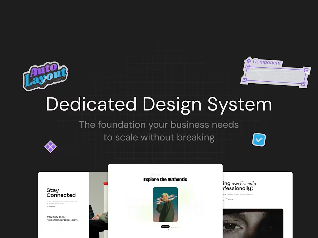
A design system built in Figma that gives your product a single source of truth - so your team stops reinventing the wheel every time a new page, feature, or component needs to be designed.
Whether you're starting from scratch or cleaning up an inconsistent existing setup, I'll build a system that's scalable, easy to maintain, and actually gets used. Every component is built with Figma's best practices in mind - variants, auto layout, variables and more so it works as hard as your team needs it to.
Works for any scale; early stage products, growing SaaS, or large teams dealing with design inconsistency across multiple surfaces.
What's included:
Discovery & Audit - A deep dive into your current design state - existing components, inconsistencies, brand guidelines, and how your team works. If you're starting fresh, this is where we define the foundation.
Foundations - Color styles, typography scale, spacing system, grid, shadows, and iconography. All defined as Figma variables and styles so changes propagate across the entire system instantly.
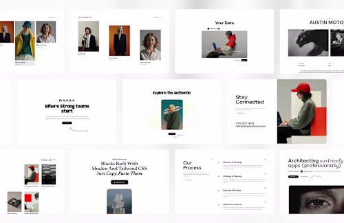
Component Library - A full library of reusable UI components built with variants, auto layout, and interactive states. Every component is documented, organized, and ready to be used directly in your product designs.
Documentation & Usage Guidelines - Clear notes and annotations inside Figma explaining how each component works, when to use it, and how it behaves across different contexts - so any designer on your team can pick it up without needing to ask.
Handoff & Team Onboarding - A walkthrough session to make sure your team knows how to use, extend, and maintain the system going forward. The goal is a system that outlives the engagement.
Pricing is flexible and based on the size of your product and the scope of the system - reach out with a brief overview and I'll put together a tailored quote.
FAQs
Mateusz's other services
Contact for pricing
Duration1 week
Tags
Figma
UI Designer
UX Designer
Web Designer
Service provided by
Mateusz Marzec maxPoland
- $1k+
- Earned
- 2
- Paid projects
- 5.00
- Rating
- 21
- Followers
Dedicated Design SystemMateusz Marzec
A design system built in Figma that gives your product a single source of truth - so your team stops reinventing the wheel every time a new page, feature, or component needs to be designed.
Whether you're starting from scratch or cleaning up an inconsistent existing setup, I'll build a system that's scalable, easy to maintain, and actually gets used. Every component is built with Figma's best practices in mind - variants, auto layout, variables and more so it works as hard as your team needs it to.
Works for any scale; early stage products, growing SaaS, or large teams dealing with design inconsistency across multiple surfaces.
What's included:
Discovery & Audit - A deep dive into your current design state - existing components, inconsistencies, brand guidelines, and how your team works. If you're starting fresh, this is where we define the foundation.
Foundations - Color styles, typography scale, spacing system, grid, shadows, and iconography. All defined as Figma variables and styles so changes propagate across the entire system instantly.
Component Library - A full library of reusable UI components built with variants, auto layout, and interactive states. Every component is documented, organized, and ready to be used directly in your product designs.
Documentation & Usage Guidelines - Clear notes and annotations inside Figma explaining how each component works, when to use it, and how it behaves across different contexts - so any designer on your team can pick it up without needing to ask.
Handoff & Team Onboarding - A walkthrough session to make sure your team knows how to use, extend, and maintain the system going forward. The goal is a system that outlives the engagement.
Pricing is flexible and based on the size of your product and the scope of the system - reach out with a brief overview and I'll put together a tailored quote.
FAQs
Mateusz's other services
Contact for pricing