
AppAlchemyDario Jankowski
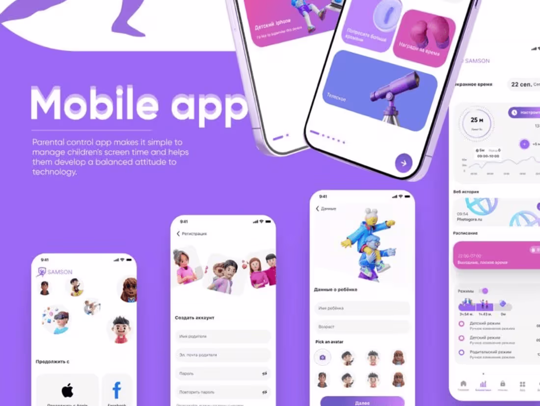
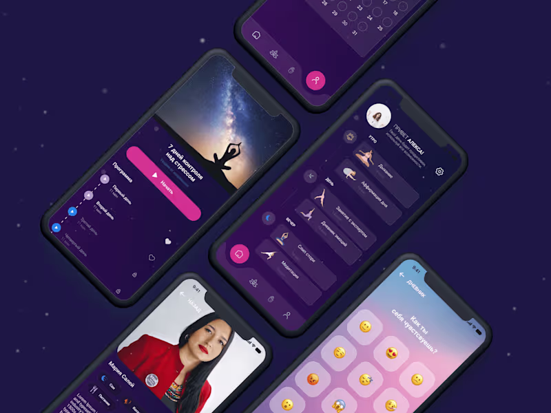
As an app designer, I bring a distinctive approach by seamlessly integrating innovative design concepts with user-centric functionality. My unique value lies in crafting visually compelling interfaces that not only captivate users but also prioritize an intuitive and delightful user experience. Elevate your digital presence with my expertise, where design meets functionality for unparalleled app experiences.
What's included
App Designer
1. User Research Report: Summarizing findings from user interviews, surveys, and usability testing to inform design decisions.
2. Persona Profiles: Detailed user personas representing target audiences with insights into their needs, behaviors, and goals.
3. Customer Journey Maps: Visualizing the end-to-end user experience, identifying touchpoints, pain points, and opportunities for improvement.
4. Wireframes: Low-fidelity representations of the interface, showcasing layout and functionality without the distraction of visual design.
5. Interactive Prototypes: High-fidelity, clickable prototypes allowing stakeholders to experience the flow and functionality of the design.
6. Information Architecture: A structured blueprint outlining the organization and hierarchy of information within the product.
7. UI Design Elements: Visual design components including color schemes, typography, and interface elements ensuring a consistent and appealing user interface.
8. Style Guide: A comprehensive document detailing design principles, guidelines, and specifications for maintaining consistency across platforms.
9. Usability Testing Reports: Insights gathered from usability testing sessions, highlighting areas of improvement and successful design elements.
10. Accessibility Guidelines: Recommendations and implementations for ensuring the design meets accessibility standards for a broader user base.
11. Final Design Assets: High-fidelity design files in formats suitable for development, including source files (e.g., Sketch, Figma, Adobe XD).
12. User Manuals or Documentation: Clear documentation providing guidance on the use and navigation of the product.
13. Stakeholder Presentation: A comprehensive presentation summarizing the design process, rationale, and key decisions for stakeholders.
14. Post-Launch Support Plan: Recommendations for ongoing monitoring, updates, and improvements after the product is live.
15. Training Materials (if applicable): Materials to train internal teams or users on new features and functionalities.
Dario's other services
Contact for pricing
Tags
Adobe Illustrator
Autodesk Maya
Figma
Sketch
Product Designer
UX Designer
Web Designer
Service provided by
Dario Jankowski England, UK
AppAlchemyDario Jankowski
Contact for pricing
Tags
Adobe Illustrator
Autodesk Maya
Figma
Sketch
Product Designer
UX Designer
Web Designer
As an app designer, I bring a distinctive approach by seamlessly integrating innovative design concepts with user-centric functionality. My unique value lies in crafting visually compelling interfaces that not only captivate users but also prioritize an intuitive and delightful user experience. Elevate your digital presence with my expertise, where design meets functionality for unparalleled app experiences.
What's included
App Designer
1. User Research Report: Summarizing findings from user interviews, surveys, and usability testing to inform design decisions.
2. Persona Profiles: Detailed user personas representing target audiences with insights into their needs, behaviors, and goals.
3. Customer Journey Maps: Visualizing the end-to-end user experience, identifying touchpoints, pain points, and opportunities for improvement.
4. Wireframes: Low-fidelity representations of the interface, showcasing layout and functionality without the distraction of visual design.
5. Interactive Prototypes: High-fidelity, clickable prototypes allowing stakeholders to experience the flow and functionality of the design.
6. Information Architecture: A structured blueprint outlining the organization and hierarchy of information within the product.
7. UI Design Elements: Visual design components including color schemes, typography, and interface elements ensuring a consistent and appealing user interface.
8. Style Guide: A comprehensive document detailing design principles, guidelines, and specifications for maintaining consistency across platforms.
9. Usability Testing Reports: Insights gathered from usability testing sessions, highlighting areas of improvement and successful design elements.
10. Accessibility Guidelines: Recommendations and implementations for ensuring the design meets accessibility standards for a broader user base.
11. Final Design Assets: High-fidelity design files in formats suitable for development, including source files (e.g., Sketch, Figma, Adobe XD).
12. User Manuals or Documentation: Clear documentation providing guidance on the use and navigation of the product.
13. Stakeholder Presentation: A comprehensive presentation summarizing the design process, rationale, and key decisions for stakeholders.
14. Post-Launch Support Plan: Recommendations for ongoing monitoring, updates, and improvements after the product is live.
15. Training Materials (if applicable): Materials to train internal teams or users on new features and functionalities.
Dario's other services
Contact for pricing