
Modern Web Application DesignChidera Anthony
I offer end-to-end web application design that blends intuitive user experience, modern aesthetics, and conversion-driven functionality. My approach focuses on user research, seamless navigation, and scalable design systems to create high-performance digital products. With interactive prototypes and developer-friendly handoff documentation, I ensure a smooth transition from concept to implementation.
What's included
Professional Web Application Design
User Flow Diagrams & Information Architecture: Visual mapping of user journeys to ensure an intuitive and efficient navigation structure.
Wireframes: Low-fidelity sketches that lay out the app’s structure and key interactions.
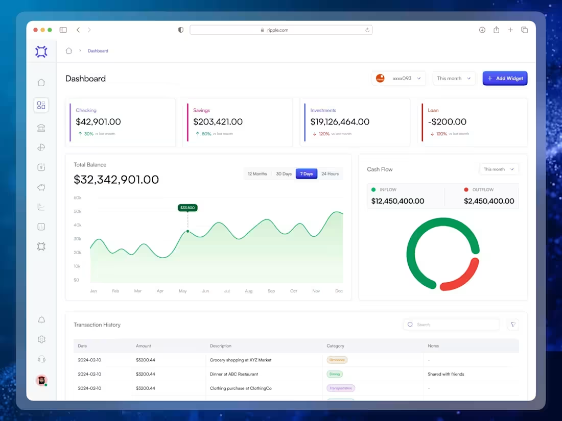
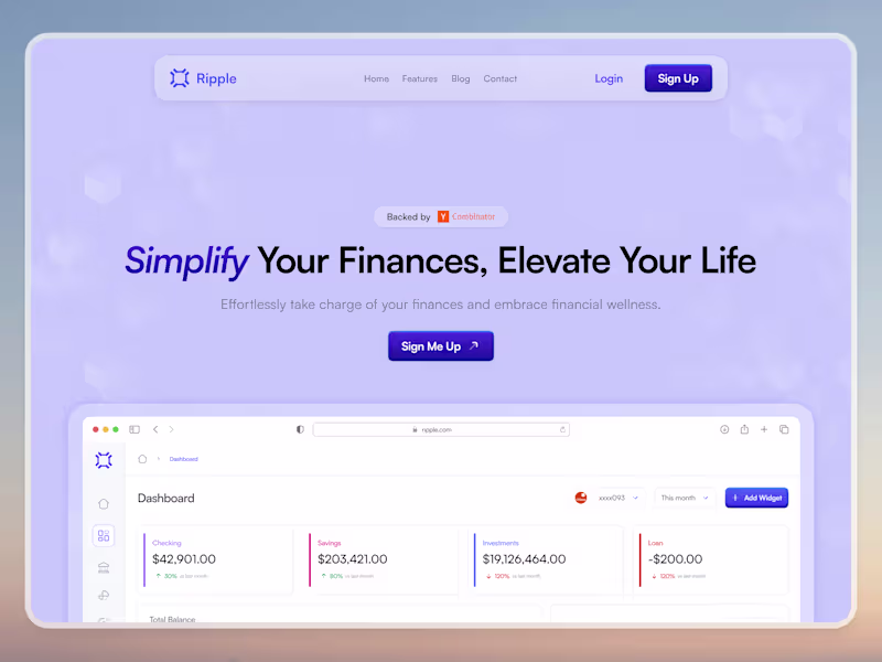
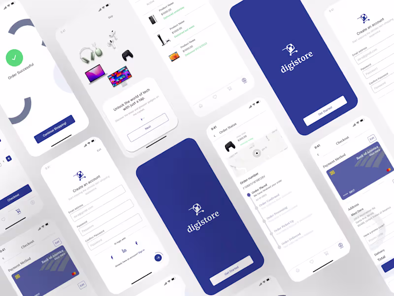
High-Fidelity Mockups: Pixel-perfect designs for all major screens, ensuring a cohesive look across devices.
Interactive Prototypes: Clickable demos using tools like Figma or InVision that simulate the user experience.
Design Assets Package: Comprehensive collection of icons, images, fonts, and color palettes optimized for web applications.
Style Guide & Design System: A documented blueprint of UI elements, typography, and color schemes to maintain brand consistency.
Developer Handoff Files: Annotated source files and specifications to streamline the transition to development.
Chidera's other services
Contact for pricing
Tags
FigJam
Figma
Jitter
Interaction Designer
UI Designer
Web Designer
Service provided by
Chidera Anthony Lagos, Nigeria
- 2
- Followers
Modern Web Application DesignChidera Anthony
I offer end-to-end web application design that blends intuitive user experience, modern aesthetics, and conversion-driven functionality. My approach focuses on user research, seamless navigation, and scalable design systems to create high-performance digital products. With interactive prototypes and developer-friendly handoff documentation, I ensure a smooth transition from concept to implementation.
What's included
Professional Web Application Design
User Flow Diagrams & Information Architecture: Visual mapping of user journeys to ensure an intuitive and efficient navigation structure.
Wireframes: Low-fidelity sketches that lay out the app’s structure and key interactions.
High-Fidelity Mockups: Pixel-perfect designs for all major screens, ensuring a cohesive look across devices.
Interactive Prototypes: Clickable demos using tools like Figma or InVision that simulate the user experience.
Design Assets Package: Comprehensive collection of icons, images, fonts, and color palettes optimized for web applications.
Style Guide & Design System: A documented blueprint of UI elements, typography, and color schemes to maintain brand consistency.
Developer Handoff Files: Annotated source files and specifications to streamline the transition to development.
Chidera's other services
Contact for pricing