
Figma Landing Page DesignChidera Anthony
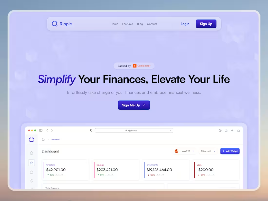
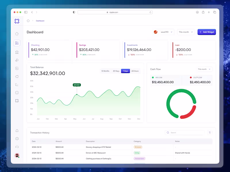
I'm offering a comprehensive landing page design service that fuses strategic UX research, responsive design, and conversion optimization to create visually compelling, high-performing web pages. What sets me apart is my unique blend of interactive prototypes and data-driven insights that ensure your landing page not only captivates your target audience but also maximizes engagement and conversion rates.
What's included
Landing Page Design Blueprint
Wireframes:
Low-fidelity sketches/layouts for each major section to visualize structure and user journey.
High-Fidelity Mockups:
Detailed, pixel-perfect designs for desktop, tablet, and mobile views.
Responsive Design Files:
Adaptations of the design ensuring consistency and usability across devices.
Interactive Prototypes:
Clickable demos (using tools like Figma or InVision) to simulate the user experience.
Design Assets Package:
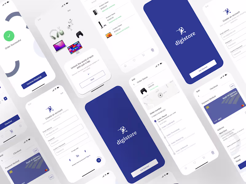
All graphics, icons, fonts, images, and color palettes in an organized format.
Style Guide/Design System:
Documentation of typography, color schemes, and UI elements for future updates and consistency.
Handoff Package:
Source files (Figma) along with annotations for developers.
Chidera's other services
Starting at$500
Duration1 week
Tags
Adobe XD
Autodesk Maya
Figma
Sketch
Interaction Designer
Mobile Designer
Web Designer
Service provided by
Chidera Anthony Lagos, Nigeria
- 2
- Followers
Figma Landing Page DesignChidera Anthony
Starting at$500
Duration1 week
Tags
Adobe XD
Autodesk Maya
Figma
Sketch
Interaction Designer
Mobile Designer
Web Designer
I'm offering a comprehensive landing page design service that fuses strategic UX research, responsive design, and conversion optimization to create visually compelling, high-performing web pages. What sets me apart is my unique blend of interactive prototypes and data-driven insights that ensure your landing page not only captivates your target audience but also maximizes engagement and conversion rates.
What's included
Landing Page Design Blueprint
Wireframes:
Low-fidelity sketches/layouts for each major section to visualize structure and user journey.
High-Fidelity Mockups:
Detailed, pixel-perfect designs for desktop, tablet, and mobile views.
Responsive Design Files:
Adaptations of the design ensuring consistency and usability across devices.
Interactive Prototypes:
Clickable demos (using tools like Figma or InVision) to simulate the user experience.
Design Assets Package:
All graphics, icons, fonts, images, and color palettes in an organized format.
Style Guide/Design System:
Documentation of typography, color schemes, and UI elements for future updates and consistency.
Handoff Package:
Source files (Figma) along with annotations for developers.
Chidera's other services
$500