Data Analysis for Actionable Business InsightsAahan Kotian
I offer tailored data visualization solutions that turn complex data into clear, actionable insights, empowering businesses to make data-driven decisions with confidence. My approach combines technical expertise with a deep understanding of design, ensuring that each visualization is not only accurate but also engaging and easy to interpret. With a strong emphasis on storytelling, I craft visuals that highlight key insights and connect with diverse audiences, setting my work apart by making data truly accessible and impactful.
What's included
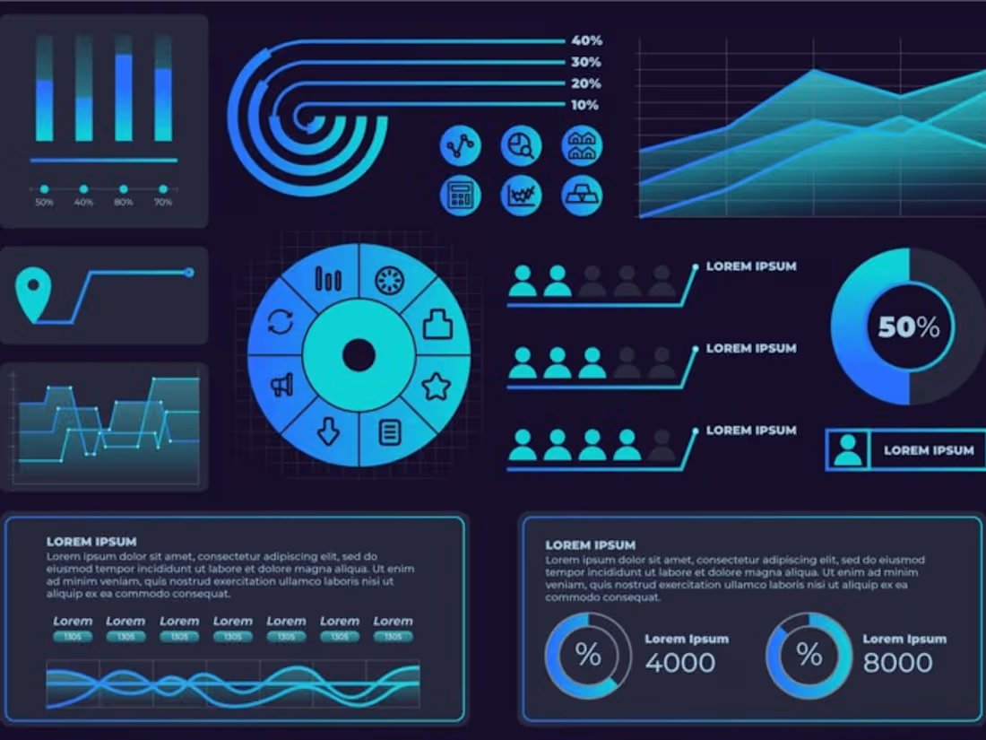
Interactive Dashboards
Custom-built dashboards that provide real-time data insights, allowing users to explore metrics, trends, and KPIs through filters, drill-downs, and dynamic charts.
Infographics
Visually appealing, single-page graphics that simplify complex data, perfect for sharing key insights, processes, or comparisons in a clear and engaging format.
Time-Series Analysis Charts
Visualizations focused on tracking data points over time, using line charts, bar graphs, or area charts to reveal trends, seasonality, and patterns in datasets.
Predictive Analytics Visualizations
Visualizations that incorporate predictive models, forecasting trends, and scenarios, using data science techniques to project future outcomes.
KPI Scorecards
Data-rich scorecards that highlight key performance indicators in real time, providing a quick snapshot of critical metrics across departments or initiatives.
Example work
Aahan's other services
Starting at$25 /hr
Tags
Looker Studio
Microsoft Excel
Microsoft Power BI
SQL
Data Analyst
Data Scientist
Marketing Analytics Specialist
Service provided by
Aahan Kotian Brampton, Canada
- 5.00
- Rating
- 1
- Followers

Data Analysis for Actionable Business InsightsAahan Kotian
Starting at$25 /hr
Tags
Looker Studio
Microsoft Excel
Microsoft Power BI
SQL
Data Analyst
Data Scientist
Marketing Analytics Specialist
I offer tailored data visualization solutions that turn complex data into clear, actionable insights, empowering businesses to make data-driven decisions with confidence. My approach combines technical expertise with a deep understanding of design, ensuring that each visualization is not only accurate but also engaging and easy to interpret. With a strong emphasis on storytelling, I craft visuals that highlight key insights and connect with diverse audiences, setting my work apart by making data truly accessible and impactful.
What's included
Interactive Dashboards
Custom-built dashboards that provide real-time data insights, allowing users to explore metrics, trends, and KPIs through filters, drill-downs, and dynamic charts.
Infographics
Visually appealing, single-page graphics that simplify complex data, perfect for sharing key insights, processes, or comparisons in a clear and engaging format.
Time-Series Analysis Charts
Visualizations focused on tracking data points over time, using line charts, bar graphs, or area charts to reveal trends, seasonality, and patterns in datasets.
Predictive Analytics Visualizations
Visualizations that incorporate predictive models, forecasting trends, and scenarios, using data science techniques to project future outcomes.
KPI Scorecards
Data-rich scorecards that highlight key performance indicators in real time, providing a quick snapshot of critical metrics across departments or initiatives.
Example work
Aahan's other services
$25 /hr
