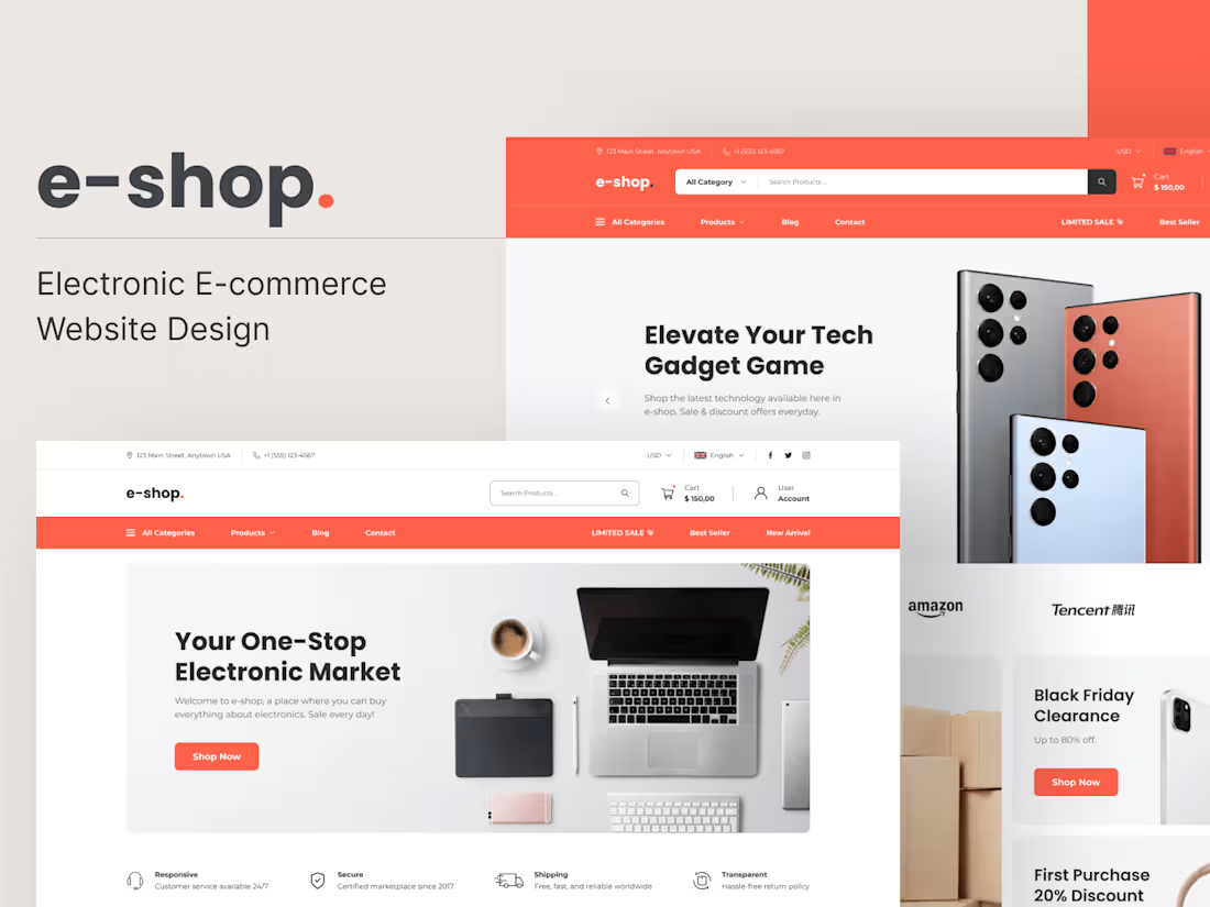
Web design | UI/UX designMark Nader
I specialize in crafting visually stunning, user-friendly digital experiences through a combination of exceptional UI/UX design and strategic brand identity development. I bring a unique blend of creativity and technical expertise, ensuring that every project not only looks great but also functions seamlessly, setting your brand apart in a competitive market. My commitment to detail and personalized approach ensures that each design aligns perfectly with your vision and business goals.
What's included
Design Files
-Complete Figma File: You will receive access to the full Figma file, which contains all the finalized designs for your project. This file includes all screens, components, and assets.
-Organized Pages: The file is organized into clear sections (e.g., Wireframes, UI Design, Components, and Assets) to make navigation and understanding easier.
Design Specifications
-Layout and Spacing: Detailed measurements for margins, padding, and element spacing. This ensures that all components are placed correctly in relation to one another.
-Typography: Information on font families, sizes, weights, line heights, and any text styles used throughout the design.
-Color Palette: A comprehensive color guide, including primary, secondary, and tertiary colors, as well as any gradients, states, and other color usages.
Components and Styles
-Component Library: A set of reusable components (e.g., buttons, input fields, modals) that follow the project's design system. This library allows for consistent and scalable UI development.
-Design System Documentation: A brief overview of the design system, including UI elements, interaction guidelines, and component states (default, hover, active, disabled).
Assets
-Exportable Assets: All necessary icons, images, and illustrations are provided in appropriate formats (SVG, PNG, etc.). These assets are optimized for web and mobile use.
-Responsive Design Assets: Separate designs for different screen sizes (desktop, tablet, mobile) to ensure a responsive experience.
Annotations and Notes
-Developer Annotations: Key notes on specific design elements, such as animations, interactions, and behavior guidelines, are included to ensure the correct implementation of features.
-Accessibility Notes: Information on accessibility considerations (e.g., contrast ratios, text sizes) to make sure the design is inclusive and meets accessibility standards.
Prototype Links
-Interactive Prototypes: Links to interactive prototypes that demonstrate user flow and interactions. This helps in understanding how different screens and components interact.
-Usage Scenarios: Prototypes are set up to showcase various user scenarios and pathways within the application, allowing for a clear understanding of the user experience.
Handoff Documentation
-Handoff Guidelines: A document summarizing key points and guidelines to help the development team understand the design rationale, structure, and usage.
-Handoff Checklist: A checklist to ensure all elements have been covered and there are no gaps in the handoff process.
Feedback and Iterations
-Feedback Loop: An agreed-upon period during which any questions or clarifications from the development team can be addressed promptly. This ensures that any issues are resolved early in the development process.
Access and Permissions
-Figma Access: You will receive the necessary permissions to view, comment, or edit the Figma files as required. This ensures continuous collaboration between the design and development teams.
Mark's other services
Starting at$1,750
Duration1 week
Tags
Adobe XD
Elementor
Figma
Sketch
Webflow
UI Designer
UX Designer
Web Designer
Service provided by
Mark Nader Egypt

Web design | UI/UX designMark Nader
Starting at$1,750
Duration1 week
Tags
Adobe XD
Elementor
Figma
Sketch
Webflow
UI Designer
UX Designer
Web Designer
I specialize in crafting visually stunning, user-friendly digital experiences through a combination of exceptional UI/UX design and strategic brand identity development. I bring a unique blend of creativity and technical expertise, ensuring that every project not only looks great but also functions seamlessly, setting your brand apart in a competitive market. My commitment to detail and personalized approach ensures that each design aligns perfectly with your vision and business goals.
What's included
Design Files
-Complete Figma File: You will receive access to the full Figma file, which contains all the finalized designs for your project. This file includes all screens, components, and assets.
-Organized Pages: The file is organized into clear sections (e.g., Wireframes, UI Design, Components, and Assets) to make navigation and understanding easier.
Design Specifications
-Layout and Spacing: Detailed measurements for margins, padding, and element spacing. This ensures that all components are placed correctly in relation to one another.
-Typography: Information on font families, sizes, weights, line heights, and any text styles used throughout the design.
-Color Palette: A comprehensive color guide, including primary, secondary, and tertiary colors, as well as any gradients, states, and other color usages.
Components and Styles
-Component Library: A set of reusable components (e.g., buttons, input fields, modals) that follow the project's design system. This library allows for consistent and scalable UI development.
-Design System Documentation: A brief overview of the design system, including UI elements, interaction guidelines, and component states (default, hover, active, disabled).
Assets
-Exportable Assets: All necessary icons, images, and illustrations are provided in appropriate formats (SVG, PNG, etc.). These assets are optimized for web and mobile use.
-Responsive Design Assets: Separate designs for different screen sizes (desktop, tablet, mobile) to ensure a responsive experience.
Annotations and Notes
-Developer Annotations: Key notes on specific design elements, such as animations, interactions, and behavior guidelines, are included to ensure the correct implementation of features.
-Accessibility Notes: Information on accessibility considerations (e.g., contrast ratios, text sizes) to make sure the design is inclusive and meets accessibility standards.
Prototype Links
-Interactive Prototypes: Links to interactive prototypes that demonstrate user flow and interactions. This helps in understanding how different screens and components interact.
-Usage Scenarios: Prototypes are set up to showcase various user scenarios and pathways within the application, allowing for a clear understanding of the user experience.
Handoff Documentation
-Handoff Guidelines: A document summarizing key points and guidelines to help the development team understand the design rationale, structure, and usage.
-Handoff Checklist: A checklist to ensure all elements have been covered and there are no gaps in the handoff process.
Feedback and Iterations
-Feedback Loop: An agreed-upon period during which any questions or clarifications from the development team can be addressed promptly. This ensures that any issues are resolved early in the development process.
Access and Permissions
-Figma Access: You will receive the necessary permissions to view, comment, or edit the Figma files as required. This ensures continuous collaboration between the design and development teams.
Mark's other services
$1,750

