
Brand Identity — Logo, Color, GuidelinesSergei Evdokimov
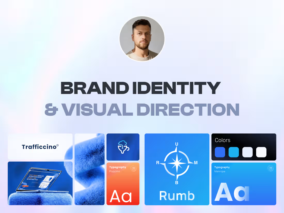
Most brand identities look great in the presentation and fall apart in the product. The palette has no state colors. The typeface has one weight and no scale. The logo works at 400px and turns to mush in a 24px navbar. Nobody notices until a developer has to build something with it.
I design identities that survive contact with real screens, because I also design the interfaces and build the websites they end up on.
Who this is for
SaaS, fintech and AI companies that have grown past the logo a founder made in a weekend. Teams heading into a launch, a raise, or a website rebuild who need the visual side settled before the pages get designed. Founders with a few pieces already, some colors, a font, a deck, but no rules holding them together.
What you get
Positioning, audience, what your competitors look like and where the gaps are. We agree on what the brand has to signal before I open tools.
Concept exploration. Directions in moodboards and early visual routes, refined together until one of them is right.
Logo or wordmark, with the lockups you'll actually use: horizontal, stacked, icon only, plus the small sizes where most logos quietly break.
A type system: pairing, scale, weights, hierarchy rules for both marketing pages and interface text.
A color system with primary, secondary and neutrals, plus the parts that usually get skipped: states, backgrounds, contrast checks against WCAG.
A graphic language. Shapes, grids, icon style, imagery treatment, motion behaviour. The things that make two unrelated pages look like the same company.
Guidelines that people read. Logo usage, spacing, color, type, do and don't examples, delivered in Figma or PDF
An organized asset folder your team can pull from on day one: SVG, PNG, favicons, fonts, source files.
How it runs
Week 1, research and brief. Competitors, audience, positioning, references. You get a written brief before any design starts.
Week 2, concept. Visual routes, color and type directions, the first screen or key surface so you can see the idea in context rather than in the abstract.
Week 3, the system. Logo family, type scale, full palette, graphic language, motion.
Week 4, application and handoff. Real surfaces, guidelines, exports, a walkthrough call.
Four weeks is typical. Bigger scopes get their own timeline agreed before we start.
Probably not a fit
Naming and full messaging strategy, packaging and print-heavy identity work, or a single logo with nothing around it. If you only need a logo, hire a logo designer, it'll cost you less.
Works well with
Most clients take this straight into the Framer website engagement. The identity gets built by the same person who designed it, so nothing gets watered down between the brand file and the live site.
Sergei's other services
Contact for pricing
Duration1 week
Tags
Adobe Illustrator

Brand Identity
Figma

B2B SaaS
Brand Designer
Brand Strategist
Logo Designer
UX Designer
Web Designer
Service provided by
Sergei Evdokimov proArmenia
- $1k+
- Earned
- 1
- Paid projects
- 15
- Followers
Brand Identity — Logo, Color, GuidelinesSergei Evdokimov
Contact for pricing
Duration1 week
Tags
Adobe Illustrator
Brand Identity
Figma
B2B SaaS
Brand Designer
Brand Strategist
Logo Designer
UX Designer
Web Designer
Most brand identities look great in the presentation and fall apart in the product. The palette has no state colors. The typeface has one weight and no scale. The logo works at 400px and turns to mush in a 24px navbar. Nobody notices until a developer has to build something with it.
I design identities that survive contact with real screens, because I also design the interfaces and build the websites they end up on.
Who this is for
SaaS, fintech and AI companies that have grown past the logo a founder made in a weekend. Teams heading into a launch, a raise, or a website rebuild who need the visual side settled before the pages get designed. Founders with a few pieces already, some colors, a font, a deck, but no rules holding them together.
What you get
Positioning, audience, what your competitors look like and where the gaps are. We agree on what the brand has to signal before I open tools.
Concept exploration. Directions in moodboards and early visual routes, refined together until one of them is right.
Logo or wordmark, with the lockups you'll actually use: horizontal, stacked, icon only, plus the small sizes where most logos quietly break.
A type system: pairing, scale, weights, hierarchy rules for both marketing pages and interface text.
A color system with primary, secondary and neutrals, plus the parts that usually get skipped: states, backgrounds, contrast checks against WCAG.
A graphic language. Shapes, grids, icon style, imagery treatment, motion behaviour. The things that make two unrelated pages look like the same company.
Guidelines that people read. Logo usage, spacing, color, type, do and don't examples, delivered in Figma or PDF
An organized asset folder your team can pull from on day one: SVG, PNG, favicons, fonts, source files.
How it runs
Week 1, research and brief. Competitors, audience, positioning, references. You get a written brief before any design starts.
Week 2, concept. Visual routes, color and type directions, the first screen or key surface so you can see the idea in context rather than in the abstract.
Week 3, the system. Logo family, type scale, full palette, graphic language, motion.
Week 4, application and handoff. Real surfaces, guidelines, exports, a walkthrough call.
Four weeks is typical. Bigger scopes get their own timeline agreed before we start.
Probably not a fit
Naming and full messaging strategy, packaging and print-heavy identity work, or a single logo with nothing around it. If you only need a logo, hire a logo designer, it'll cost you less.
Works well with
Most clients take this straight into the Framer website engagement. The identity gets built by the same person who designed it, so nothing gets watered down between the brand file and the live site.
Sergei's other services
Contact for pricing