
User Interface DesignAdebola Kazeem

Adebola is a skilled UI designer who leverages Figma and Illustrator to create user-centered interfaces. His designs prioritize usability and visual appeal.
What's included
User Interface Design Deliverables
High-Fidelity Mockups:
Layout and structure
Typography and colour palette
Imagery and iconography
Interactive elements and microinteractions
Low-Fidelity Wireframes:
Simplified sketches or diagrams of the user interface
Used for initial planning and client feedback
Style Guide:
Color palette
Typography
Iconography
Spacing and layout guidelines
Interactive Prototype:
A clickable prototype that simulates the user experience
Used for testing and user feedback
Source Files:
The original design files (e.g., Figma, Adobe XD)
Asset Library:
A collection of all visual assets used in the design
Includes:
Images
Icons
Illustrations
Fonts
Additional Deliverables (Optional):
User Flow Diagrams: Visual representations of user journeys
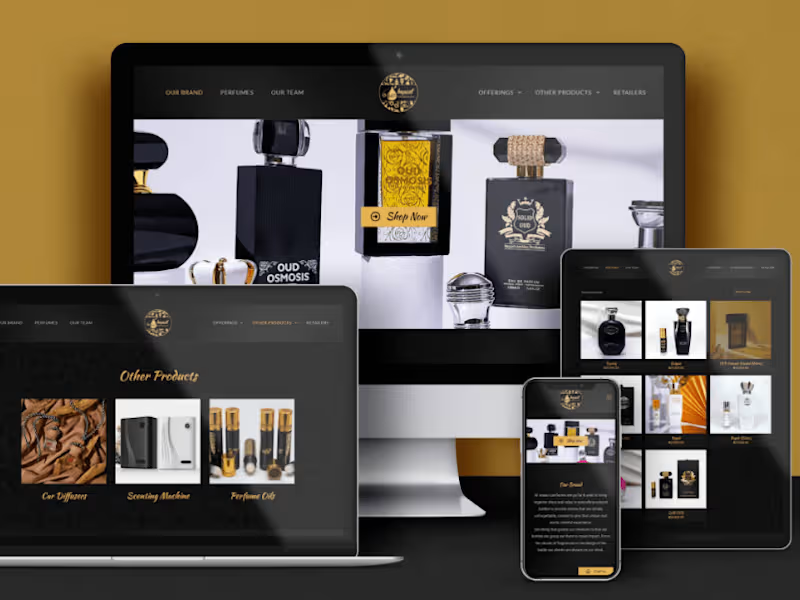
Example work
Adebola's other services

Contact for pricing
Tags
Adobe XD

Figma

UX Designer
UX Engineer
Service provided by
Adebola Kazeem Nigeria
- 5.00
- Rating
- 3
- Followers
User Interface DesignAdebola Kazeem
Adebola is a skilled UI designer who leverages Figma and Illustrator to create user-centered interfaces. His designs prioritize usability and visual appeal.
What's included
User Interface Design Deliverables
High-Fidelity Mockups:
Layout and structure
Typography and colour palette
Imagery and iconography
Interactive elements and microinteractions
Low-Fidelity Wireframes:
Simplified sketches or diagrams of the user interface
Used for initial planning and client feedback
Style Guide:
Color palette
Typography
Iconography
Spacing and layout guidelines
Interactive Prototype:
A clickable prototype that simulates the user experience
Used for testing and user feedback
Source Files:
The original design files (e.g., Figma, Adobe XD)
Asset Library:
A collection of all visual assets used in the design
Includes:
Images
Icons
Illustrations
Fonts
Additional Deliverables (Optional):
User Flow Diagrams: Visual representations of user journeys
Example work
Adebola's other services
Contact for pricing