
Create a Design SystemRyan Tanner
I've built multiple design systems for small to medium companies and I have seen the value they bring in speeding up the development process. Setting you up for speedy development allows nimble development and guerrilla testing of features.
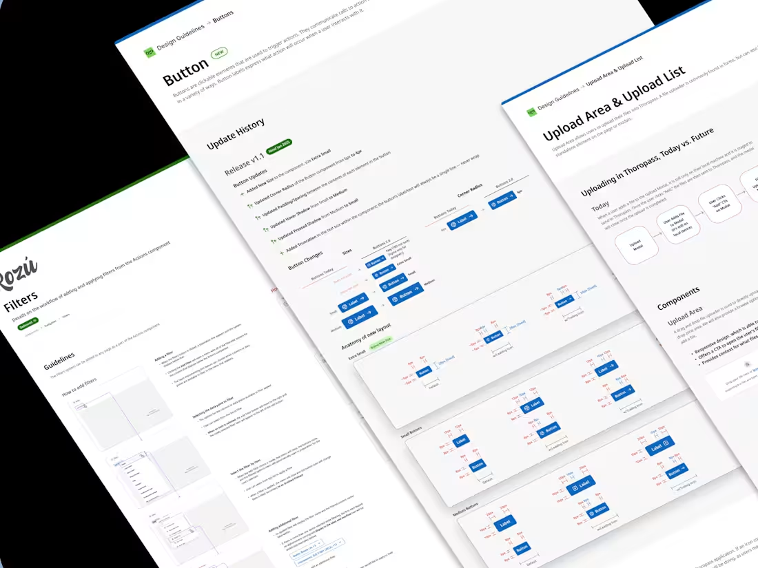
A Design System includes the following:
- Up to 10-20 core components (buttons, inputs, banners, etc.)
- Usage guidelines
- Accessibility guidelines and metrics
- Component anatomy (a how-to-build for engineers)
What's included
Design Language
This will be some of the core principles for communicating with your audience through your product's design:
- Vision
- Design Principles
- Tone of Voice
- Assets
- Guidelines for Accessibility and Copywriting
Foundations
These are the core styles required to build upon for the Design System:
- Color
- Layout
- Typography
- Elevation
- Motion
- Iconography
Core Components
These are the main building blocks for your user interface. A reusable library enhances your product development workflow by reducing design and tech debt, speeding up your process. Examples of core components: buttons, input fields, banners, accordions, etc.
Documentation
Guidelines for the anatomy of the components, how to use them, the dos and don'ts, etc.
Ryan's other services
Contact for pricing
Tags
FigJam
Figma
Product Designer
UX Designer
Visual Designer
Service provided by
Ryan Tanner Ventura, USA
- 7
- Followers
Create a Design SystemRyan Tanner
I've built multiple design systems for small to medium companies and I have seen the value they bring in speeding up the development process. Setting you up for speedy development allows nimble development and guerrilla testing of features.
A Design System includes the following:
- Up to 10-20 core components (buttons, inputs, banners, etc.)
- Usage guidelines
- Accessibility guidelines and metrics
- Component anatomy (a how-to-build for engineers)
What's included
Design Language
This will be some of the core principles for communicating with your audience through your product's design:
- Vision
- Design Principles
- Tone of Voice
- Assets
- Guidelines for Accessibility and Copywriting
Foundations
These are the core styles required to build upon for the Design System:
- Color
- Layout
- Typography
- Elevation
- Motion
- Iconography
Core Components
These are the main building blocks for your user interface. A reusable library enhances your product development workflow by reducing design and tech debt, speeding up your process. Examples of core components: buttons, input fields, banners, accordions, etc.
Documentation
Guidelines for the anatomy of the components, how to use them, the dos and don'ts, etc.
Ryan's other services
Contact for pricing