
SaaS UI/UX Design That Reduces ChurnNazar Koliano
Users sign up for your product. They poke around for a few days. Then they quietly cancel. Support tickets pile up for things that should be obvious. Your churn rate keeps climbing, and you're not sure if it's the product or the interface.
It's almost always the interface.
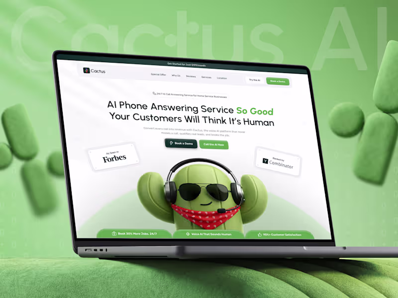
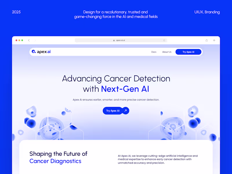
I redesign SaaS products and web applications so users actually understand them, adopt them, and keep paying for them. Not because the UI looks trendy, but because every interaction removes confusion and builds confidence in your product.
What's actually causing your churn:
Onboarding that dumps features instead of delivering value in the first 5 minutes
Navigation that makes sense to your team but confuses everyone else
Key actions buried 3 clicks deep when they should be 1
No visual feedback when users complete important tasks
Inconsistent UI patterns that erode trust over time
My process:
Product + user audit — I walk through your app, identify where users get stuck, and map the friction points killing retention
Competitor analysis — What are the best products in your space doing that you're not?
Information architecture — Restructure navigation, feature grouping, and data hierarchy for intuitive access
Wireframes + flow validation — Test the new structure before committing to visual design
Moodboard + visual direction — 2 style concepts aligned with your brand and user expectations
High-fidelity UI design — Every screen, state, modal, and edge case designed to production quality
Design system — Modular component library your engineers can implement systematically
Dev handoff + support — Organized Figma file, Loom walkthrough, and availability for implementation questions
Proof this works:
$20M+ profit generated for a single client after SaaS redesign
+34% Day-7 retention after onboarding redesign
+27% activation rate improvement after first-session restructure
30% LTV increase after UI/UX redesign
55,000+ paid subscriptions driven by redesigned onboarding
30% free-to-paid subscription conversion
What you get:
UX audit with prioritized findings
Redesigned core flows (onboarding, dashboard, key actions)
High-fidelity screens with all states (empty, loading, error, success)
Modular design system (50-100+ components)
Responsive guidelines (desktop + tablet + mobile)
Dev-ready Figma file with organized naming and specs
Recorded Loom walkthrough for your engineering team
This is for you if:
Your SaaS has growing churn you can't fully explain
Your product works technically but feels "clunky" to users
You're preparing for a major redesign or v2 launch
Your team ships features fast but the overall UX has become inconsistent
You need your product to feel as polished as the competition
13 years in UI/UX design. 100+ products launched. $150M+ earned by clients.
Let's talk about your product: https://yasno-design-agency.plutio.com/p/scheduler/wjRkDFmeDrKLg2YYP
FAQs
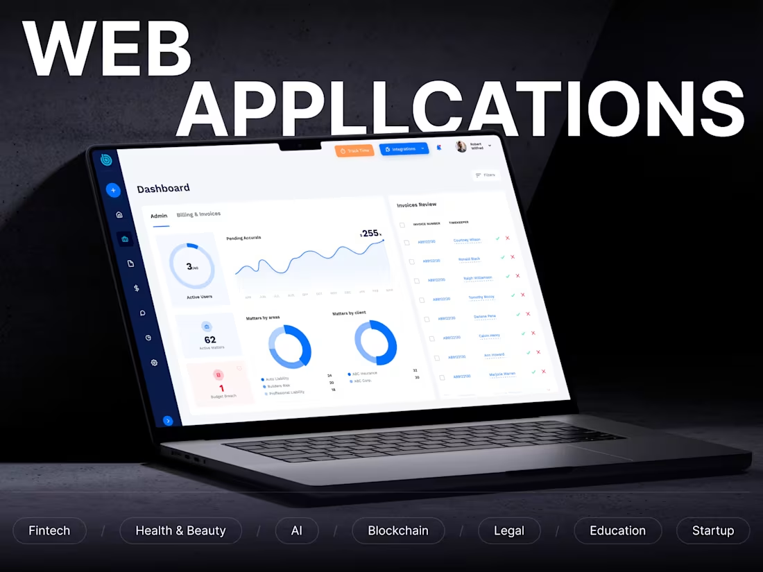
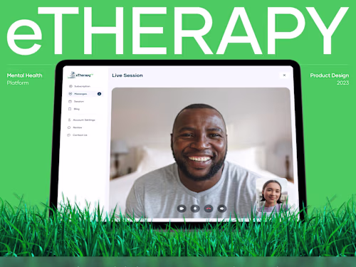
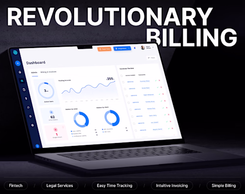
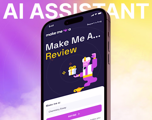
Example work
Contact for pricing
Tags
Adobe Photoshop
Claude
Figma
Relume
Interaction Designer
Mobile Designer
UI Designer
UX Designer
Web Designer
Service provided by
Nazar Koliano proKyiv, 02000
- $25k+
- Earned
- 14
- Paid projects
- 4.93
- Rating
- 156
- Followers
SaaS UI/UX Design That Reduces ChurnNazar Koliano
Contact for pricing
Tags
Adobe Photoshop
Claude
Figma
Relume
Interaction Designer
Mobile Designer
UI Designer
UX Designer
Web Designer
Users sign up for your product. They poke around for a few days. Then they quietly cancel. Support tickets pile up for things that should be obvious. Your churn rate keeps climbing, and you're not sure if it's the product or the interface.
It's almost always the interface.
I redesign SaaS products and web applications so users actually understand them, adopt them, and keep paying for them. Not because the UI looks trendy, but because every interaction removes confusion and builds confidence in your product.
What's actually causing your churn:
Onboarding that dumps features instead of delivering value in the first 5 minutes
Navigation that makes sense to your team but confuses everyone else
Key actions buried 3 clicks deep when they should be 1
No visual feedback when users complete important tasks
Inconsistent UI patterns that erode trust over time
My process:
Product + user audit — I walk through your app, identify where users get stuck, and map the friction points killing retention
Competitor analysis — What are the best products in your space doing that you're not?
Information architecture — Restructure navigation, feature grouping, and data hierarchy for intuitive access
Wireframes + flow validation — Test the new structure before committing to visual design
Moodboard + visual direction — 2 style concepts aligned with your brand and user expectations
High-fidelity UI design — Every screen, state, modal, and edge case designed to production quality
Design system — Modular component library your engineers can implement systematically
Dev handoff + support — Organized Figma file, Loom walkthrough, and availability for implementation questions
Proof this works:
$20M+ profit generated for a single client after SaaS redesign
+34% Day-7 retention after onboarding redesign
+27% activation rate improvement after first-session restructure
30% LTV increase after UI/UX redesign
55,000+ paid subscriptions driven by redesigned onboarding
30% free-to-paid subscription conversion
What you get:
UX audit with prioritized findings
Redesigned core flows (onboarding, dashboard, key actions)
High-fidelity screens with all states (empty, loading, error, success)
Modular design system (50-100+ components)
Responsive guidelines (desktop + tablet + mobile)
Dev-ready Figma file with organized naming and specs
Recorded Loom walkthrough for your engineering team
This is for you if:
Your SaaS has growing churn you can't fully explain
Your product works technically but feels "clunky" to users
You're preparing for a major redesign or v2 launch
Your team ships features fast but the overall UX has become inconsistent
You need your product to feel as polished as the competition
13 years in UI/UX design. 100+ products launched. $150M+ earned by clients.
Let's talk about your product: https://yasno-design-agency.plutio.com/p/scheduler/wjRkDFmeDrKLg2YYP
FAQs
Example work
Contact for pricing