
App DesignEl-shaddai Oche
Design Services for Websites, Mobile Apps, and UI/UX
We offer a comprehensive service package for new designs or redesigns of websites, mobile apps, web apps, and landing pages. Our experienced design team is dedicated to delivering visually stunning solutions that optimize user interface (UI) and user experience (UX), enhancing user engagement and overall effectiveness.
Deliverable of UX Design Services
User Journey Maps: Visual representations of the user’s journey through the application or website, highlighting their interactions, thoughts, and feelings at each stage. This helps in understanding the user experience from start to finish.
Information Architecture: A sitemap outlining the structure of the application or website, illustrating how different pages and features are organized and connected.
Wireframes: Low-fidelity wireframes for key screens that demonstrate the layout, navigation, and functionality of the design. These serve as blueprints for the visual design and development phases.
Prototypes: Interactive prototypes that allow stakeholders to experience the design in action. These prototypes showcase the flow and functionality of the user interface.
Design Specifications: Detailed guidelines for the visual design, including color palettes, typography, icons, and other UI elements that should be used in the final product. This ensures consistency across the application.
Deliverable of UI Design Services
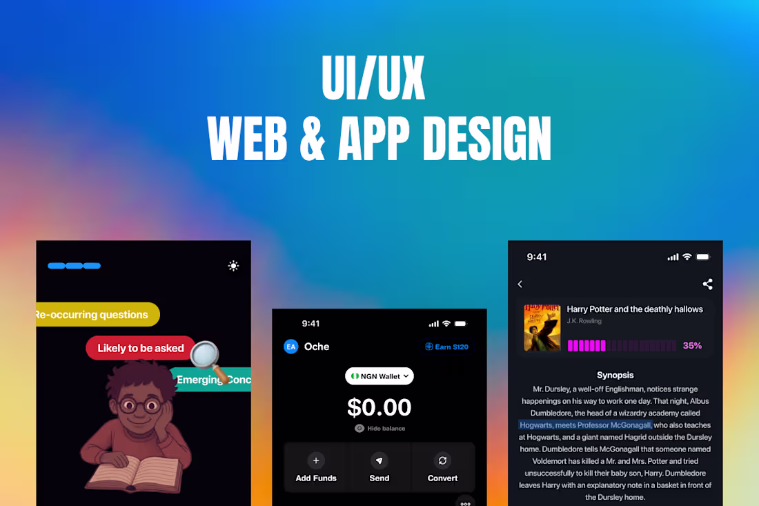
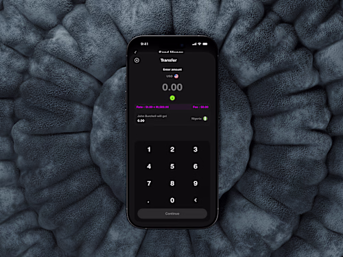
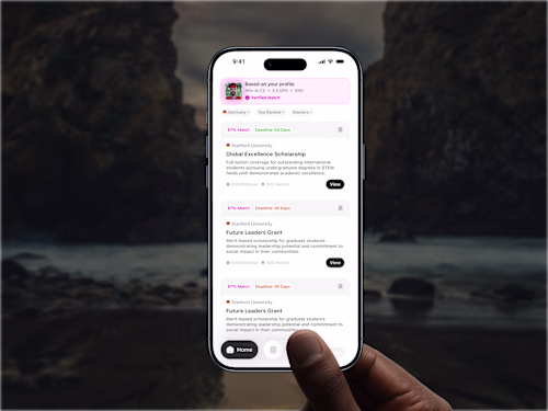
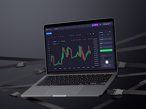
High-Fidelity Mockups: Detailed, pixel-perfect designs of each screen that demonstrate the visual aesthetics, including colors, typography, icons, and layout. These mockups provide a clear representation of the final product.
Interactive Prototypes: Clickable prototypes that simulate the user interface and interactions, allowing stakeholders to experience the flow and functionality of the design. This helps in gathering feedback before development.
Design Specifications: Detailed specifications for developers, including dimensions, spacing, and behavior of UI elements. This ensures that the development team accurately implements the design.
Responsive Design Guidelines: Guidelines on how the UI should adapt across different devices and screen sizes. This includes breakpoints and design adjustments to ensure a seamless experience on mobile, tablet, and desktop.
Collaboration Tools Access: Access to collaborative tools (such as Figma or Adobe XD) where the design files are hosted. This allows for real-time collaboration and feedback during the implementation phase.
Example work
El-shaddai's other services
Starting at$1,500
Duration1 week
Tags
Figma
Sketch
Interaction Designer
Mobile Designer
Service provided by
El-shaddai Oche Abuja, Nigeria
- 5.00
- Rating
- 25
- Followers
App DesignEl-shaddai Oche
Design Services for Websites, Mobile Apps, and UI/UX
We offer a comprehensive service package for new designs or redesigns of websites, mobile apps, web apps, and landing pages. Our experienced design team is dedicated to delivering visually stunning solutions that optimize user interface (UI) and user experience (UX), enhancing user engagement and overall effectiveness.
Deliverable of UX Design Services
User Journey Maps: Visual representations of the user’s journey through the application or website, highlighting their interactions, thoughts, and feelings at each stage. This helps in understanding the user experience from start to finish.
Information Architecture: A sitemap outlining the structure of the application or website, illustrating how different pages and features are organized and connected.
Wireframes: Low-fidelity wireframes for key screens that demonstrate the layout, navigation, and functionality of the design. These serve as blueprints for the visual design and development phases.
Prototypes: Interactive prototypes that allow stakeholders to experience the design in action. These prototypes showcase the flow and functionality of the user interface.
Design Specifications: Detailed guidelines for the visual design, including color palettes, typography, icons, and other UI elements that should be used in the final product. This ensures consistency across the application.
Deliverable of UI Design Services
High-Fidelity Mockups: Detailed, pixel-perfect designs of each screen that demonstrate the visual aesthetics, including colors, typography, icons, and layout. These mockups provide a clear representation of the final product.
Interactive Prototypes: Clickable prototypes that simulate the user interface and interactions, allowing stakeholders to experience the flow and functionality of the design. This helps in gathering feedback before development.
Design Specifications: Detailed specifications for developers, including dimensions, spacing, and behavior of UI elements. This ensures that the development team accurately implements the design.
Responsive Design Guidelines: Guidelines on how the UI should adapt across different devices and screen sizes. This includes breakpoints and design adjustments to ensure a seamless experience on mobile, tablet, and desktop.
Collaboration Tools Access: Access to collaborative tools (such as Figma or Adobe XD) where the design files are hosted. This allows for real-time collaboration and feedback during the implementation phase.
Example work
El-shaddai's other services
$1,500