
UX/UI Design for Digital Platforms (Web, App, WatchOS)Daniel Palma
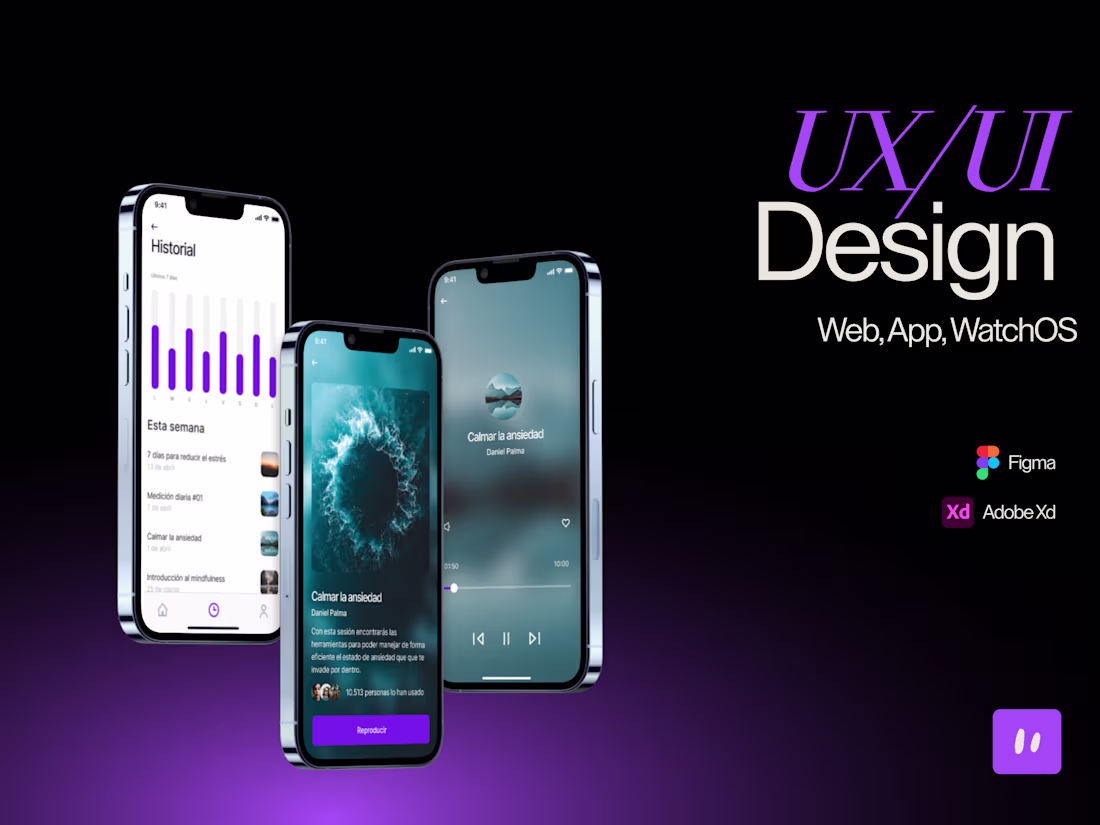
I design clean, intuitive and emotionally engaging digital interfaces for web, app and platform products. Every project is built in Figma, with a strategic UX flow and pixel-perfect UI. Let’s create visuals that show your brand’s soul — and make your users feel at home.
What's included
Project Brief & Creative Direction
Client goals, target users, visual tone, UX priorities, and product scope, documented and aligned before design begins.
User Flow & Wireframes
Low-fidelity wireframes in Figma for web, app, or platform screens. UX structure designed for clarity and navigation logic.
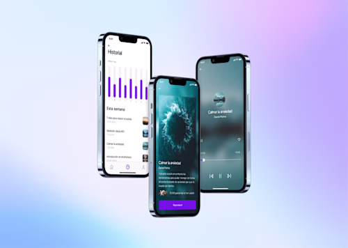
High-Fidelity UI Design
Final UI mockups in Figma with pixel-perfect components, layout hierarchy, typography, and responsive design for all screens.
Design System & Style Guide
Color palette, typography, components, icons, buttons, spacing, and usage rules. All documented in a scalable Figma file.
Usability Testing & Iteration (Optional)
Feedback loop from early users or team with iteration rounds to refine UX and improve usability and visual consistency.
FAQs


Contact for pricing
Tags
Adobe XD
Figma
Notion
ProtoPie
Sketch
UI Designer
UX Designer
UX Engineer
Service provided by
Daniel Palma Leganés, Spain
- 2
- Followers
UX/UI Design for Digital Platforms (Web, App, WatchOS)Daniel Palma
Contact for pricing
Tags
Adobe XD
Figma
Notion
ProtoPie
Sketch
UI Designer
UX Designer
UX Engineer
I design clean, intuitive and emotionally engaging digital interfaces for web, app and platform products. Every project is built in Figma, with a strategic UX flow and pixel-perfect UI. Let’s create visuals that show your brand’s soul — and make your users feel at home.
What's included
Project Brief & Creative Direction
Client goals, target users, visual tone, UX priorities, and product scope, documented and aligned before design begins.
User Flow & Wireframes
Low-fidelity wireframes in Figma for web, app, or platform screens. UX structure designed for clarity and navigation logic.
High-Fidelity UI Design
Final UI mockups in Figma with pixel-perfect components, layout hierarchy, typography, and responsive design for all screens.
Design System & Style Guide
Color palette, typography, components, icons, buttons, spacing, and usage rules. All documented in a scalable Figma file.
Usability Testing & Iteration (Optional)
Feedback loop from early users or team with iteration rounds to refine UX and improve usability and visual consistency.
FAQs
Contact for pricing