
Responsive Web DesignAlexander Sevilla
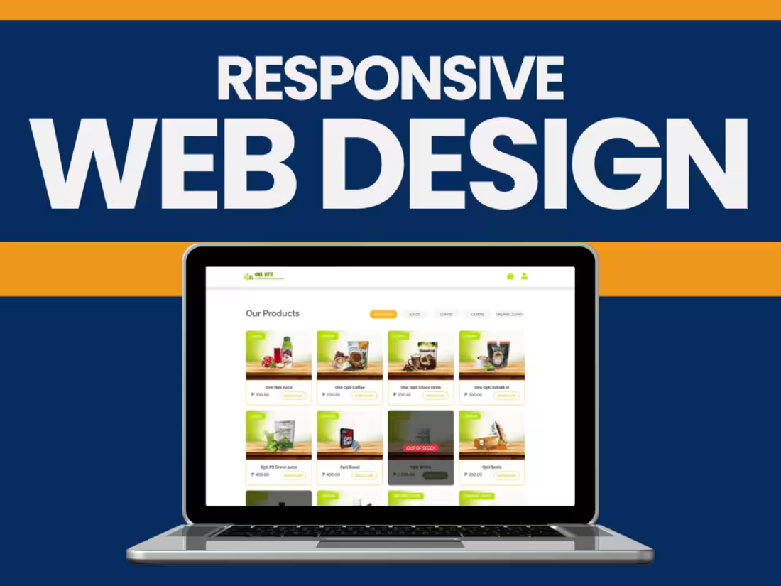
We leverage the concept of mobile-first design. Through our work, we focus on designing an experience that works across different screen sizes.
What's included
Planning and Research Deliverables
Project Brief:
A document outlining the goals, target audience, and key design considerations for the responsive website.
Wireframes (Low-Fidelity):
Device-specific wireframes for desktop, tablet, and mobile to outline the layout and structure.
Responsive Grid System:
A defined grid system (e.g., Bootstrap or custom grid) is used to ensure consistency across all screen sizes.
Design Deliverables
High-Fidelity Mockups:
Mockups for key breakpoints: desktop, tablet, and mobile (e.g., 1440px, 768px, 375px).
Pixel-perfect designs showcasing how elements will adapt to different screen sizes.
Typography Scaling:
A style guide specifying font sizes, line heights, and weights for each device type.
Color Palette and Theme:
Defined colors with accessible contrast ratios for all screen sizes.
UI Components:
A library of reusable components like buttons, navigation menus, and forms designed for responsiveness.
Style Guide:
Documentation for branding elements, spacing, and visual hierarchy adapted for responsiveness.
Development Deliverables
Responsive HTML and CSS Code:
Clean, semantic HTML and CSS files optimized for responsiveness.
Media Queries:
Breakpoints are implemented in the CSS to adjust layouts for various devices.
Flexible Grid and Layouts:
Grid-based structure using frameworks (e.g., Bootstrap, Tailwind) or custom CSS.
Fluid Images and Videos:
Media that scales proportionally and maintains aspect ratios across screen sizes.
Testing Results for CSS Frameworks:
Verification of how frameworks like Bootstrap or custom grids perform.
Interactive Elements
Responsive Navigation Menus:
Fully functional menus that adapt to smaller screens (e.g., dropdown or hamburger menus).
Touch-Friendly Elements:
Interactive elements optimized for touch devices (e.g., larger buttons, proper spacing).
Responsive Forms:
Forms that scale correctly and maintain usability on all devices.
Testing and Quality Assurance
Cross-Browser Testing Report:
Compatibility verified on major browsers (Chrome, Firefox, Safari, Edge, etc.).
Device-Specific Testing:
Testing was performed on different screen sizes (e.g., desktops, tablets, smartphones).
Performance Optimization:
Minimized CSS, JS, and image files for faster loading on mobile devices.
Lighthouse report for mobile and desktop performance.
Accessibility Compliance Testing:
WCAG-compliant design for usability by all users.
Documentation
Responsive Design Guidelines:
Detailed documentation for maintaining and extending the responsive design.
Codebase Documentation:
Comments in the code explaining media queries, grid setup, and breakpoints.
Handoff Files:
Final design files (Figma, Adobe XD, Sketch).
Development files and assets (HTML, CSS, JS, images).
Deployment and Post-Launch Deliverables
Live Website:
Fully responsive website deployed to a staging or live server.
Training for Content Management (Optional):
Guidance for updating content within the responsive framework.
Post-Launch Support (Optional):
A plan for handling feedback, bugs, and improvements after deployment.
Alexander's other services
Contact for pricing
Tags
Adobe XD
Elementor
Figma
Sketch
Webflow
Frontend Engineer
UX Designer
Web Developer
Service provided by
Alexander Sevilla Bacoor, Philippines
Responsive Web DesignAlexander Sevilla
Contact for pricing
Tags
Adobe XD
Elementor
Figma
Sketch
Webflow
Frontend Engineer
UX Designer
Web Developer
We leverage the concept of mobile-first design. Through our work, we focus on designing an experience that works across different screen sizes.
What's included
Planning and Research Deliverables
Project Brief:
A document outlining the goals, target audience, and key design considerations for the responsive website.
Wireframes (Low-Fidelity):
Device-specific wireframes for desktop, tablet, and mobile to outline the layout and structure.
Responsive Grid System:
A defined grid system (e.g., Bootstrap or custom grid) is used to ensure consistency across all screen sizes.
Design Deliverables
High-Fidelity Mockups:
Mockups for key breakpoints: desktop, tablet, and mobile (e.g., 1440px, 768px, 375px).
Pixel-perfect designs showcasing how elements will adapt to different screen sizes.
Typography Scaling:
A style guide specifying font sizes, line heights, and weights for each device type.
Color Palette and Theme:
Defined colors with accessible contrast ratios for all screen sizes.
UI Components:
A library of reusable components like buttons, navigation menus, and forms designed for responsiveness.
Style Guide:
Documentation for branding elements, spacing, and visual hierarchy adapted for responsiveness.
Development Deliverables
Responsive HTML and CSS Code:
Clean, semantic HTML and CSS files optimized for responsiveness.
Media Queries:
Breakpoints are implemented in the CSS to adjust layouts for various devices.
Flexible Grid and Layouts:
Grid-based structure using frameworks (e.g., Bootstrap, Tailwind) or custom CSS.
Fluid Images and Videos:
Media that scales proportionally and maintains aspect ratios across screen sizes.
Testing Results for CSS Frameworks:
Verification of how frameworks like Bootstrap or custom grids perform.
Interactive Elements
Responsive Navigation Menus:
Fully functional menus that adapt to smaller screens (e.g., dropdown or hamburger menus).
Touch-Friendly Elements:
Interactive elements optimized for touch devices (e.g., larger buttons, proper spacing).
Responsive Forms:
Forms that scale correctly and maintain usability on all devices.
Testing and Quality Assurance
Cross-Browser Testing Report:
Compatibility verified on major browsers (Chrome, Firefox, Safari, Edge, etc.).
Device-Specific Testing:
Testing was performed on different screen sizes (e.g., desktops, tablets, smartphones).
Performance Optimization:
Minimized CSS, JS, and image files for faster loading on mobile devices.
Lighthouse report for mobile and desktop performance.
Accessibility Compliance Testing:
WCAG-compliant design for usability by all users.
Documentation
Responsive Design Guidelines:
Detailed documentation for maintaining and extending the responsive design.
Codebase Documentation:
Comments in the code explaining media queries, grid setup, and breakpoints.
Handoff Files:
Final design files (Figma, Adobe XD, Sketch).
Development files and assets (HTML, CSS, JS, images).
Deployment and Post-Launch Deliverables
Live Website:
Fully responsive website deployed to a staging or live server.
Training for Content Management (Optional):
Guidance for updating content within the responsive framework.
Post-Launch Support (Optional):
A plan for handling feedback, bugs, and improvements after deployment.
Alexander's other services
Contact for pricing