
Design system and component library in FigmaDaniel Petrevski
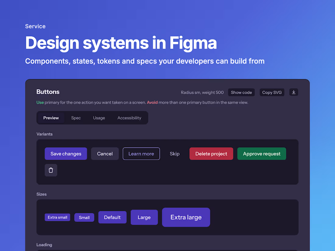
A component library built for the product you have, not a generic UI kit. Every component comes with its variants, states and usage rules, so your team designs faster and developers build each part once.
What's included
An audit of your current screens and the patterns they repeat
Tokens for colour, type, spacing and corner radius
Components with variants, states and auto layout
Light and dark mode, with text contrast checked against WCAG AA
Usage notes: when to use each component and when not to
See how I build one
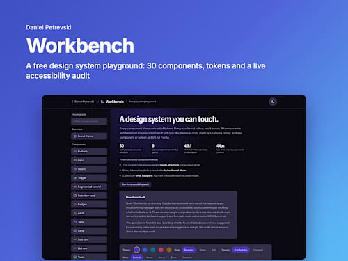
Workbench is my free, live design system: 30 components, three real screens built from them and an accessibility audit you can run yourself. Open it at danielpetrevski.com/workbench.
Example work
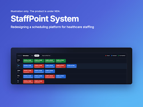
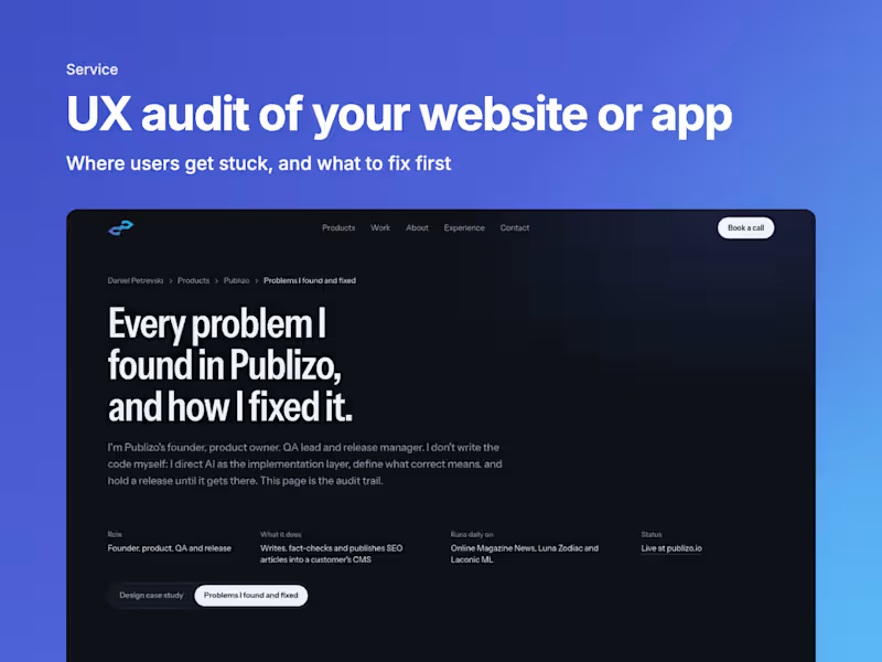
Daniel's other services

Starting at$60 /hr
Tags
Figma

Product Designer
UI Designer
Service provided by
Daniel Petrevski North Macedonia
- 2
- Followers
Design system and component library in FigmaDaniel Petrevski
A component library built for the product you have, not a generic UI kit. Every component comes with its variants, states and usage rules, so your team designs faster and developers build each part once.
What's included
An audit of your current screens and the patterns they repeat
Tokens for colour, type, spacing and corner radius
Components with variants, states and auto layout
Light and dark mode, with text contrast checked against WCAG AA
Usage notes: when to use each component and when not to
See how I build one
Workbench is my free, live design system: 30 components, three real screens built from them and an accessibility audit you can run yourself. Open it at danielpetrevski.com/workbench.
Example work
Daniel's other services
$60 /hr