
Website Design · Figma · Conversion-FocusedAjeya S

The hard part of a website isn't the page count. It's the 5 seconds someone spends deciding whether to trust you or leave.
That's the window I design for. I build responsive websites in Figma for consumer startups (grounded in research, psychology insights & data).
What you get
Responsive design, up to 10 pages. Fully designed, responsive website in Figma, including desktop and mobile screens, scroll animations, and clean layouts that align with your brand.
Interactive prototype. Clickable, covering the main user flows, so you can feel the site before it's built.
Developer handoff. Organized file with components, spacing, type, and specs. Your developer shouldn't have to ask you questions.
Unlimited revisions. Design isn't done until it feels right, within the scope we agree on at the start.
Copywriting is included. If development is needed, we can build it directly in Claude.
My design process
The approach depends on the problem, and it changes based on constraints and context. But at a high level, here's how a 6-week website project unfolds:
Week 1: Understanding the problem
I dig into your goals and any existing data, analytics, feedback, whatever exists, to find where the real friction is.
Week 2: Defining goals and constraints
I map out what the site needs to do, who it's for, and what limits, timeline, brand, technical, shape the work. This upfront alignment is what saves a rebuild later.
Week 3: Exploring directions based on insight, not decoration
Once the real problem is clear, I sketch a few directions, each solving it differently.
Weeks 4–5: Building and iterating
I move into high-fidelity design, prototyping the flows that matter most, refining based on your feedback as we go.
Week 6: Delivering dev-ready
Every file ships organized: components, specs, states. Built so your developer isn't guessing.
After launch: Measuring what happens
Finally, I check what the numbers say afterward. I care about whether the final result performs, not just whether it looks good.
FAQs
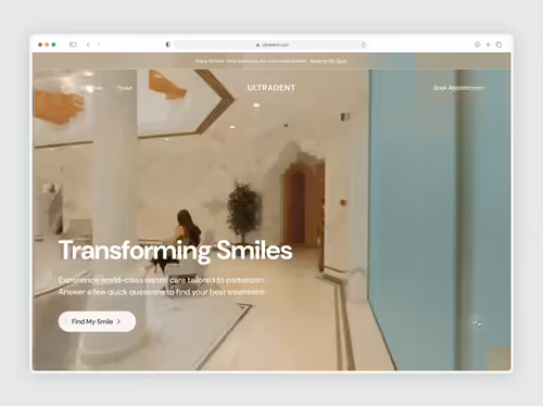
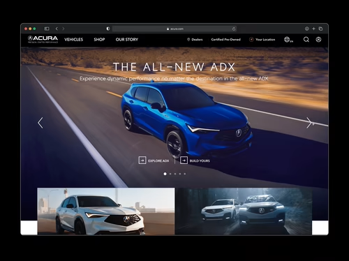
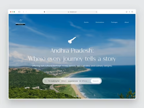
Example work
Starting at$1,999
Duration6 weeks
Tags
Figma

Framer

Google Analytics

Jitter

Product Designer
UI Designer
Web Designer
Service provided by
Ajeya S proBengaluru, India
- $1k+
- Earned
- 2
- Paid projects
- 5.00
- Rating
- 84
- Followers
Website Design · Figma · Conversion-FocusedAjeya S
Starting at$1,999
Duration6 weeks
Tags
Figma
Framer
Google Analytics
Jitter
Product Designer
UI Designer
Web Designer
The hard part of a website isn't the page count. It's the 5 seconds someone spends deciding whether to trust you or leave.
That's the window I design for. I build responsive websites in Figma for consumer startups (grounded in research, psychology insights & data).
What you get
Responsive design, up to 10 pages. Fully designed, responsive website in Figma, including desktop and mobile screens, scroll animations, and clean layouts that align with your brand.
Interactive prototype. Clickable, covering the main user flows, so you can feel the site before it's built.
Developer handoff. Organized file with components, spacing, type, and specs. Your developer shouldn't have to ask you questions.
Unlimited revisions. Design isn't done until it feels right, within the scope we agree on at the start.
Copywriting is included. If development is needed, we can build it directly in Claude.
My design process
The approach depends on the problem, and it changes based on constraints and context. But at a high level, here's how a 6-week website project unfolds:
Week 1: Understanding the problem
I dig into your goals and any existing data, analytics, feedback, whatever exists, to find where the real friction is.
Week 2: Defining goals and constraints
I map out what the site needs to do, who it's for, and what limits, timeline, brand, technical, shape the work. This upfront alignment is what saves a rebuild later.
Week 3: Exploring directions based on insight, not decoration
Once the real problem is clear, I sketch a few directions, each solving it differently.
Weeks 4–5: Building and iterating
I move into high-fidelity design, prototyping the flows that matter most, refining based on your feedback as we go.
Week 6: Delivering dev-ready
Every file ships organized: components, specs, states. Built so your developer isn't guessing.
After launch: Measuring what happens
Finally, I check what the numbers say afterward. I care about whether the final result performs, not just whether it looks good.
FAQs
Example work
$1,999