
Figma Multi-page & Marketing Website UI/UX DesignMabel Okeke
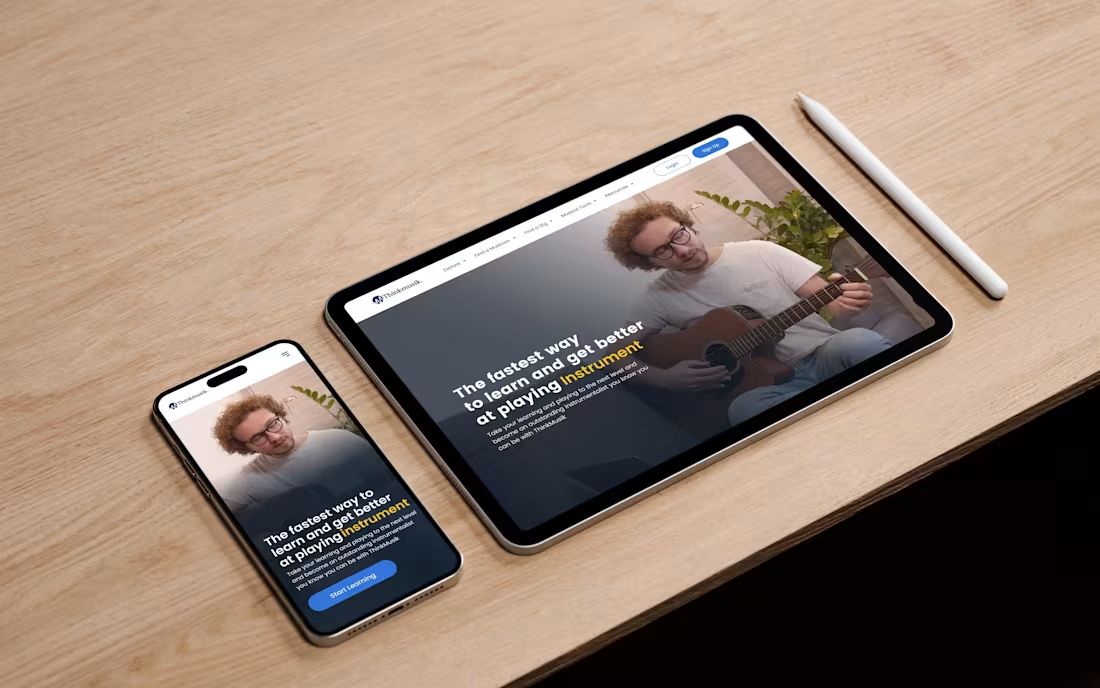
I design high-performing marketing websites in Figma that balance strong visual appeal with strategy and usability. My focus is on creating clean, conversion-driven designs that engage your audience and reflect your brand’s identity across every screen size.
From responsive layouts to interactive prototypes, I make sure every element feels intentional and easy to use. You’ll receive pixel-perfect designs, reusable components, and a complete style guide, making developer handoff simple and setting your site up for long-term growth.
Let’s build a marketing website that not only looks incredible but also works hard for your business.
What's included
Figma Design Files
Neatly Structured Layers: Every frame and layer is clearly labeled for easy navigation and collaboration.
Reusable Components: Buttons, forms, headers, and other elements are built as components for easy updates and scalability.
Auto Layouts: Flexible layouts that adapt seamlessly when content or screen sizes change.
Interactive Prototypes
Clickable Flows: Interactive prototypes that let you experience the website before it’s built.
Testing Ready: Perfect for internal reviews or quick usability testing with your team or clients.
Device Views: Separate prototypes for desktop, tablet, and mobile for realistic previews.
Visual Style Guide
Typography System: Font styles, sizes, and weights defined for clarity and hierarchy.
Color System: A balanced palette with accessible contrast ratios across primary and neutral tones.
UI Elements: Core components like buttons, inputs, and cards are designed for consistency.
Layout & Spacing Rules: Clear padding, margin, and grid guidelines for uniform structure.
Developer Handoff Package
Figma Dev Mode Enabled: Makes inspecting design specs and exporting assets straightforward.
Interaction Notes: Clear documentation for transitions, states, and behaviors.
Optimized Assets: Exportable SVGs, PNGs, and icons prepared for use in development.
Responsive Guidance: Defined breakpoints and resizing rules for adaptive, responsive builds.
FAQs
Example work
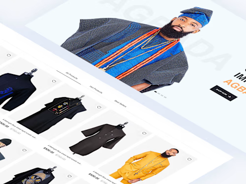

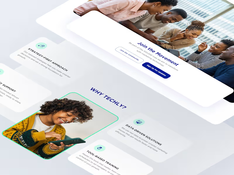
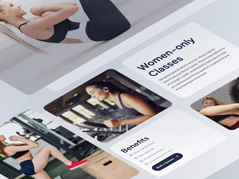
Contact for pricing
Duration1 week
Tags
FigJam

Figma
Jitter

Loom

Slack

UI Designer
UX Designer
Web Designer
Service provided by
Mabel Okeke Lagos, Nigeria
- 5
- Followers
Figma Multi-page & Marketing Website UI/UX DesignMabel Okeke
Contact for pricing
Duration1 week
Tags
FigJam
Figma
Jitter
Loom
Slack
UI Designer
UX Designer
Web Designer
I design high-performing marketing websites in Figma that balance strong visual appeal with strategy and usability. My focus is on creating clean, conversion-driven designs that engage your audience and reflect your brand’s identity across every screen size.
From responsive layouts to interactive prototypes, I make sure every element feels intentional and easy to use. You’ll receive pixel-perfect designs, reusable components, and a complete style guide, making developer handoff simple and setting your site up for long-term growth.
Let’s build a marketing website that not only looks incredible but also works hard for your business.
What's included
Figma Design Files
Neatly Structured Layers: Every frame and layer is clearly labeled for easy navigation and collaboration.
Reusable Components: Buttons, forms, headers, and other elements are built as components for easy updates and scalability.
Auto Layouts: Flexible layouts that adapt seamlessly when content or screen sizes change.
Interactive Prototypes
Clickable Flows: Interactive prototypes that let you experience the website before it’s built.
Testing Ready: Perfect for internal reviews or quick usability testing with your team or clients.
Device Views: Separate prototypes for desktop, tablet, and mobile for realistic previews.
Visual Style Guide
Typography System: Font styles, sizes, and weights defined for clarity and hierarchy.
Color System: A balanced palette with accessible contrast ratios across primary and neutral tones.
UI Elements: Core components like buttons, inputs, and cards are designed for consistency.
Layout & Spacing Rules: Clear padding, margin, and grid guidelines for uniform structure.
Developer Handoff Package
Figma Dev Mode Enabled: Makes inspecting design specs and exporting assets straightforward.
Interaction Notes: Clear documentation for transitions, states, and behaviors.
Optimized Assets: Exportable SVGs, PNGs, and icons prepared for use in development.
Responsive Guidance: Defined breakpoints and resizing rules for adaptive, responsive builds.
FAQs
Example work
Contact for pricing