Custom KPI Dashboard (Standard)Bright Mike
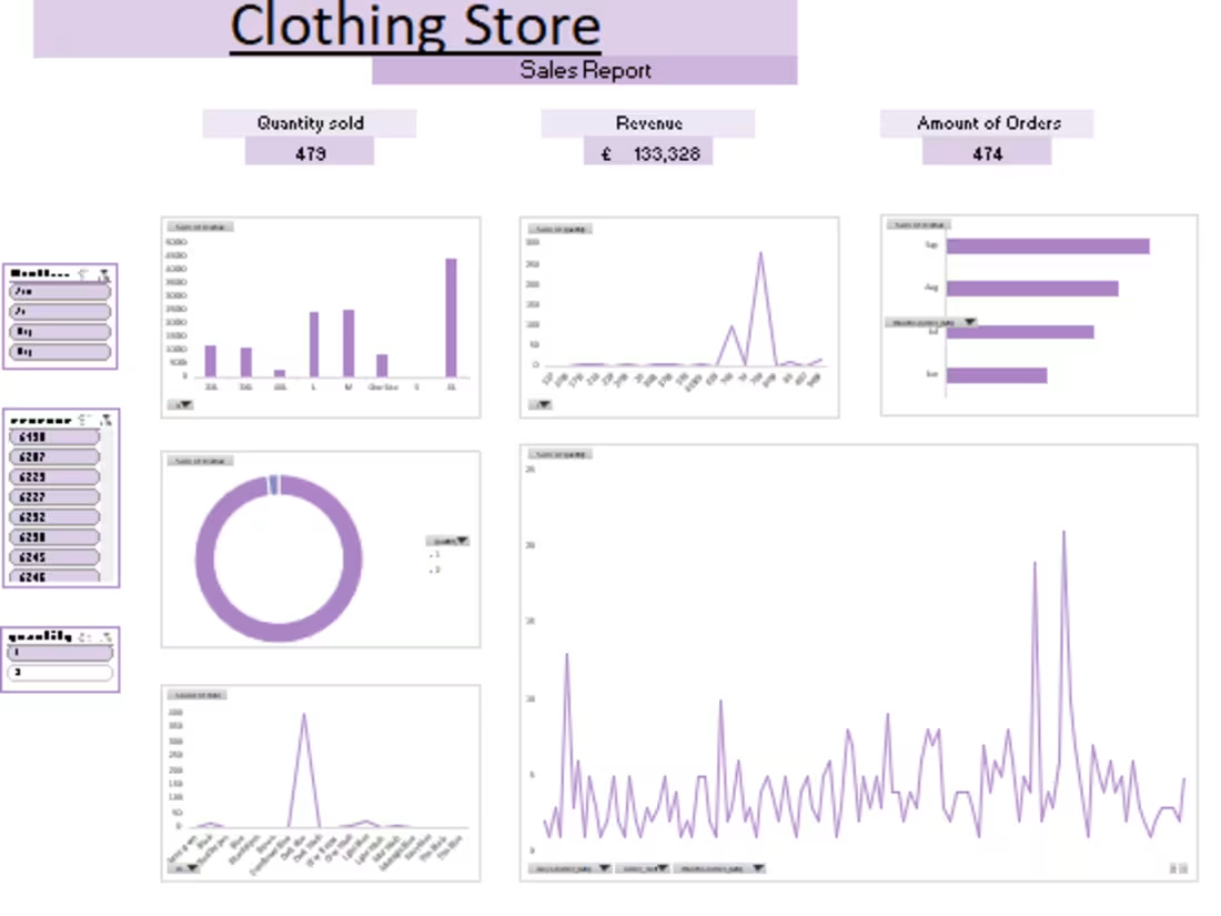
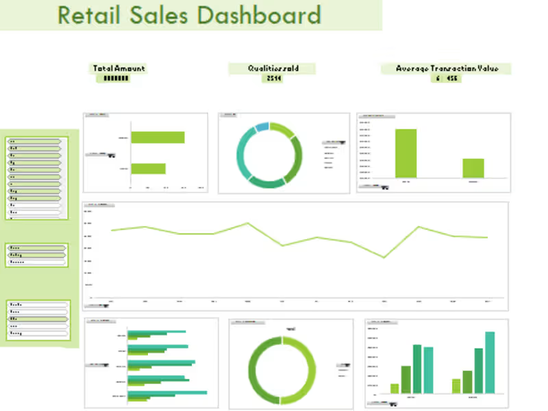
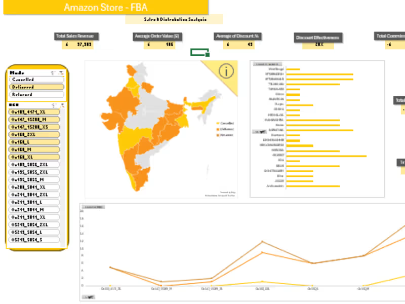
I offer custom KPI dashboards in Excel tailored to businesses of all sizes, helping you track and visualize your most important metrics without the need for macros or VBA.
From simple dashboards to advanced, fully automated systems, I design solutions that are interactive, easy to update, and visually engaging.
My unique approach lies in delivering highly customized, user-friendly dashboards that empower you to make data-driven decisions—no technical skills required.
What's included
Custom KPI Dashboard
- A more advanced Excel dashboard featuring up to 5 KPIs.
- Enhanced visualizations such as pie charts, scatter plots, and conditional formatting for highlighting trends and anomalies.
- A well-structured, clean design for improved usability and reporting clarity.
Multi-Source Data Integration
- Integration to data sources (e.g., sales and marketing data, customer feedback and financial data).
3 Revision
Two opportunities for clients to request adjustments or modifications to the dashboard after delivery.
FAQs
Bright 's other services
Starting at$55
Duration3 days
Tags
Microsoft Excel
Business Analyst
Data Analyst
Data Visualizer
Service provided by
Bright Mike United Kingdom

Custom KPI Dashboard (Standard)Bright Mike
Starting at$55
Duration3 days
Tags
Microsoft Excel
Business Analyst
Data Analyst
Data Visualizer
I offer custom KPI dashboards in Excel tailored to businesses of all sizes, helping you track and visualize your most important metrics without the need for macros or VBA.
From simple dashboards to advanced, fully automated systems, I design solutions that are interactive, easy to update, and visually engaging.
My unique approach lies in delivering highly customized, user-friendly dashboards that empower you to make data-driven decisions—no technical skills required.
What's included
Custom KPI Dashboard
- A more advanced Excel dashboard featuring up to 5 KPIs.
- Enhanced visualizations such as pie charts, scatter plots, and conditional formatting for highlighting trends and anomalies.
- A well-structured, clean design for improved usability and reporting clarity.
Multi-Source Data Integration
- Integration to data sources (e.g., sales and marketing data, customer feedback and financial data).
3 Revision
Two opportunities for clients to request adjustments or modifications to the dashboard after delivery.
FAQs
Bright 's other services
$55


