
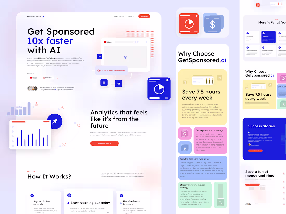
Saas Landing Page Designvictoria Lione
About this service
Desktop and Mobile Pages
Figma file design
5 to 7 working days
First concept in 72 hours
Figma design
Responsive (2 breakpoints Desktop and mobile design)
Basic interactions and animations
Unlimited Revisions
Unlimited stock elements
What's Included
Placeholder text content with ChatGPT or your own content.
If there is no text content provided, I will use placeholder text content generated by ChatGPT for the client to alter or rewrite, saving time and allowing the website to be delivered faster.
What's included
Prototype:
Figma File (.fig): Includes the interactive prototype with animations and micro-interactions to showcase the full user experience.
High-Fidelity Screens:
Export screens in PDF, PNG, JPG, and SVG formats for quick viewing and reference.
Design System & Style Guide:
Component Library
Figma file or organized folder with all reusable components (buttons, forms, menus, etc.) labeled and ready for development.
Design Tokens
Reference file with colors, typography, spacing, and sizes, adaptable for development (JSON, CSS, or Figma Tokens).
UI Guidelines
Document detailing design principles, component usage rules, spacing, and interaction patterns.
Typography & Color Palette: Explanation and examples for typography and color palette usage.
Assets Folder
Icons and Illustrations: Exported in multiple sizes and formats (SVG, PNG), optimized for web and mobile.
Image Assets: Optimized images and graphics at the appropriate resolution.
Animation Assets: GIFs or Lottie files for animations, ready for integration.
Project Overview Document
Brief explanation of the design approach and key decisions.
victoria's other services
Starting at$2,500
Duration5 days
Tags
Adobe Photoshop
Figma
Webflow
UI Designer
UX Designer
Web Designer
Service provided by
victoria Lione proArgentina
- 1
- Paid projects
- 10
- Followers
Saas Landing Page Designvictoria Lione
Starting at$2,500
Duration5 days
Tags
Adobe Photoshop
Figma
Webflow
UI Designer
UX Designer
Web Designer
About this service
Desktop and Mobile Pages
Figma file design
5 to 7 working days
First concept in 72 hours
Figma design
Responsive (2 breakpoints Desktop and mobile design)
Basic interactions and animations
Unlimited Revisions
Unlimited stock elements
What's Included
Placeholder text content with ChatGPT or your own content.
If there is no text content provided, I will use placeholder text content generated by ChatGPT for the client to alter or rewrite, saving time and allowing the website to be delivered faster.
What's included
Prototype:
Figma File (.fig): Includes the interactive prototype with animations and micro-interactions to showcase the full user experience.
High-Fidelity Screens:
Export screens in PDF, PNG, JPG, and SVG formats for quick viewing and reference.
Design System & Style Guide:
Component Library
Figma file or organized folder with all reusable components (buttons, forms, menus, etc.) labeled and ready for development.
Design Tokens
Reference file with colors, typography, spacing, and sizes, adaptable for development (JSON, CSS, or Figma Tokens).
UI Guidelines
Document detailing design principles, component usage rules, spacing, and interaction patterns.
Typography & Color Palette: Explanation and examples for typography and color palette usage.
Assets Folder
Icons and Illustrations: Exported in multiple sizes and formats (SVG, PNG), optimized for web and mobile.
Image Assets: Optimized images and graphics at the appropriate resolution.
Animation Assets: GIFs or Lottie files for animations, ready for integration.
Project Overview Document
Brief explanation of the design approach and key decisions.
victoria's other services
$2,500