
User Centric Landing Page DesignArnab Dhar
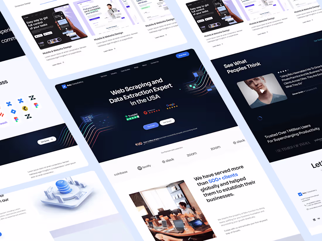
Designing a user-centric landing page is like crafting an irresistible journey. I create an engaging experience that really connects with visitors, encouraging them to stick around and act on your site.
Don't settle for 'good enough' when you can have the 'best among the competition.
Let's get started. shall we?
What's included
Organized Figma File Handover
You will receive:
The Figma file is the source file for the entire website design project. It includes all design elements, layouts, and interactions (if opted in as additional requirements) organized in a structured manner. Handing over the Figma file allows developers to access and inspect the design components, styles, and assets.
Parent Components & Child Components
Parent components represent the main structural elements of the design, such as navigation bars, headers, footers, and content sections. Child components are nested within parent components and include elements like buttons, cards, forms, and icons. Organizing components hierarchically streamlines design consistency and scalability.
Style Guide (Typography and Colors)
1) Typography
This section defines the typography choices for the website, including font families, sizes, weights, and styles for headings, subheadings, and body text. Consistent typography enhances readability and visual hierarchy.
2)Colors:
The style guide specifies the color palette used in the design, including primary, secondary, and accent colors, as well as background colors. Consistent color usage maintains brand identity and visual harmony across the website.
Parent Components & Child Components
Parent components represent the main structural elements of the design, such as navigation bars, headers, footers, and content sections. Child components are nested within parent components and include elements like buttons, cards, forms, and icons. Organizing components hierarchically streamlines design consistency and scalability.
Button Components States
Button components have different states based on user interactions. These states may include normal (default), hover (mouse-over), active (clicked), and disabled (inactive) states. Defining button states ensures consistent user experience and visual feedback.
Margins and Marks for Sections & Components
Margins define the spacing between sections and components, maintaining visual balance and separation. Marks, such as alignment guides and grids, assist developers in accurately implementing the design layout and alignment.
Annotations (if Required)
Annotations provide additional context, explanations, or instructions related to specific design elements or functionalities. They clarify design decisions, interactions, or technical requirements for developers' reference.
Handover & Dev Mode for Developers
Handover instructions guide developers in accessing design assets, code snippets, and specifications. Developers must use Figma's development mode, which allows direct access to assets, code, and design specifications within the Figma environment.
FAQs
Arnab's other services

Starting at$229
Duration8 days
Tags
Figma
Miro
Notion
UX Designer
Web Designer
Service provided by
Arnab Dhar Darjeeling, India
User Centric Landing Page DesignArnab Dhar
Designing a user-centric landing page is like crafting an irresistible journey. I create an engaging experience that really connects with visitors, encouraging them to stick around and act on your site.
Don't settle for 'good enough' when you can have the 'best among the competition.
Let's get started. shall we?
What's included
Organized Figma File Handover
You will receive:
The Figma file is the source file for the entire website design project. It includes all design elements, layouts, and interactions (if opted in as additional requirements) organized in a structured manner. Handing over the Figma file allows developers to access and inspect the design components, styles, and assets.
Parent Components & Child Components
Parent components represent the main structural elements of the design, such as navigation bars, headers, footers, and content sections. Child components are nested within parent components and include elements like buttons, cards, forms, and icons. Organizing components hierarchically streamlines design consistency and scalability.
Style Guide (Typography and Colors)
1) Typography
This section defines the typography choices for the website, including font families, sizes, weights, and styles for headings, subheadings, and body text. Consistent typography enhances readability and visual hierarchy.
2)Colors:
The style guide specifies the color palette used in the design, including primary, secondary, and accent colors, as well as background colors. Consistent color usage maintains brand identity and visual harmony across the website.
Parent Components & Child Components
Parent components represent the main structural elements of the design, such as navigation bars, headers, footers, and content sections. Child components are nested within parent components and include elements like buttons, cards, forms, and icons. Organizing components hierarchically streamlines design consistency and scalability.
Button Components States
Button components have different states based on user interactions. These states may include normal (default), hover (mouse-over), active (clicked), and disabled (inactive) states. Defining button states ensures consistent user experience and visual feedback.
Margins and Marks for Sections & Components
Margins define the spacing between sections and components, maintaining visual balance and separation. Marks, such as alignment guides and grids, assist developers in accurately implementing the design layout and alignment.
Annotations (if Required)
Annotations provide additional context, explanations, or instructions related to specific design elements or functionalities. They clarify design decisions, interactions, or technical requirements for developers' reference.
Handover & Dev Mode for Developers
Handover instructions guide developers in accessing design assets, code snippets, and specifications. Developers must use Figma's development mode, which allows direct access to assets, code, and design specifications within the Figma environment.
FAQs
Arnab's other services
$229