
Multi-Page Website & Design SystemEsther Inontah
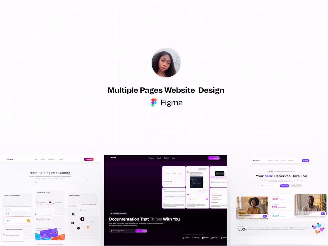
I design thoughtfully structured, multi-page websites that clearly communicate your brand’s value, guide users seamlessly across key pages, and support meaningful actions at every step of the journey. Each page is designed to work together as part of a cohesive system — not in isolation.
Whether you’re launching a new website or refining an existing one, I’ll help translate your ideas into a clean, modern, and scalable design that feels intentional, consistent, and easy to navigate across devices.
I enjoy working closely with founders and teams who care deeply about how their website looks, how it functions, and the story it tells about their product or brand.
Perfect for startups, SaaS, and growing brands looking to launch or elevate a multi-page website with clarity and confidence.
Pricing and timelines may vary depending on scope and complexity.
What's included
Sitemap & Content Strategy
A structured breakdown of page goals, content blocks, hierarchy, and required components.
High-Fidelity Designs
Beautiful, responsive designs thoughtfully crafted to align with your brand’s tone, values, and goals. Every layout, interaction, and visual decision is intentional, ensuring your product not only looks polished across devices but also communicates clearly, instills trust, and guides users toward meaningful action.
Responsive Web Breakpoints
Desktop + mobile designs for all pages
Micro-Interactions & Motion Guidelines
Subtle transitions, hover states, loading cues, and motion direction for a polished UX.
Reusable Component Library
Buttons, cards, headers, footers, forms, navigation, grids, and spacing rules — built using Figma auto-layout and component properties.
Developer Handoff Package
Clean Figma hierarchy, named layers, component documentation, exportable assets, and implementation notes.
FAQs
Esther's other services
Starting at$2,000
Duration5 weeks
Tags
Figma
Figma Make
Product Designer
UI Designer
UX Designer
Service provided by
Esther Inontah Abuja, Nigeria
- 24
- Followers
Multi-Page Website & Design SystemEsther Inontah
Starting at$2,000
Duration5 weeks
Tags
Figma
Figma Make
Product Designer
UI Designer
UX Designer
I design thoughtfully structured, multi-page websites that clearly communicate your brand’s value, guide users seamlessly across key pages, and support meaningful actions at every step of the journey. Each page is designed to work together as part of a cohesive system — not in isolation.
Whether you’re launching a new website or refining an existing one, I’ll help translate your ideas into a clean, modern, and scalable design that feels intentional, consistent, and easy to navigate across devices.
I enjoy working closely with founders and teams who care deeply about how their website looks, how it functions, and the story it tells about their product or brand.
Perfect for startups, SaaS, and growing brands looking to launch or elevate a multi-page website with clarity and confidence.
Pricing and timelines may vary depending on scope and complexity.
What's included
Sitemap & Content Strategy
A structured breakdown of page goals, content blocks, hierarchy, and required components.
High-Fidelity Designs
Beautiful, responsive designs thoughtfully crafted to align with your brand’s tone, values, and goals. Every layout, interaction, and visual decision is intentional, ensuring your product not only looks polished across devices but also communicates clearly, instills trust, and guides users toward meaningful action.
Responsive Web Breakpoints
Desktop + mobile designs for all pages
Micro-Interactions & Motion Guidelines
Subtle transitions, hover states, loading cues, and motion direction for a polished UX.
Reusable Component Library
Buttons, cards, headers, footers, forms, navigation, grids, and spacing rules — built using Figma auto-layout and component properties.
Developer Handoff Package
Clean Figma hierarchy, named layers, component documentation, exportable assets, and implementation notes.
FAQs
Esther's other services
$2,000