
MoneyMate — Budget Tracker & Personal Finance Mobile AppHarika konda
Overview
MoneyMate is a personal finance mobile app designed to help users track expenses, manage budgets, and build savings habits through a clean and intuitive interface.
Goal
Design a finance app that simplifies money management while encouraging users to make informed financial decisions.
Problem
Many budgeting apps overwhelm users with complex dashboards and difficult navigation.
Users often struggle to:
Understand their financial overview
Track monthly spending
Stay motivated to save
Find important information quickly
Research
From reviewing existing finance apps and common UX patterns, I identified that users value:
A clear dashboard
Simple expense tracking
Easy-to-understand analytics
Visible savings progress
Design Goals
Reduce visual complexity
Make financial data easy to understand
Encourage regular app usage
Build user confidence
Wireframes
Explain briefly:
Low-fidelity wireframes were created to organize information hierarchy and validate the navigation flow before moving into high-fidelity UI design.
(Insert wireframe images.)
Final Solution
Show your final screens.
Then explain each one in one sentence.
Splash
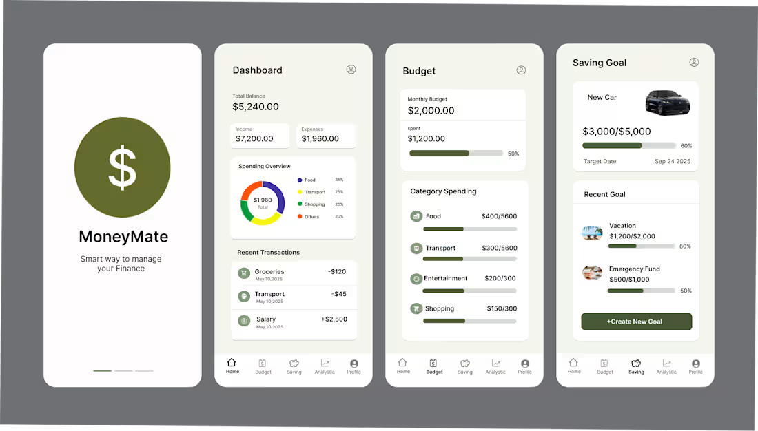
Creates a simple first impression and introduces the brand.
Onboarding
Communicates the app's core value before sign-in.
Login
Provides a familiar and low-friction authentication experience.
Dashboard
Gives users an immediate overview of balances, income, expenses, and recent activity.
Budget
Displays monthly spending progress by category.
Savings Goal
Helps users visualize progress toward financial goals.
Analytics
Presents spending trends with charts to support better financial decisions.
Design Decisions
Instead of saying "I chose green because it looks nice," explain the reasoning.
Olive Green Color Palette
Chosen to communicate financial stability, growth, and trust while giving the app a calm, distinctive identity.
Dashboard First
Important financial information is visible immediately after login so users can understand their finances at a glance.
Progress Bars
Budget and savings progress use visual indicators to make goals easier to track.
Card Layout
Related information is grouped into cards to improve readability and reduce cognitive load.
Prototype
Mention:
A clickable prototype was created to demonstrate the primary user journey from onboarding to financial insights.
You can also include a short GIF or video of the prototype.
Outcome
This project demonstrates my ability to design an end-to-end mobile experience, from user research and wireframes to polished UI and interactive prototyping.
Harika's other services
Starting at$500
Duration1 week
Tags
Mobile Designer
UX Designer
UX Researcher
Service provided by
Harika konda Hyderabad, India
MoneyMate — Budget Tracker & Personal Finance Mobile AppHarika konda
Starting at$500
Duration1 week
Tags
Mobile Designer
UX Designer
UX Researcher
Overview
MoneyMate is a personal finance mobile app designed to help users track expenses, manage budgets, and build savings habits through a clean and intuitive interface.
Goal
Design a finance app that simplifies money management while encouraging users to make informed financial decisions.
Problem
Many budgeting apps overwhelm users with complex dashboards and difficult navigation.
Users often struggle to:
Understand their financial overview
Track monthly spending
Stay motivated to save
Find important information quickly
Research
From reviewing existing finance apps and common UX patterns, I identified that users value:
A clear dashboard
Simple expense tracking
Easy-to-understand analytics
Visible savings progress
Design Goals
Reduce visual complexity
Make financial data easy to understand
Encourage regular app usage
Build user confidence
Wireframes
Explain briefly:
Low-fidelity wireframes were created to organize information hierarchy and validate the navigation flow before moving into high-fidelity UI design.
(Insert wireframe images.)
Final Solution
Show your final screens.
Then explain each one in one sentence.
Splash
Creates a simple first impression and introduces the brand.
Onboarding
Communicates the app's core value before sign-in.
Login
Provides a familiar and low-friction authentication experience.
Dashboard
Gives users an immediate overview of balances, income, expenses, and recent activity.
Budget
Displays monthly spending progress by category.
Savings Goal
Helps users visualize progress toward financial goals.
Analytics
Presents spending trends with charts to support better financial decisions.
Design Decisions
Instead of saying "I chose green because it looks nice," explain the reasoning.
Olive Green Color Palette
Chosen to communicate financial stability, growth, and trust while giving the app a calm, distinctive identity.
Dashboard First
Important financial information is visible immediately after login so users can understand their finances at a glance.
Progress Bars
Budget and savings progress use visual indicators to make goals easier to track.
Card Layout
Related information is grouped into cards to improve readability and reduce cognitive load.
Prototype
Mention:
A clickable prototype was created to demonstrate the primary user journey from onboarding to financial insights.
You can also include a short GIF or video of the prototype.
Outcome
This project demonstrates my ability to design an end-to-end mobile experience, from user research and wireframes to polished UI and interactive prototyping.
Harika's other services
$500