
High-Conversion E-commerce Email AutomationPeculiar Duke
Role: Lead Email Strategist & UI/UX Designer Tools: Figma, GoHighLevel, Adobe Photoshop Industry: Consumer Tech & Digital Assets
1. The Project Scope (The "Why" & "How")
The Problem: The client, a digital lifestyle and tech retailer, was suffering from "Inbox Blindness." Their existing text-heavy emails were getting ignored, and their generic templates failed to showcase the premium nature of products like the iPhone 13 Pro Max and Black+Decker appliances. They needed to bridge the gap between a sleek mobile app experience and their email communication.
The Solution: I engineered a 4-part visual automation workflow designed to nurture leads from "Curious" to "Customer" to "Brand Loyalist." This wasn't just about making it pretty; it was about Cognitive Flow.
Design Strategy (Figma): I utilized a "Z-pattern" layout to guide the eye from the headline to the product to the CTA. I implemented a dark-mode-friendly color palette (Deep Navy & Electric Blue) to evoke trust and tech-savviness.
Technical Implementation (GoHighLevel): The designs were built as modular components to allow for dynamic product insertion (e.g., showing the specific blender the user abandoned) and responsive scaling for mobile devices.
2. Detailed Deliverables (The "What")
Here is the breakdown of the specific assets delivered, categorized by their psychological trigger.
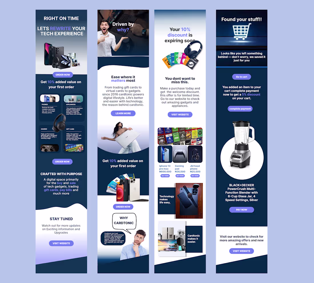
A. The "First Impression" Welcome Series (Flow 1 - Left)
Objective: Immediate value delivery and brand positioning.
The Build:
Hero Section: A high-impact "Right on Time" header with a collage of high-ticket items (MacBooks, Cameras) to immediately signal inventory quality.
Incentive Design: A prominent, contrasting "Get 10% Value" section. Note the hierarchy: The offer is bold, but the CTA "Order Now" is isolated for clickability.
Category Navigation: Visual icons (Phones, Appliances, Gaming) to serve as a mini-menu, reducing friction for users who know what they want.
B. The "Brand Indoctrination" Flow (Flow 2 - Center Left)
Objective: Moving the customer from transactional to emotional.
The Build:
Storytelling Layout: Used a human-centric hero image (Model with laptop) to humanize the "Digital Lifestyle."
Typography: A clean mix of Serif headings for authority and Sans-Serif body text for readability.
Psychological Trigger: The "Ease where it matters most" section addresses the customer's pain point (complexity) before offering the solution (Cardtonic).
C. The "FOMO" Promotional Blast (Flow 3 - Center Right)
Objective: Urgency creation and liquidation of inventory.
The Build:
Scarcity Element: "Your 10% discount is expiring soon." I used visual cues (Gift cards fanned out) to show variety.
Product Grid: A clean 3-column layout featuring specific SKUs (iPhone 13, Gaming Pad, JBL Headphones) with clear pricing. This mimics the e-commerce browsing experience directly inside the inbox.
CTA Strategy: Double CTA placement (Top and Bottom) to catch skimmers and deep readers.
D. The "Cart Recovery" Savior (Flow 4 - Right)
Objective: Recovering lost revenue (The highest ROI email).
The Build:
Dynamic Hero: "Found your stuff!!" headline coupled with a shopping cart icon that visually connects to the shopping experience.
The "Nudge": A strategic 5% discount offer specifically for completing the checkout now.
Spotlight Product: A massive, high-fidelity render of the abandoned item (Black+Decker PowerCrush Blender). By isolating the product on a white circle against a dark background, we create a "showcase" effect that makes the item look irresistible.
3. The Results (The "So What?")
100% Mobile Responsiveness: Designs were sliced and coded to stack perfectly on iPhone and Android native mail apps.
Modular Design System: The client now has a Figma "Drag and Drop" library, allowing them to swap out the Black+Decker blender for a PS5 in seconds without breaking the layout.
Visual Consistency: Aligned the email aesthetic with the app UI to create a seamless omni-channel experience.
What's included
PHASE 1: THE VISUAL ARCHITECTURE
The "Master Source" Figma File: A clean, organized .fig file using Auto-Layout frames. This allows the client's internal team (or future freelancers) to change the text length without breaking the design structure.
The Component Library: I created a "Drag-and-Drop" asset page containing the buttons, product cards (like the iPhone and Blender cutouts), and headers as reusable components. This ensures brand consistency for future emails.
Optimized Image Slices: All complex graphics (the floating gadgets, the model with the laptop) were sliced and exported as high-res but web-optimized PNGs/JPGs (under 100kb) to ensure near-instant load times even on slow 4G networks.
Mobile & Desktop Mockups: A side-by-side visualization showing exactly how the layout stacks vertically on mobile versus the wide view on desktop.
GoHighLevel Implementation
4 Custom HTML/Drag-and-Drop Templates: I didn't just paste images. I rebuilt the designs inside the GoHighLevel (GHL) email builder.
Deliverable: Live links to the 4 templates (Welcome, Story, Promo, Abandoned Cart) pre-loaded into their account.
Responsiveness "Hardening" Code: I added custom CSS snippets to the header of the emails to force proper rendering on "difficult" email clients like Outlook Desktop and older Android devices.
Dynamic Variable Setup: The templates were set up with {{contact.first_name}} and {{custom_values.offer_expiry}} tags, ensuring the personalization shown in the design actually functions in real life.
THE STRATEGY & COPY
The "Click-Trance" Copy Deck: A PDF document containing the final Subject Lines, Pre-header text (the snippet people see before opening), and the body copy.
Bonus: Included 2 variations of Subject Lines for A/B testing (e.g., "You forgot this..." vs. "Is this blender yours?").
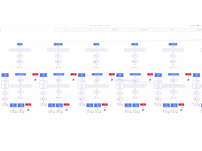
The Automation Logic Map: A flowchart visual explaining the trigger settings.
Example: "Cart Abandonment Flow: Triggers 45 minutes after checkout page is closed -> Checks if purchase was made -> Sends Email -> Waits 24 Hours -> Sends SMS nudge."
Peculiar 's other services
Starting at$1,500
Duration1 week
Tags
Figma
Gmail
Klaviyo
MailChimp
Email Marketer
Email Marketing Designer
Email Newsletter Writer
Service provided by
Peculiar Duke Abuja, Nigeria
- 5.00
- Rating
- 19
- Followers
High-Conversion E-commerce Email AutomationPeculiar Duke
Starting at$1,500
Duration1 week
Tags
Figma
Gmail
Klaviyo
MailChimp
Email Marketer
Email Marketing Designer
Email Newsletter Writer
Role: Lead Email Strategist & UI/UX Designer Tools: Figma, GoHighLevel, Adobe Photoshop Industry: Consumer Tech & Digital Assets
1. The Project Scope (The "Why" & "How")
The Problem: The client, a digital lifestyle and tech retailer, was suffering from "Inbox Blindness." Their existing text-heavy emails were getting ignored, and their generic templates failed to showcase the premium nature of products like the iPhone 13 Pro Max and Black+Decker appliances. They needed to bridge the gap between a sleek mobile app experience and their email communication.
The Solution: I engineered a 4-part visual automation workflow designed to nurture leads from "Curious" to "Customer" to "Brand Loyalist." This wasn't just about making it pretty; it was about Cognitive Flow.
Design Strategy (Figma): I utilized a "Z-pattern" layout to guide the eye from the headline to the product to the CTA. I implemented a dark-mode-friendly color palette (Deep Navy & Electric Blue) to evoke trust and tech-savviness.
Technical Implementation (GoHighLevel): The designs were built as modular components to allow for dynamic product insertion (e.g., showing the specific blender the user abandoned) and responsive scaling for mobile devices.
2. Detailed Deliverables (The "What")
Here is the breakdown of the specific assets delivered, categorized by their psychological trigger.
A. The "First Impression" Welcome Series (Flow 1 - Left)
Objective: Immediate value delivery and brand positioning.
The Build:
Hero Section: A high-impact "Right on Time" header with a collage of high-ticket items (MacBooks, Cameras) to immediately signal inventory quality.
Incentive Design: A prominent, contrasting "Get 10% Value" section. Note the hierarchy: The offer is bold, but the CTA "Order Now" is isolated for clickability.
Category Navigation: Visual icons (Phones, Appliances, Gaming) to serve as a mini-menu, reducing friction for users who know what they want.
B. The "Brand Indoctrination" Flow (Flow 2 - Center Left)
Objective: Moving the customer from transactional to emotional.
The Build:
Storytelling Layout: Used a human-centric hero image (Model with laptop) to humanize the "Digital Lifestyle."
Typography: A clean mix of Serif headings for authority and Sans-Serif body text for readability.
Psychological Trigger: The "Ease where it matters most" section addresses the customer's pain point (complexity) before offering the solution (Cardtonic).
C. The "FOMO" Promotional Blast (Flow 3 - Center Right)
Objective: Urgency creation and liquidation of inventory.
The Build:
Scarcity Element: "Your 10% discount is expiring soon." I used visual cues (Gift cards fanned out) to show variety.
Product Grid: A clean 3-column layout featuring specific SKUs (iPhone 13, Gaming Pad, JBL Headphones) with clear pricing. This mimics the e-commerce browsing experience directly inside the inbox.
CTA Strategy: Double CTA placement (Top and Bottom) to catch skimmers and deep readers.
D. The "Cart Recovery" Savior (Flow 4 - Right)
Objective: Recovering lost revenue (The highest ROI email).
The Build:
Dynamic Hero: "Found your stuff!!" headline coupled with a shopping cart icon that visually connects to the shopping experience.
The "Nudge": A strategic 5% discount offer specifically for completing the checkout now.
Spotlight Product: A massive, high-fidelity render of the abandoned item (Black+Decker PowerCrush Blender). By isolating the product on a white circle against a dark background, we create a "showcase" effect that makes the item look irresistible.
3. The Results (The "So What?")
100% Mobile Responsiveness: Designs were sliced and coded to stack perfectly on iPhone and Android native mail apps.
Modular Design System: The client now has a Figma "Drag and Drop" library, allowing them to swap out the Black+Decker blender for a PS5 in seconds without breaking the layout.
Visual Consistency: Aligned the email aesthetic with the app UI to create a seamless omni-channel experience.
What's included
PHASE 1: THE VISUAL ARCHITECTURE
The "Master Source" Figma File: A clean, organized .fig file using Auto-Layout frames. This allows the client's internal team (or future freelancers) to change the text length without breaking the design structure.
The Component Library: I created a "Drag-and-Drop" asset page containing the buttons, product cards (like the iPhone and Blender cutouts), and headers as reusable components. This ensures brand consistency for future emails.
Optimized Image Slices: All complex graphics (the floating gadgets, the model with the laptop) were sliced and exported as high-res but web-optimized PNGs/JPGs (under 100kb) to ensure near-instant load times even on slow 4G networks.
Mobile & Desktop Mockups: A side-by-side visualization showing exactly how the layout stacks vertically on mobile versus the wide view on desktop.
GoHighLevel Implementation
4 Custom HTML/Drag-and-Drop Templates: I didn't just paste images. I rebuilt the designs inside the GoHighLevel (GHL) email builder.
Deliverable: Live links to the 4 templates (Welcome, Story, Promo, Abandoned Cart) pre-loaded into their account.
Responsiveness "Hardening" Code: I added custom CSS snippets to the header of the emails to force proper rendering on "difficult" email clients like Outlook Desktop and older Android devices.
Dynamic Variable Setup: The templates were set up with {{contact.first_name}} and {{custom_values.offer_expiry}} tags, ensuring the personalization shown in the design actually functions in real life.
THE STRATEGY & COPY
The "Click-Trance" Copy Deck: A PDF document containing the final Subject Lines, Pre-header text (the snippet people see before opening), and the body copy.
Bonus: Included 2 variations of Subject Lines for A/B testing (e.g., "You forgot this..." vs. "Is this blender yours?").
The Automation Logic Map: A flowchart visual explaining the trigger settings.
Example: "Cart Abandonment Flow: Triggers 45 minutes after checkout page is closed -> Checks if purchase was made -> Sends Email -> Waits 24 Hours -> Sends SMS nudge."
Peculiar 's other services
$1,500