
UI/UXTarun Gupta
The service also involves the creation of user flows and style guides to ensure a consistent and intuitive design. Clients receive UI kits for reusable design components, user persona profiles for targeted audience representation, and usability testing reports for valuable feedback. Responsive designs are included for adaptability across various devices.
The "Design Blueprint Package" further comprises handoff documents for developers, facilitating accurate implementation, and final design files in source formats for client use or future iterations. Throughout the process, there is continuous collaboration and communication, ensuring that client feedback is incorporated for a refined and effective design solution.
What's included
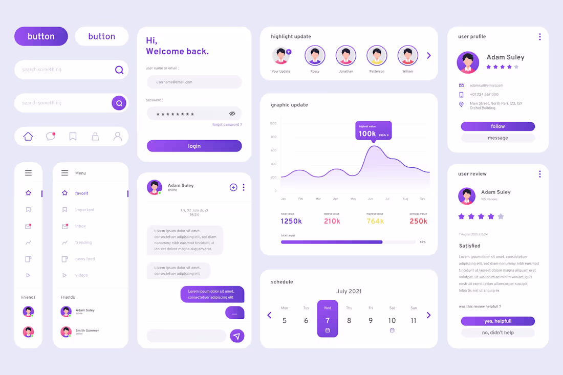
Interactive Interface Suite
Wireframes: Low-fidelity visual representations outlining the structure and layout of the interface.
Mockups: High-fidelity static or interactive visual designs showcasing the final look of the user interface.
Prototypes: Interactive models that simulate the user experience, allowing clients to navigate and interact with the design.
User Flows: Diagrams illustrating the paths a user might take through the interface to achieve specific tasks.
Style Guides: Detailed documentation specifying design elements such as colors, typography, and UI components to maintain consistency.
UI Kits: Pre-designed components and assets that can be reused across the interface for a cohesive look and feel.
User Persona Profiles: Profiles representing the target audience, helping to align design decisions with user needs.
Usability Testing Reports: Feedback and insights gathered from testing sessions, highlighting areas for improvement.
Responsive Designs: Adaptations of the interface for various devices and screen sizes to ensure a consistent user experience.
Handoff Documents: Detailed instructions and assets for developers to implement the design accurately.
Final Design Files: Source files (e.g., PSD, Sketch, Figma) for the client's use or future design iterations.
Collaboration and Communication: Regular communication throughout the design process to address client feedback and make necessary revisions.
Tarun's other services
Contact for pricing
Tags
Axure
Figma
Framer
Proto.io
Webflow
Graphic Designer
UI Designer
Service provided by
Tarun Gupta India
UI/UXTarun Gupta
The service also involves the creation of user flows and style guides to ensure a consistent and intuitive design. Clients receive UI kits for reusable design components, user persona profiles for targeted audience representation, and usability testing reports for valuable feedback. Responsive designs are included for adaptability across various devices.
The "Design Blueprint Package" further comprises handoff documents for developers, facilitating accurate implementation, and final design files in source formats for client use or future iterations. Throughout the process, there is continuous collaboration and communication, ensuring that client feedback is incorporated for a refined and effective design solution.
What's included
Interactive Interface Suite
Wireframes: Low-fidelity visual representations outlining the structure and layout of the interface.
Mockups: High-fidelity static or interactive visual designs showcasing the final look of the user interface.
Prototypes: Interactive models that simulate the user experience, allowing clients to navigate and interact with the design.
User Flows: Diagrams illustrating the paths a user might take through the interface to achieve specific tasks.
Style Guides: Detailed documentation specifying design elements such as colors, typography, and UI components to maintain consistency.
UI Kits: Pre-designed components and assets that can be reused across the interface for a cohesive look and feel.
User Persona Profiles: Profiles representing the target audience, helping to align design decisions with user needs.
Usability Testing Reports: Feedback and insights gathered from testing sessions, highlighting areas for improvement.
Responsive Designs: Adaptations of the interface for various devices and screen sizes to ensure a consistent user experience.
Handoff Documents: Detailed instructions and assets for developers to implement the design accurately.
Final Design Files: Source files (e.g., PSD, Sketch, Figma) for the client's use or future design iterations.
Collaboration and Communication: Regular communication throughout the design process to address client feedback and make necessary revisions.
Tarun's other services
Contact for pricing