
Figma design system Joana Ferreira
In my design journey, I've contributed to the development of three design systems, each with its unique challenges. One involved seamlessly continuing an existing system, while the other two required starting from scratch, organizing existing designs before implementation. Additionally, I specialize in crafting UI kits on Figma, ideal for those not looking to code a design system. What sets me apart is my meticulous approach to maintaining component consistency and thorough documentation, ensuring clarity and usability for anyone accessing the system.
What's included
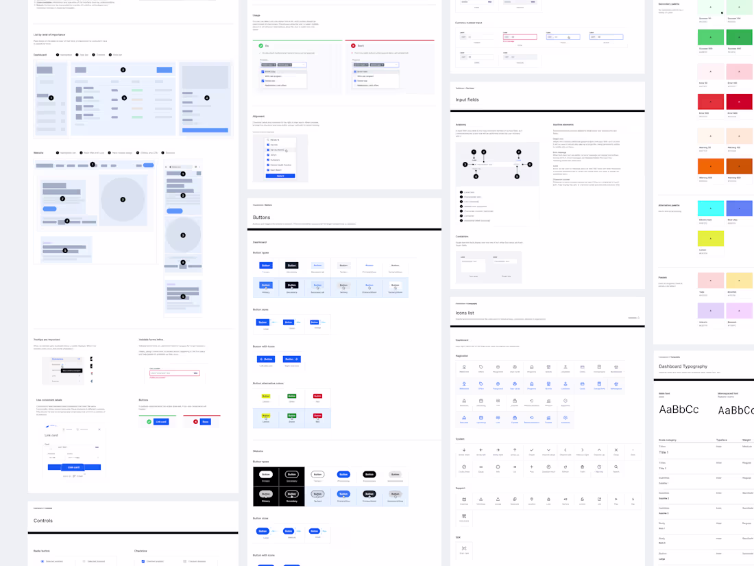
Design system figma library
Design Components: Consistent UI elements such as buttons, inputs, icons, and typography that can be reused across multiple designs.
Design Tokens: Variables defining colors, typography, spacing, and other stylistic attributes to maintain consistency and facilitate easy updates.
UI Patterns: Pre-designed layouts and patterns for common user interface elements, ensuring consistency and efficiency in design workflows.
Documentation: Guidelines and best practices for using the design system, including usage instructions, design principles, and accessibility guidelines.
Interactive Prototypes: Functional prototypes showcasing the usage and behavior of components within the design system, allowing for testing and validation.
Version Control: Managed versions of the design system components and assets to track changes and ensure consistency across designs and updates.
Collaboration Tools: Integration with collaboration features in Figma, enabling team members to work together on design system components and projects seamlessly.
By providing these deliverables, a design system on Figma facilitates efficient design workflows, promotes consistency across designs, and streamlines collaboration within design teams.
Joana's other services
Contact for pricing
Tags
Figma
Design Systems Specialist
Product Designer
UI Designer
Service provided by
Joana Ferreira Porto, Portugal
- 1
- Followers
Figma design system Joana Ferreira
In my design journey, I've contributed to the development of three design systems, each with its unique challenges. One involved seamlessly continuing an existing system, while the other two required starting from scratch, organizing existing designs before implementation. Additionally, I specialize in crafting UI kits on Figma, ideal for those not looking to code a design system. What sets me apart is my meticulous approach to maintaining component consistency and thorough documentation, ensuring clarity and usability for anyone accessing the system.
What's included
Design system figma library
Design Components: Consistent UI elements such as buttons, inputs, icons, and typography that can be reused across multiple designs.
Design Tokens: Variables defining colors, typography, spacing, and other stylistic attributes to maintain consistency and facilitate easy updates.
UI Patterns: Pre-designed layouts and patterns for common user interface elements, ensuring consistency and efficiency in design workflows.
Documentation: Guidelines and best practices for using the design system, including usage instructions, design principles, and accessibility guidelines.
Interactive Prototypes: Functional prototypes showcasing the usage and behavior of components within the design system, allowing for testing and validation.
Version Control: Managed versions of the design system components and assets to track changes and ensure consistency across designs and updates.
Collaboration Tools: Integration with collaboration features in Figma, enabling team members to work together on design system components and projects seamlessly.
By providing these deliverables, a design system on Figma facilitates efficient design workflows, promotes consistency across designs, and streamlines collaboration within design teams.
Joana's other services
Contact for pricing