
Crafting Stunning Visuals that Speak VolumesRaphael Farodoye

I provide freelance data visualization services that transform complex data into clear, compelling visuals that drive decision-making. With a unique blend of analytical precision and creative design, I deliver tailored dashboards, reports, and visual narratives that make your data not only accessible but impactful. My approach is highly customized to fit your goals, ensuring every visualization tells the right story.
What's included
Data Made Beautiful: Freelance Visualizations that Drive Decisions
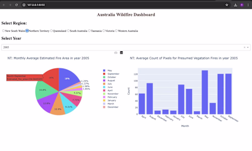
Interactive Dashboards: Custom-built, real-time dashboards using tools like Power BI, or Python (Plotly, Dash) that offer dynamic data exploration and actionable insights.
Static Visual Reports: Professionally designed visual reports in PDF, PowerPoint, or Excel, featuring a comprehensive array of charts, graphs, and infographics to effectively communicate key findings.
Custom Data Visuals: Tailored visualizations—ranging from heat maps to network diagrams—created to meet specific client needs, optimized for both web and print.
Data Storytelling Presentation: An engaging presentation that transforms data into a compelling narrative, complete with annotations, highlights, and callouts to emphasize critical insights.
Source Data Files: Meticulously cleaned and structured data files (CSV, Excel, SQL) used in visualizations, accompanied by detailed documentation on data preparation.
Visualization Templates: Reusable, customizable templates in Excel, Google Sheets, or other software, empowering clients to create future visualizations with ease.
Code and Scripts: Well-documented Python, SQL, or other scripts that power visualizations or automate data processing, with clear annotations for easy understanding.
User Guides and Documentation: A comprehensive manual guiding users through navigating, modifying, and integrating visualizations into existing workflows.
Consultation Session: A post-project session to walk through the visualizations, discuss insights, and provide expert guidance on future data analysis endeavors.
Feedback Revisions: Up to two rounds of revisions based on client feedback, ensuring the final visualizations align perfectly with the client's expectations.
Example work
Raphael's other services

Starting at$25
Duration2 weeks
Tags
D3.js
Matplotlib
Tableau
TensorFlow
three.js
Data Analyst
Data Scientist
Data Visualizer
Service provided by
Raphael Farodoye Lagos, Nigeria
Crafting Stunning Visuals that Speak VolumesRaphael Farodoye
Starting at$25
Duration2 weeks
Tags
D3.js
Matplotlib
Tableau
TensorFlow
three.js
Data Analyst
Data Scientist
Data Visualizer
I provide freelance data visualization services that transform complex data into clear, compelling visuals that drive decision-making. With a unique blend of analytical precision and creative design, I deliver tailored dashboards, reports, and visual narratives that make your data not only accessible but impactful. My approach is highly customized to fit your goals, ensuring every visualization tells the right story.
What's included
Data Made Beautiful: Freelance Visualizations that Drive Decisions
Interactive Dashboards: Custom-built, real-time dashboards using tools like Power BI, or Python (Plotly, Dash) that offer dynamic data exploration and actionable insights.
Static Visual Reports: Professionally designed visual reports in PDF, PowerPoint, or Excel, featuring a comprehensive array of charts, graphs, and infographics to effectively communicate key findings.
Custom Data Visuals: Tailored visualizations—ranging from heat maps to network diagrams—created to meet specific client needs, optimized for both web and print.
Data Storytelling Presentation: An engaging presentation that transforms data into a compelling narrative, complete with annotations, highlights, and callouts to emphasize critical insights.
Source Data Files: Meticulously cleaned and structured data files (CSV, Excel, SQL) used in visualizations, accompanied by detailed documentation on data preparation.
Visualization Templates: Reusable, customizable templates in Excel, Google Sheets, or other software, empowering clients to create future visualizations with ease.
Code and Scripts: Well-documented Python, SQL, or other scripts that power visualizations or automate data processing, with clear annotations for easy understanding.
User Guides and Documentation: A comprehensive manual guiding users through navigating, modifying, and integrating visualizations into existing workflows.
Consultation Session: A post-project session to walk through the visualizations, discuss insights, and provide expert guidance on future data analysis endeavors.
Feedback Revisions: Up to two rounds of revisions based on client feedback, ensuring the final visualizations align perfectly with the client's expectations.
Example work
Raphael's other services
$25