
Indian Wildlife DashboardDikshant Choudhary
I am offering a comprehensive Wildlife Data Dashboard built in Power BI that transforms complex wildlife and conservation data into clear, actionable insights. This project stands out for its visually compelling, interactive reports tailored for researchers, policymakers, and conservationists, ensuring informed decisions to protect biodiversity.
What's included
Interactive Power BI Dashboard
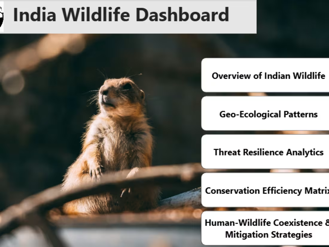
A fully developed and interactive Power BI dashboard visualizing key wildlife data, including sections such as Overview of Indian Wildlife, Geo-Ecological Patterns, Threat Resilience Analytics, Conservation Efficiency Matrix, and Human-Wildlife Coexistence & Mitigation Strategies.
Format: Power BI (.pbix) file and a published version on Power BI Service (with a shareable link).
Quantity: One complete dashboard file.
Data Source and Data Model Documentation
A detailed document outlining the data sources used, the data model structure, relationships, DAX calculations, and measures implemented in the dashboard.
Presentation & User Guide
A slide deck or PDF presentation summarizing key insights from the dashboard and a user guide explaining how to interact with the visuals, filter data, and interpret charts.
Format: PowerPoint (.pptx) and PDF formats.
Quantity: 1 presentation (10–15 slides) + 1 user guide (3–5 pages).
FAQs
Example work
Dikshant's other services

Contact for pricing
Tags
ChatGPT
Microsoft Excel
Microsoft Power BI
Data Analyst
Data Modelling Analyst
Data Scientist
Service provided by
Dikshant Choudhary Udaipur, India
Indian Wildlife DashboardDikshant Choudhary
Contact for pricing
Tags
ChatGPT
Microsoft Excel
Microsoft Power BI
Data Analyst
Data Modelling Analyst
Data Scientist
I am offering a comprehensive Wildlife Data Dashboard built in Power BI that transforms complex wildlife and conservation data into clear, actionable insights. This project stands out for its visually compelling, interactive reports tailored for researchers, policymakers, and conservationists, ensuring informed decisions to protect biodiversity.
What's included
Interactive Power BI Dashboard
A fully developed and interactive Power BI dashboard visualizing key wildlife data, including sections such as Overview of Indian Wildlife, Geo-Ecological Patterns, Threat Resilience Analytics, Conservation Efficiency Matrix, and Human-Wildlife Coexistence & Mitigation Strategies.
Format: Power BI (.pbix) file and a published version on Power BI Service (with a shareable link).
Quantity: One complete dashboard file.
Data Source and Data Model Documentation
A detailed document outlining the data sources used, the data model structure, relationships, DAX calculations, and measures implemented in the dashboard.
Presentation & User Guide
A slide deck or PDF presentation summarizing key insights from the dashboard and a user guide explaining how to interact with the visuals, filter data, and interpret charts.
Format: PowerPoint (.pptx) and PDF formats.
Quantity: 1 presentation (10–15 slides) + 1 user guide (3–5 pages).
FAQs
Example work
Dikshant's other services
Contact for pricing