
Design SystemElisa Ulloa
✅ Summary
I’m a freelance web designer focused on creating modern, user-friendly sites that leave a strong impression and deliver an effortless experience. Whether you’re launching something new or giving your site a fresh look, I’ll make sure it truly reflects your brand’s style and vision. I love working closely with founders and teams to bring ideas to life, turning concepts into polished, effective websites that engage and convert. Let’s build something that feels true to you and resonates with your audience.
✅ FAQs
Do I need to have everything figured out before we start? Not at all. Whether you have detailed requirements and references or just a rough idea, I’ll help you shape it into a clear, well-structured plan.
How will we communicate and collaborate? I’m flexible. We can use email, Slack, WhatsApp, or Telegram for day-to-day updates. For feedback and revisions, I’m happy to schedule Zoom/Google Meet calls or keep everything organized in Figma comments.
How many revision rounds are included? I want you to love the result. For hourly projects, I offer unlimited revisions. For flat-fee projects, I typically include up to 3 revision rounds after the Structure and Design stages.
What if I need changes or extra screens later? No problem. I’m happy to provide ongoing support or add new screens at my current hourly rate whenever you’re ready to expand or update your app.
What's included
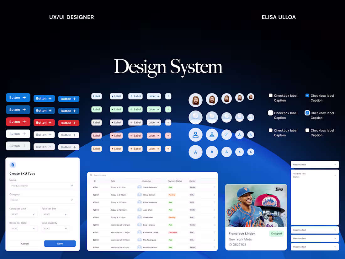
Custom Component Library in Figma
A curated set of UI components tailored to your product’s needs, ready to ensure consistency and speed up design workflows.
Typography Guidelines
Clear rules for type scales, styles, and usage—from headings to body text—to maintain a cohesive look throughout your app or site.
Accessible Color Palette
Thoughtfully crafted color system with primary, secondary, and accent colors, designed for accessibility and clear usage across all UI states.
Design Variables & Tokens
Reusable variables for color, typography, spacing, and more, making it easy to maintain consistency and adapt to future changes.
Usage Documentation
Detailed guides on applying your design system correctly, complete with examples, tips, and best practices to keep your team aligned.
Interaction Guidelines
Instructions on how each component should behave and respond to user actions, ensuring predictable, intuitive interactions.
Reusable Design Patterns
Examples of common layouts and essential screens like onboarding, login, or forms, ready to serve as a solid starting point for your team.
Elisa's other services
Contact for pricing
Tags
Figma
Design Systems Specialist
Service provided by
Elisa Ulloa Lisbon, Portugal
- $1k+
- Earned
- 2
- Paid projects
- 5.00
- Rating
- 74
- Followers
Design SystemElisa Ulloa
✅ Summary
I’m a freelance web designer focused on creating modern, user-friendly sites that leave a strong impression and deliver an effortless experience. Whether you’re launching something new or giving your site a fresh look, I’ll make sure it truly reflects your brand’s style and vision. I love working closely with founders and teams to bring ideas to life, turning concepts into polished, effective websites that engage and convert. Let’s build something that feels true to you and resonates with your audience.
✅ FAQs
Do I need to have everything figured out before we start? Not at all. Whether you have detailed requirements and references or just a rough idea, I’ll help you shape it into a clear, well-structured plan.
How will we communicate and collaborate? I’m flexible. We can use email, Slack, WhatsApp, or Telegram for day-to-day updates. For feedback and revisions, I’m happy to schedule Zoom/Google Meet calls or keep everything organized in Figma comments.
How many revision rounds are included? I want you to love the result. For hourly projects, I offer unlimited revisions. For flat-fee projects, I typically include up to 3 revision rounds after the Structure and Design stages.
What if I need changes or extra screens later? No problem. I’m happy to provide ongoing support or add new screens at my current hourly rate whenever you’re ready to expand or update your app.
What's included
Custom Component Library in Figma
A curated set of UI components tailored to your product’s needs, ready to ensure consistency and speed up design workflows.
Typography Guidelines
Clear rules for type scales, styles, and usage—from headings to body text—to maintain a cohesive look throughout your app or site.
Accessible Color Palette
Thoughtfully crafted color system with primary, secondary, and accent colors, designed for accessibility and clear usage across all UI states.
Design Variables & Tokens
Reusable variables for color, typography, spacing, and more, making it easy to maintain consistency and adapt to future changes.
Usage Documentation
Detailed guides on applying your design system correctly, complete with examples, tips, and best practices to keep your team aligned.
Interaction Guidelines
Instructions on how each component should behave and respond to user actions, ensuring predictable, intuitive interactions.
Reusable Design Patterns
Examples of common layouts and essential screens like onboarding, login, or forms, ready to serve as a solid starting point for your team.
Elisa's other services
Contact for pricing