
User Interface Design — UIDAndrej Mlinarevic
User Interface Design (UID) focuses on creating visually engaging and user-friendly products.
This service involves crafting the look and feel of digital interfaces, including layout, colors, typography, and interactive elements, to ensure a seamless experience for users.
By blending visual aesthetics with functionality, UID enhances both usability and brand appeal, providing an intuitive and enjoyable interaction with digital products.
What's included
Design Audit
— Review and analysis of existing interface
— UI/UX recommendations for improvement
— Visual report or presentation with key findings
Moodboards and Visual Style Guide
— Moodboard design with style, color palette, and visual inspiration
— Typography selection and guidelines
— Iconography and imagery guidelines
Wireframes
— Low-fidelity wireframes to map out basic layout and structure
— High-fidelity wireframes with more refined details
— User flows to illustrate navigation between screens
High-Fidelity Mockups
— Typography & color scheme
— Layout designs & grids
— Visual design of screens & flows
— Variations for different screen sizes and device types
Clickable Prototype
— Interactive prototype with clickable elements
— Basic user flows to demonstrate functionality
— Prototype for user testing and feedback sessions
Component library design
— Comprehensive design system including colors, typography, and spacing guidelines
— Reusable UI components (buttons, cards, modals, etc.)
— Component library and documentation for developers
Icon Set and Graphic Assets
— Custom icon set design
— Downloadable assets
UI Specifications for Developers
— Detailed UI specifications with sizes, spacing, and color values
— Developer-ready assets and export guidelines
— Annotation and explanation of complex interactions and transitions
Animations and Micro-interactions
— Micro-animation & other animation guidelines + examples
— Animated elements and transitions for key UI components
— Interaction guidelines for user feedback (e.g., loading spinners, button animations)
Final Design Package
— All project files in appropriate formats (Figma, Illustrator etc.)
— Organized file structure for easy handoff to developers
— Style guide and supporting documentation for ongoing development
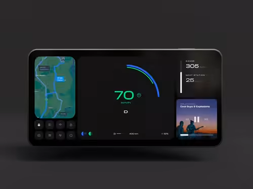
Example work
Andrej's other services
Starting at$120 /hr
Tags
Adobe Illustrator
Blender
Figma
Framer
Notion
Mobile Designer
Product Designer
Service provided by
Andrej Mlinarevic Zagreb, Croatia
- 10
- Followers
User Interface Design — UIDAndrej Mlinarevic
Starting at$120 /hr
Tags
Adobe Illustrator
Blender
Figma
Framer
Notion
Mobile Designer
Product Designer
User Interface Design (UID) focuses on creating visually engaging and user-friendly products.
This service involves crafting the look and feel of digital interfaces, including layout, colors, typography, and interactive elements, to ensure a seamless experience for users.
By blending visual aesthetics with functionality, UID enhances both usability and brand appeal, providing an intuitive and enjoyable interaction with digital products.
What's included
Design Audit
— Review and analysis of existing interface
— UI/UX recommendations for improvement
— Visual report or presentation with key findings
Moodboards and Visual Style Guide
— Moodboard design with style, color palette, and visual inspiration
— Typography selection and guidelines
— Iconography and imagery guidelines
Wireframes
— Low-fidelity wireframes to map out basic layout and structure
— High-fidelity wireframes with more refined details
— User flows to illustrate navigation between screens
High-Fidelity Mockups
— Typography & color scheme
— Layout designs & grids
— Visual design of screens & flows
— Variations for different screen sizes and device types
Clickable Prototype
— Interactive prototype with clickable elements
— Basic user flows to demonstrate functionality
— Prototype for user testing and feedback sessions
Component library design
— Comprehensive design system including colors, typography, and spacing guidelines
— Reusable UI components (buttons, cards, modals, etc.)
— Component library and documentation for developers
Icon Set and Graphic Assets
— Custom icon set design
— Downloadable assets
UI Specifications for Developers
— Detailed UI specifications with sizes, spacing, and color values
— Developer-ready assets and export guidelines
— Annotation and explanation of complex interactions and transitions
Animations and Micro-interactions
— Micro-animation & other animation guidelines + examples
— Animated elements and transitions for key UI components
— Interaction guidelines for user feedback (e.g., loading spinners, button animations)
Final Design Package
— All project files in appropriate formats (Figma, Illustrator etc.)
— Organized file structure for easy handoff to developers
— Style guide and supporting documentation for ongoing development
Example work
Andrej's other services
$120 /hr