
Stunning Modern Website & Mobile Designs on FigmaAnikait M Nair
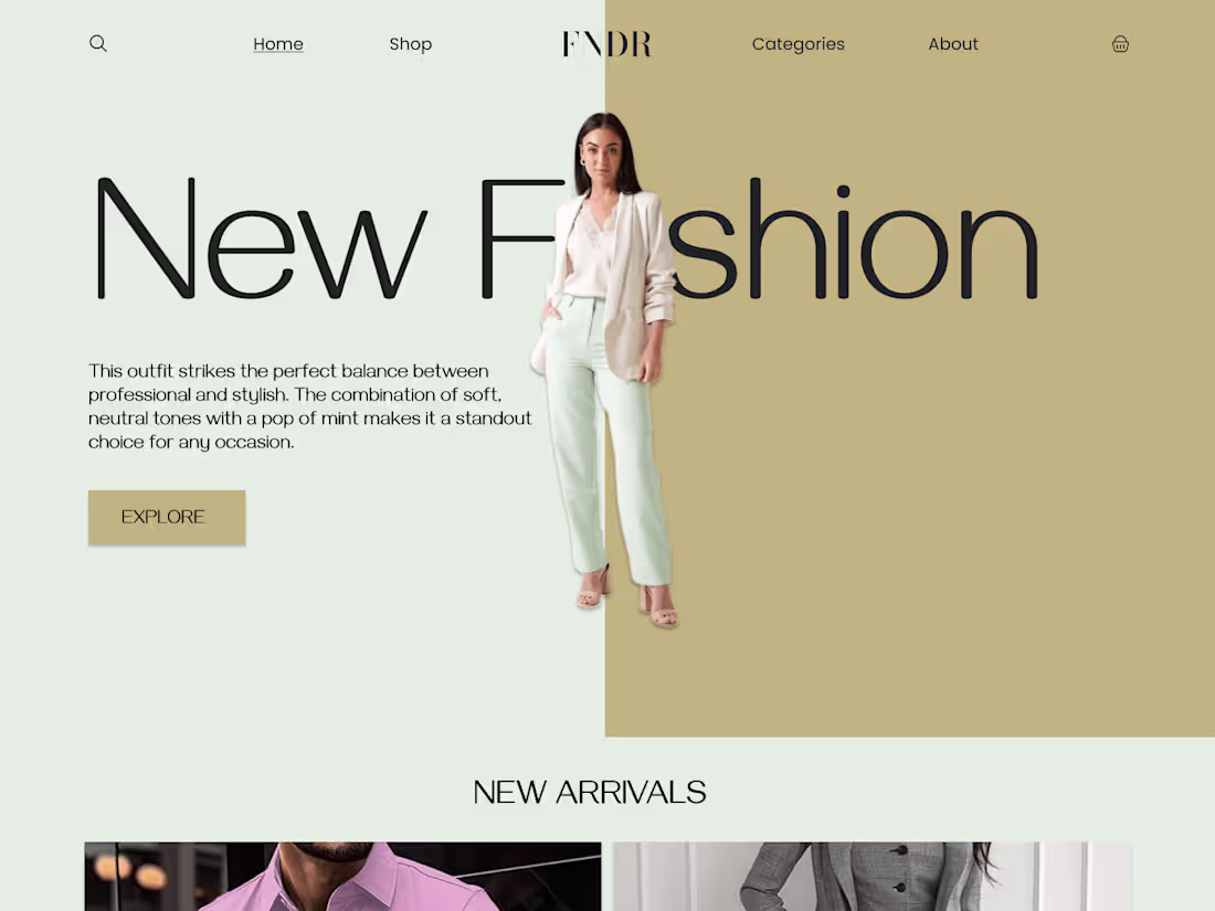
Innovative and Modern Aesthetics: The design reflects the latest UI/UX trends, use of clean layouts, effective typography, and a sophisticated color scheme sets the website apart from competitors.
What's included
Responsive Design
Overview: Creating designs that adapt seamlessly to various screen sizes and devices, ensuring a consistent user experience across desktops, tablets, and mobile phones.
Benefits: Users will enjoy optimal performance and aesthetics, regardless of their device, leading to increased engagement and satisfaction.
Approach: Using a mobile-first design strategy, leveraging flexible grids, and incorporating media queries to adjust layouts, images, and other elements dynamically.
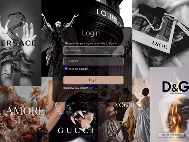
Prototyping and User Flows
Overview: Developing interactive prototypes in Figma to showcase how users will navigate through the website or app, illustrating key interactions and user paths.
Benefits: Provides stakeholders with a tangible preview of the final product, facilitating better feedback and decision-making.
Approach: Mapping out user journeys, creating wireframes, and linking them with interactive elements to simulate the actual user experience. Prototypes will be detailed enough to demonstrate core functionalities and interactions.
Brand Consistency
Overview: Designing with a keen eye on maintaining the client's brand identity, ensuring that every visual element reflects the brand's personality and values.
Benefits: Enhances brand recognition and trust, providing users with a cohesive and familiar experience.
Approach: Using the client's brand guidelines to dictate the choice of color schemes, typography, imagery, and other visual elements. Consistency is ensured through design systems and reusable components in Figma.
Usability Testing
Overview: Conducting thorough usability tests to gather real user feedback and identify areas for improvement, ensuring the design meets the intended user needs and expectations.
Benefits: Validates design decisions and highlights usability issues early, allowing for adjustments before final implementation, leading to a more user-centric product.
Approach: Planning and executing usability tests with target users, using methods such as task analysis, A/B testing, and user interviews. Analyzing the results to make informed design adjustments, enhancing overall usability and satisfaction.
Anikait M's other services
Starting at$20 /hr
Tags
Adobe XD
Elementor
Figma
Sketch
Webflow
UI Designer
UX Designer
Web Developer
Service provided by
Anikait M Nair Kochi, India
- 1
- Followers
Stunning Modern Website & Mobile Designs on FigmaAnikait M Nair
Starting at$20 /hr
Tags
Adobe XD
Elementor
Figma
Sketch
Webflow
UI Designer
UX Designer
Web Developer
Innovative and Modern Aesthetics: The design reflects the latest UI/UX trends, use of clean layouts, effective typography, and a sophisticated color scheme sets the website apart from competitors.
What's included
Responsive Design
Overview: Creating designs that adapt seamlessly to various screen sizes and devices, ensuring a consistent user experience across desktops, tablets, and mobile phones.
Benefits: Users will enjoy optimal performance and aesthetics, regardless of their device, leading to increased engagement and satisfaction.
Approach: Using a mobile-first design strategy, leveraging flexible grids, and incorporating media queries to adjust layouts, images, and other elements dynamically.
Prototyping and User Flows
Overview: Developing interactive prototypes in Figma to showcase how users will navigate through the website or app, illustrating key interactions and user paths.
Benefits: Provides stakeholders with a tangible preview of the final product, facilitating better feedback and decision-making.
Approach: Mapping out user journeys, creating wireframes, and linking them with interactive elements to simulate the actual user experience. Prototypes will be detailed enough to demonstrate core functionalities and interactions.
Brand Consistency
Overview: Designing with a keen eye on maintaining the client's brand identity, ensuring that every visual element reflects the brand's personality and values.
Benefits: Enhances brand recognition and trust, providing users with a cohesive and familiar experience.
Approach: Using the client's brand guidelines to dictate the choice of color schemes, typography, imagery, and other visual elements. Consistency is ensured through design systems and reusable components in Figma.
Usability Testing
Overview: Conducting thorough usability tests to gather real user feedback and identify areas for improvement, ensuring the design meets the intended user needs and expectations.
Benefits: Validates design decisions and highlights usability issues early, allowing for adjustments before final implementation, leading to a more user-centric product.
Approach: Planning and executing usability tests with target users, using methods such as task analysis, A/B testing, and user interviews. Analyzing the results to make informed design adjustments, enhancing overall usability and satisfaction.
Anikait M's other services
$20 /hr